
I recommended Calibre in the QQ group several times before, because it is very convenient to use. It is equivalent to a local Douban. It maintains a database of books locally, and it is very convenient to search after tagging and setting the author. However, after blowing it for a long time, few people responded. I still lost a bunch of files on the desktop. I put a layer of folders in a conscience and organized it. When I really wanted to find it, I couldn’t find it for a long time. Finally, I would like to say that I recommend this software. The cost of learning is too high. I wonder if it’s similar to Douban…
However, this software does have a problem. It should be said that open source software has this problem. The UI is ugly and ugly. Even if you really want to learn to see such an ugly UI, you will be timid first. The settings are complicated, and you don’t know at all. Where to start. In the end, it looks like this by default:
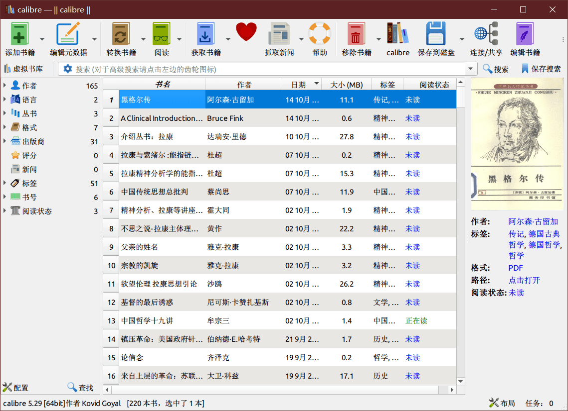
Seriously, use a hammer for such a software, even if it is really easy to use, I don’t want to use it when I see this appearance…
So let’s talk about how to beautify this software
style/icon/font
In fact, the first item in the preferences is the interface appearance. The first two items in the interface appearance can be set casually and the software will look good. But when I saw so many settings, I was first afraid…
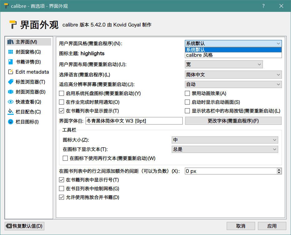
The first item in the settings defaults to the calibre style. This option determines that the scroll bar on the database table and the table is the jelly-like skeuomorphic style in the XP era. It looks ugly now. After changing to the system default It has become the flat style of the win10 era. Flat, flat, quasi-physical, no.
The second option is the icon theme, which is recommended for replacement.
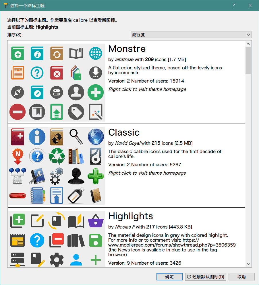
Just change this one, and don’t change anything else, and the appearance can be improved several times…
Then there is the font, here you can change it at will to see if you like it. I recommend Holly Black Body, a font used by Apple in the early years, which is just right for UI.
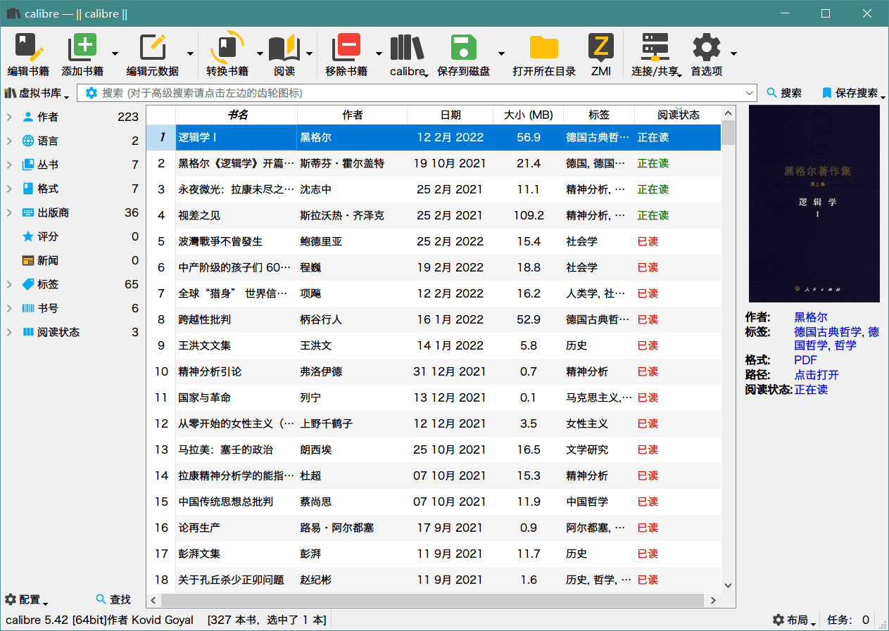
This is the effect after setting, this is not the default of random seconds.
read, unread, reading
This is not difficult, just add a column in the preferences and set it like I do
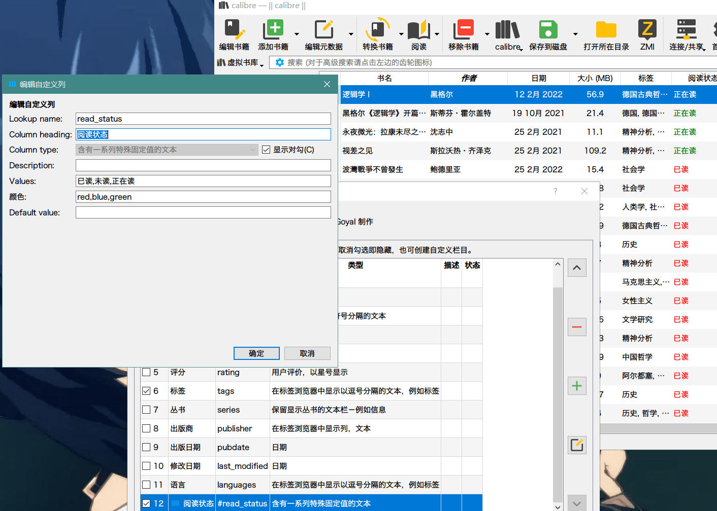
Calibre Viewer Beautify
Opening PDF in Calibre is the default PDF opening method set by the system by default, but if you open an e-book such as mobi or epub, it is opened with the built-in Calibre Viewer by default. This built-in reader I used to have a lot of black farts, it is really ugly and difficult to use. However, recently I found that it is not so bad. It is not so difficult to use, especially after trying it under Windows, I found that it is very easy to use. As for ugly, it can be set, but the settings are too many and complicated. Compare Ha people.
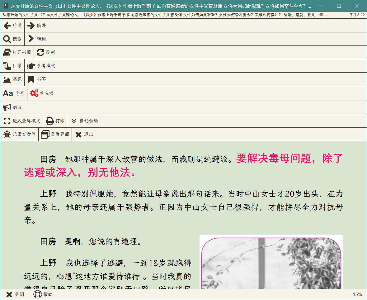
The operation logic of Calibre Viewer is that the selected text will automatically appear highlighted and other options, and the right-click is to display the menu. This operation logic is quite strange on Windows. In fact, touch-screen operating systems such as Android are more suitable for this kind of operation. The operation logic, for example, the moon+ reader that I commonly use on Android is similar to this logic. Here, right-click the menu and enter the preferences to see the settings I have made. Basically, I am trying to carry the rice husk reader set.
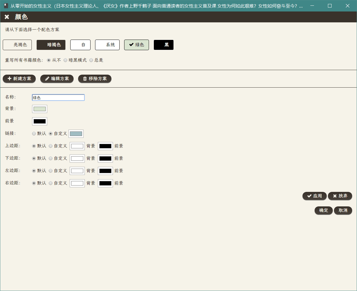
The first is the color, which must be changed. It looks more comfortable to change to light green or light yellow and light brown. The color I use is #dae5d0 . In fact, you can also find your favorite color on this color matching website , or directly Look for the kind of terminal color matching that is ready-made.
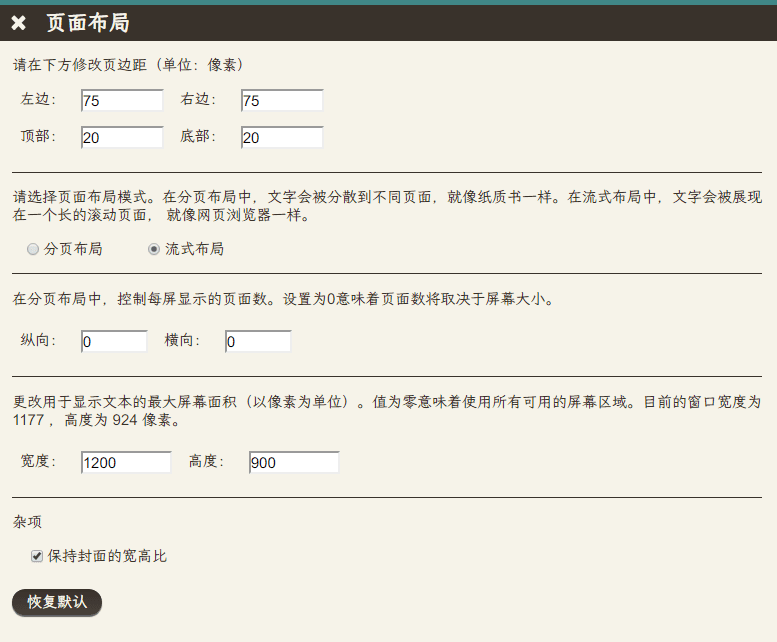
The page layout is simply changed. I prefer the flow layout.
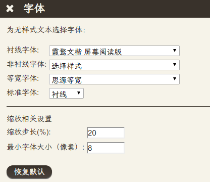
Modifying the font is also fixed. Here, I chose a Xiahu Wenkai which is more suitable for reading books. This is an open source font. You can download this font and its derivative version on Github . I use a derivative version here. The font weight is heavier and the lines look thicker.
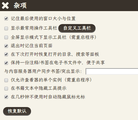
In Miscellaneous, remember the last used window size and position is mandatory, this software will open with a very small window by default, which is very annoying…

The final display effect is probably like this, so it feels okay.
This article is reprinted from: https://yuukoamamiya.github.io/p/theme-for-calibre/
This site is for inclusion only, and the copyright belongs to the original author.