In the past, in order to make a dialog effect on the page, it was often very complicated, and it was necessary to write a mask layer and write a lot of code with CSS, but I just learned that dialog is also natively supported in html.
Standard usage
<dialog open> <h1>Hello</h1> </dialog>

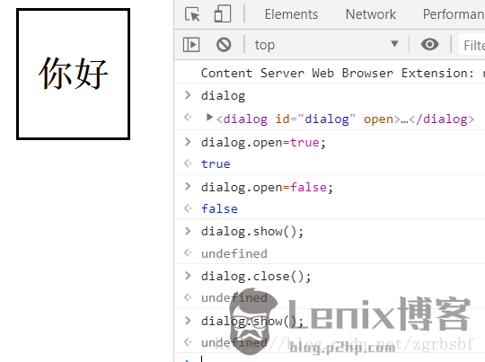
It can be displayed or hidden by changing the open property, as shown in the figure above. You can also use the show method or close method of the dialog.
modal usage

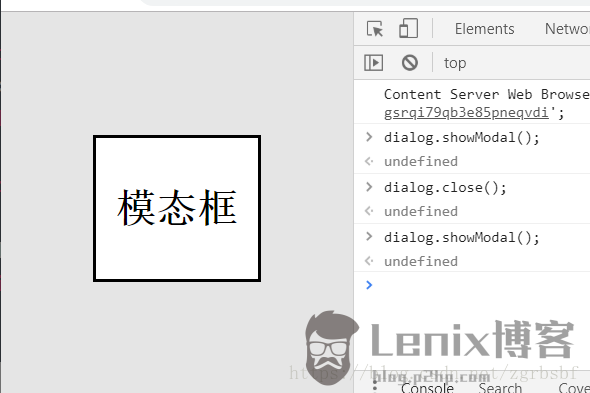
Different from common usage, the display needs to use the showModal method, and the modal box is centered up, down, left, and right by default, and there is a default mask. When the modal box is displayed, you can press the ESC key to hide it.
Modify style

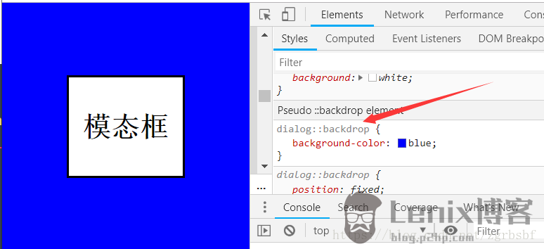
The style of the background can be modified through the ::backdrop pseudo-class. As shown in the figure above, the background color is changed to blue; of course, the style of the modal box can also be modified with CSS.
modal box in form
accomplish
<dialog id="dialog"> <form method="dialog"> <p>Want to close? </p> <button type="submit" value="no">no</button> <button type="submit" value="yes">Yes</button> </form> </dialog> <script> const dialog = document.getElementById('dialog'); dialog.showModal(); dialog.addEventListener('close', function () { console.log(dialog.returnValue); //
…
The post html on dialog tag element usage first appeared on Lenix Blog .
This article is reprinted from https://blog.p2hp.com/archives/8963
This site is for inclusion only, and the copyright belongs to the original author.