Original link: https://www.zhangxinxu.com/wordpress/2022/10/css-media-range-syntax/
by zhangxinxu from https://www.zhangxinxu.com/wordpress/?p=10569 Xin Space-Xin Life
This article welcomes sharing and aggregation. It is not necessary to reprint the full text. The copyright is respected. The circle is so big. If you need it urgently, you can contact for authorization.

One, in a nutshell
In the past, media queries for device sizes were written using min-width or max-width , for example:
@media (min-width: 100px) and (max-width: 1900px) { /* your css here */ }
Indicates that the browser form is matched and rendered when the width is between 100px and 1900px (including 100px and 1900px).
Now, there is a new syntax, no need to use min-width or max-width for range specification, and directly use the more intuitive than sign (>), less than sign (<) and greater than or equal to (>=) Less than or equal to (<=) sign to set.
E.g:
@media (100px
For newcomers, this kind of grammar is obviously easier to understand (old grammars often don’t know whether the package does not include boundaries), and it is easier to remember (in line with the writing habits of logical languages).
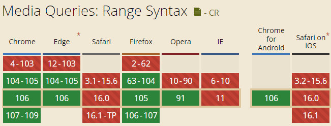
compatibility
Compatibility is shown in the figure below (from caniuse), both Chrome and Firefox already support this syntax, but Safari does not currently support it, which restricts the application and popularization of this syntax, but it does not mean that it cannot be used at all. There will be indications at the end of this article. .
2. Seeing is believing
Whether it’s a mule or a horse, pull it out for a walk.
Run the entire online demo to see if this syntax works as expected.
You can hard hit here: CSS meaia query Range new syntax demo demo
At this point, when we adjust the width of the browser’s visible window (you can open the developer tools console to change it), we can find that the font size and stroke color of the text change with different size ranges.
The change effect is shown in the following GIF screenshot:

The relevant code is shown below, starting with the HTML part:
<strong class="caption">Look at my font size and stroke color? </strong>
Then the relevant CSS code is:
.caption { font-size: 3rem; -webkit-text-fill-color: transparent; -webkit-text-stroke: 2px currentColor; } @media (800px < width <= 1200px) { .caption { color: red; font-size: 2.25rem; } } @media (width <= 800px) { .caption { color: green; font-size: 1.5rem; } }
You can see that the code and the actual rendering result are as expected.
3. The end of the song is gone
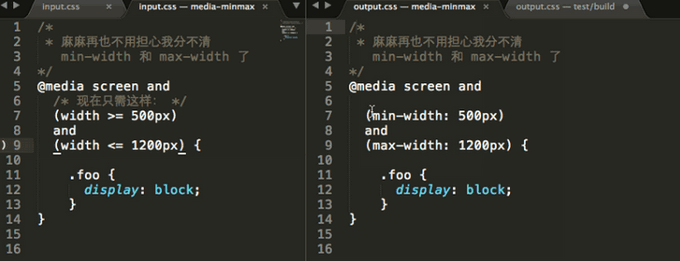
Although the Safari browser does not support the Range writing syntax, it is not impossible to use it with some tools.
For example, if your project uses postcss, you can try polyfilling this project: https://github.com/postcss/postcss-media-minmax
It will automatically compile CSS from the new syntax to the traditional syntax, so that it can ensure that developers can use it well, and the normal experience of users will not be affected.
Well, that’s all for this article.
Thank you for reading, and if you find it helpful, please share.

This article is an original article, welcome to share, do not reprint in full text, if you really like it, you can collect it, it will never expire, and will update knowledge points and correct errors in time, and the reading experience will be better.
Address of this article: https://www.zhangxinxu.com/wordpress/?p=10569
(End of this article)
This article is reproduced from: https://www.zhangxinxu.com/wordpress/2022/10/css-media-range-syntax/
This site is for inclusion only, and the copyright belongs to the original author.