Original link: https://www.zhangxinxu.com/wordpress/2023/05/css-margin-trim/
by zhangxinxu from https://www.zhangxinxu.com/wordpress/?p=10858Xin Space-Xin Life
This article is welcome to share and aggregate, there is no need to reprint the full text, respect copyright, the circle is so big, if you need it urgently, you can contact for authorization.

One, in a word
The CSS margin-trim property is set on the container element, which can make the calculated value of margin setting of the child element (requiring edge contact) become 0 .
2. Grammar and presentation
The syntax is as follows:
 margin-trim: none;

margin-trim: block;

margin-trim: block-start;

margin-trim: block-end;

margin-trim: inline;

margin-trim: inline-start;

margin-trim: inline-end;
Only supports logical CSS attribute values, indicating which direction the margin needs to be trimmed.
inline indicates the typesetting direction of inline elements, that is, horizontal, and block indicates the typesetting direction of block-level elements, which naturally means vertical, that is, up and down.
Instructions for use
margin-trim is used in lists with margins set, or in repeated label items.
For example, consider a container with several list items.
There will be some up and down spacing between each list.
We often use margin to set this spacing, for example:
 <div class="box">

    <div class="item">China's aerospace industry is moving forward</div>

    ...

    <div class="item">Angelababy has never missed a red carpet</div>

</div>
 .box {

    border: 1px solid #999;

    padding: .75rem;

}

.item {

    ...

    margin-block: .75rem;

}
At this time, the space between the upper part of the first element and the lower part of the last element will be too large, as shown in the following result:
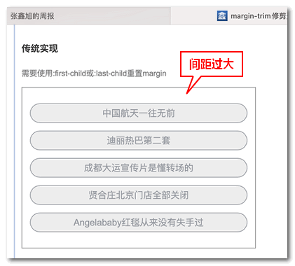
In the past, we often needed to use :first-child or :last-child to reset the margin property value.
 .item:first-child {

    margin-top: 0;

}

.item:last-child {

    margin-bottom: 0;

}
Now, as far as I am concerned, the Grid layout is used to solve this problem.
For example:
 .box {

    display: grid;

    /* Subitems do not set the margin property */

    gap: .75rem;

}
It’s also very nice, except for the size (both height and width), there may be unexpected rendering, everything else is OK.
In the future, margin-trim attribute may be used, which will not change the original display state of the container, nor will it change the size model of the child items, which will be more friendly.
It is also very simple to use:
 .box {

    margin-trim: block;

}
A few lines of CSS code can solve the problem.
At this point, the rendering effect of the list will be as follows (taken from Safari 16.5, I specially upgraded the Ventura version of macOS, and downloaded the 11.79G upgrade package):

Seeing is believing, if you have Safari 16.4 and above browsers, you can click here: margin-trim trimming edge spacing list layout demo
margin-trim: strange behavior of inline
If I set the horizontal margin to the list element and set margin-trim:inline to the container element, there is an unexpected rendering effect, that is, only the horizontal margin of the last element is trimmed.
As shown in the screenshot below:

It’s really strange, not all the horizontal margins disappear, nor the first and last two elements, but the last one.
Is it related to the layout direction?
So I tried the flex layout again to arrange the sub-items horizontally.
 .box {

    display: flex;

    margin-trim: inline;

}

.item {

    margin: .75rem;

}
The result is really like this. If the items are arranged horizontally and the sub-items have margin settings in the horizontal direction, the margins of the first and last elements in the direction of contact with the container will disappear. The schematic diagram is as follows:

In fact, according to my understanding, margin-trim should mean that as long as the edge touches, the margin will disappear, not just limited to the first and last elements. In this way, the application potential of this attribute will be even greater.
For example, in the layout scene as shown in the figure below, because all the labels have a margin-right, there is obviously enough space, but the labels are still changed to the following:

If margin-trim is aimed at any sub-element, then the classic problem above can be easily solved, but unfortunately, it is not supported. 
compatibility
Currently, margin-trim attribute is only supported by Safari, and it will take some time before it is officially applied in the production environment.
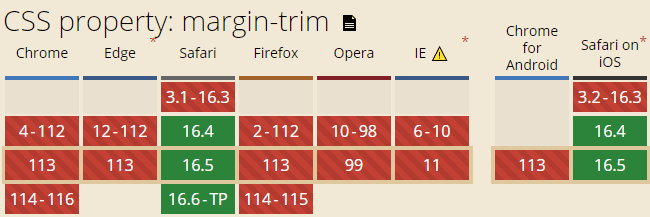
Therefore, everyone can understand this attribute for the time being.
Three, nonsense time
1. My thoughts on reading “Shao Song”
“Shao Song” has been added to Qidian’s bookshelf for a long time. At the beginning, I was chasing comics (available in Qidian APP). The comics are really good, but the update is too slow. I just saw the key, it’s gone, and I can’t help it. I started to follow the article, read many chapters in one breath, and felt deeply.
- The author is awesome, especially the details and sense of substitution;
- The novel I started from made a fatal mistake, and the positioning was not accurate. I don’t need to deliberately rely on the routine of Shuangwen. I should pursue my heart and write what I am good at;
- Learned a lot about history;
- It is quite inspiring in the workplace, such as what kind of employee to be, what kind of self to be, technology and politics, etc.
2. Sunday exercise program
There is a free and open basketball court in the neighborhood next door. The infrastructure is very good. I went to shoot basketball for an hour on Sunday morning.
3. The Android phone is changed
Because of development needs, I have an iPhone and an Android machine.
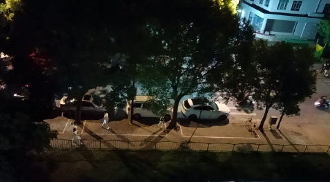
A few months ago, the Android mobile phone did not fall into the water when fishing, but the signal was not good. Last Saturday, I couldn’t bear it, so I changed it. It is the same brand. It is said that the photo is 100 million pixels, but the quality of the photo is… only It can be said that it is worthy of the price. 
This article is an original article, welcome to share, do not reprint the full text, if you really like it, you can bookmark it, it will never expire, and will update knowledge points and correct errors in time, and the reading experience will be better.
Address of this article: https://www.zhangxinxu.com/wordpress/?p=10858
(End of this article)
This article is transferred from: https://www.zhangxinxu.com/wordpress/2023/05/css-margin-trim/
This site is only for collection, and the copyright belongs to the original author.