Original link: https://www.zhangxinxu.com/wordpress/2023/07/css-image-aspect-ratio-layout/
by zhangxinxu from https://www.zhangxinxu.com/wordpress/?p=10915Xin Space-Xin Life
This article is welcome to share and aggregate, there is no need to reprint the full text, respect copyright, the circle is so big, if you need it urgently, you can contact for authorization.

It is known that the size of the picture is unknown, and the ratio is unknown, but it needs to be displayed in a 1:1 ratio, four in a row, and the width is self-adaptive, always elastically responsive.
The effect of the MP4 video is as follows (click to play without moving).
Excuse me, this effect is achieved by you, how will you achieve it?
1. Percentage padding
To make the content of an element displayed in a fixed proportion.
In the past, when compatibility with IE browsers was required, it was basically implemented using percentage padding, because the percentage calculation value of padding is calculated relative to the width, even in the vertical direction.
For example:
 div {

  padding: 100% 100% 0 0;

}
It will support a 1:1 div element.
We can take advantage of this feature to allow the image to be flexibly displayed with a 1:1 aspect ratio.
The HTML structure is as follows, three layers of tags are required, one layer of width, one layer of height and width, and finally the image is filled.
 <ul class="box">

    <li class="list">

        <div class="cover">

            <img src="0.jpg" />

        </div>

    </li>

    <li class="list">

        <div class="cover">

            <img src="1.jpg" />

        </div>

    </li>

    ...

</ul>
The CSS code is shown below. In order to be compatible with IE9, the traditional floating layout is deliberately used.
 .box {

    overflow: hidden;

}

.list {

    width: calc(25% - 1.5rem / 4);

    float: left;

    margin-bottom: .5rem;

}

.list:not(:nth-child(4n + 1)) {

    margin-left: .5rem;

}

.cover {

    padding: 100% 100% 0 0;

    position: relative;

}

.cover img {

    position: absolute;

    left: 0; top: 0;

    width: 100%;

    height: 100%;

    object-fit: cover;

}
Since the padding occupies space, the image needs to use absolute positioning to cover the supporting space of the div element.
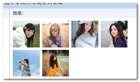
The following figure shows the effect after implementation:

Seeing is believing, you can click here: CSS percentage padding and image layout demo
In fact, this layout effect will be introduced in detail in 2027. If you are interested, you can visit here: ” CSS percentage padding achieves a fixed-scale image adaptive layout “
Two, aspect-ratio attribute
By 2021, with the development of CSS technology, there will be a new option for fixed-ratio image layouts. This is the CSS aspect-ratio attribute, which specifically sets the aspect ratio of elements.
However, this attribute has no effect on the IMG element, because the image element has an intrinsic size and is not affected by aspect-ratio attribute.
Therefore, at least two layers of tags are required to implement the elastic layout of equal-scale images using aspect-ratio attribute.
 <ul class="box">

    <li class="list">

        <img src="0.jpg" />

    </li>

    <li class="list">

        <img src="1.jpg" />

    </li>

    ...

</ul>
Compared with the padding method, CSS is naturally simplified, and the Flex layout is used here.
 .box {

    display: flex;

    gap: .5rem;

    flex-wrap: wrap;

}

.list {

    flex-basis: calc(25% - 1.5rem / 4);

    aspect-ratio: 1 / 1;

}

.list img {

    display: block;

    width: 100%;

    height: 100%;

    object-fit: cover;

}
Is it much easier to understand.
The effect is similar to the screenshot below:

Similarly, seeing is believing, you can click here hard: CSS aspect-ratio and image proportion layout demo
For more information about aspect-ratio attribute, such as the priority compared with attributes such as width/height, etc., you can refer to my previous article: ” Chrome 88 already supports the aspect-ratio attribute, let’s learn it “.
Three, cqw unit
Now in 2023, there is a simpler method, and only one layer of container tags is needed to achieve the final layout.
 <div class="box">

    <img src="0.jpg" />

    <img src="1.jpg" />

    <img src="2.jpg" />

    <img src="3.jpg" />

    <img src="4.jpg" />

    <img src="5.jpg" />

</div>
So powerful, what is it used to achieve it?
Hey, container elements and cqw units, the specific CSS is as follows:
 .box {

    display: flex;

    gap: .5rem;

    flex-wrap: wrap;

    container-type: inline-size;

}

.box img {

    width: calc(25cqw - 1.5rem / 4);

    height: calc(25cqw - 1.5rem / 4);

    object-fit: cover;

}
container-type:inline-size can turn ordinary elements into container container elements, and cqw is the container width unit, 1cqw=1% of the container width, and 100cqw is the container width.
However, this requirement needs to display 4 pictures in one line, so the size of each picture relative to the container is easy to calculate.
It’s that simple.
The effect is the same:

Seeing is believing, you can click here hard: CSS container unit cqw and picture equal proportion layout demo
The @container container rule is still very strong and practical. For details, please visit ” Introduction to the most anticipated and officially supported CSS container container query in 2022 ” to learn more.
Fourth, the ending chatter
From the above layout evolution, we can actually see the progress of CSS and the significance it brings to our development.
Generally speaking, the new features of CSS are not to solve the problem of 0 to 1, but to enhance it, making the development easier and the code more concise.
Of course, there are special cases, such as :has() pseudo-class. The appearance of this selector is a bit subversive. The change of any element can control the change of any other element on the page.
Finally, let me talk about why the update this month is a bit slow.
On the one hand, I am writing short stories, and the last one of the collection has already written tens of thousands of characters.
On the other hand, the children are sent back to their hometown during the summer vacation, and then I have to go back to play every weekend. After I go back, it is impossible to still have the mind to work and catch the flying fish.
As a result, output is near record lows.
August should be better.
Starting in the second half of the year, I plan to write a book about HTML. I have already thought about the title of the book. What’s the matter? Wait, I wrote it in the memo on my phone.
Oh, found it, it’s called “You’re not good at HTML”, ummmm, that’s a good name.
OK, that’s all for now, let’s continue to complain in the next article.
Suddenly remembered the question, is css-tricks not updated, have you noticed?


This article is an original article, welcome to share, do not reprint the full text, if you really like it, you can bookmark it, it will never expire, and will update knowledge points and correct errors in time, and the reading experience will be better.
Address of this article: https://www.zhangxinxu.com/wordpress/?p=10915
(End of this article)
This article is transferred from: https://www.zhangxinxu.com/wordpress/2023/07/css-image-aspect-ratio-layout/
This site is only for collection, and the copyright belongs to the original author.