Original link: https://shyrz.me/cyberclip-31-colorful-colors/


Issue 31 of Issue 23 03 25
Hello, end of March!
This issue’s selection “Why the Definition of Design May Need to Change” introduces the origin and development of design: how it was born from architecture, and gradually expanded its boundaries with technological changes, but kept its original meaning; selection “Why is Gold Gold?” 》Analyzes the physical and chemical principles of human seeing colors in a simple and simple way, and explores the reasons for the unique color of gold which is different from other metals.
Hope to be enlightened.

Save time, save money!

ClickUp →
One tool for everything – ClickUp provides everything you need in one platform: task management, file management, whiteboard mapping, dashboards, object tracking… and more! Switch to ClickUp today and explore our 100% customizable features!
(Clicking on the link above helps me run the business better, and I receive a small sponsorship for every valid click)

Why the Definition of Design May Need to Change
→ Original link : Why the definition of design might need a change — Nicholas de Monchaux / MIT Technology Review / 2023-02-22
 Lauren Simkin Berke
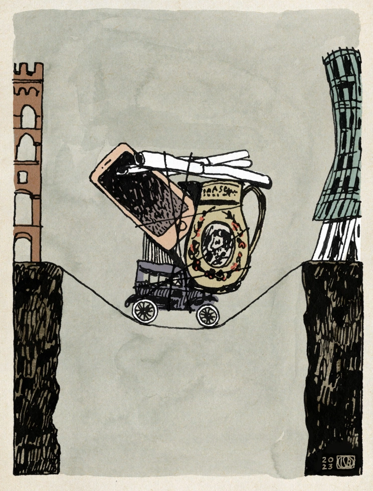
It was painting, or disegno , that was employed in the production of Renaissance Italian architecture that brought us the term “design”—or rather, it was my introduction to the architecture department in the late 1990s as an architecture student. The romantic explanation students get. Of course, history tells a more complicated story.
While the meaning of “design” did undergo a major shift between the 14th and 16th centuries, it had less to do with language and more to do with a fundamental shift in the making of things themselves. The relationship between painting and design did not generate a word, or even expand its meaning. Instead, it has reduced the former use of the word, and to some extent it may now be necessary to reverse that.
The Latin root “dē-signo” for “design” conveyed to Cicero and others a broader and more abstract meaning than we usually ascribe to the word today. These range from literal and material (such as sketches), to strategies (to design and achieve goals), to organizations and institutions—such as the strategic “designation” of people and things (the root of “design” is still deeply involved). All these meanings have a broad sense of exerting influence in the institutions and arrangements of the world.
However, the use of drawings to directly shape architecture in the 13th and 14th centuries started a linguistic shift in which “design” in this sense eclipsed almost all other meanings.
A parchment from 1340 is an early microcosm of this transformation process. This parchment, with folds, creases and perforated nails, records the contract between the patron and the three main builders for the construction of the Palazzo Sancedoni in the center of Siena. The lower half of the parchment records the legal and financial arrangements surrounding the construction of the palace; the upper half depicts an elevation of the yet-to-be-built outer wall, with notes and dimensions.
Drawings, of course, recorded builders’ intentions long before 1340—on the ground, on the walls, or eventually on some other more convenient surface. However, these inscriptions are secondary, adjacent to the building process. But as economies such as Siena’s grew prosperous in the 14th century, great master builders were likely to balance multiple simultaneous projects, necessitating the need to rely on the authority to draw up documents – the term “design” at the time Has multiple meanings – to manage activities on a construction site. In fact, part of the Sansedoni parchment’s role was to outline the role of a fourth unnamed builder who would remain on site to direct the work while the contract’s three named signatories were busy elsewhere. Concurrent with this shift, the masters of the building site were replaced by architects who would produce and document the design of the building – primarily authorized through documents and drawings.
Consequently, architects sometimes adopt a proprietary attitude towards the word “design”. If there is any reason for this feeling, it is that architects were indeed the first group to practice design in a contemporary sense – as a strategic, drawing-based mode of separating objects and environments from immediate fabrication . However, if architecture is a precursor to design, it will soon not be alone as a stand-alone vocational and research course. While architecture students at the Ecole des Beaux-Arts made sketches, or preparatory sketches, as prescribed by the course and as part of what we now call the “design process,” factory chimneys rose farther from Paris to mark the end of the physical world. There has been an even bigger shift in the economy and the design philosophy within it.
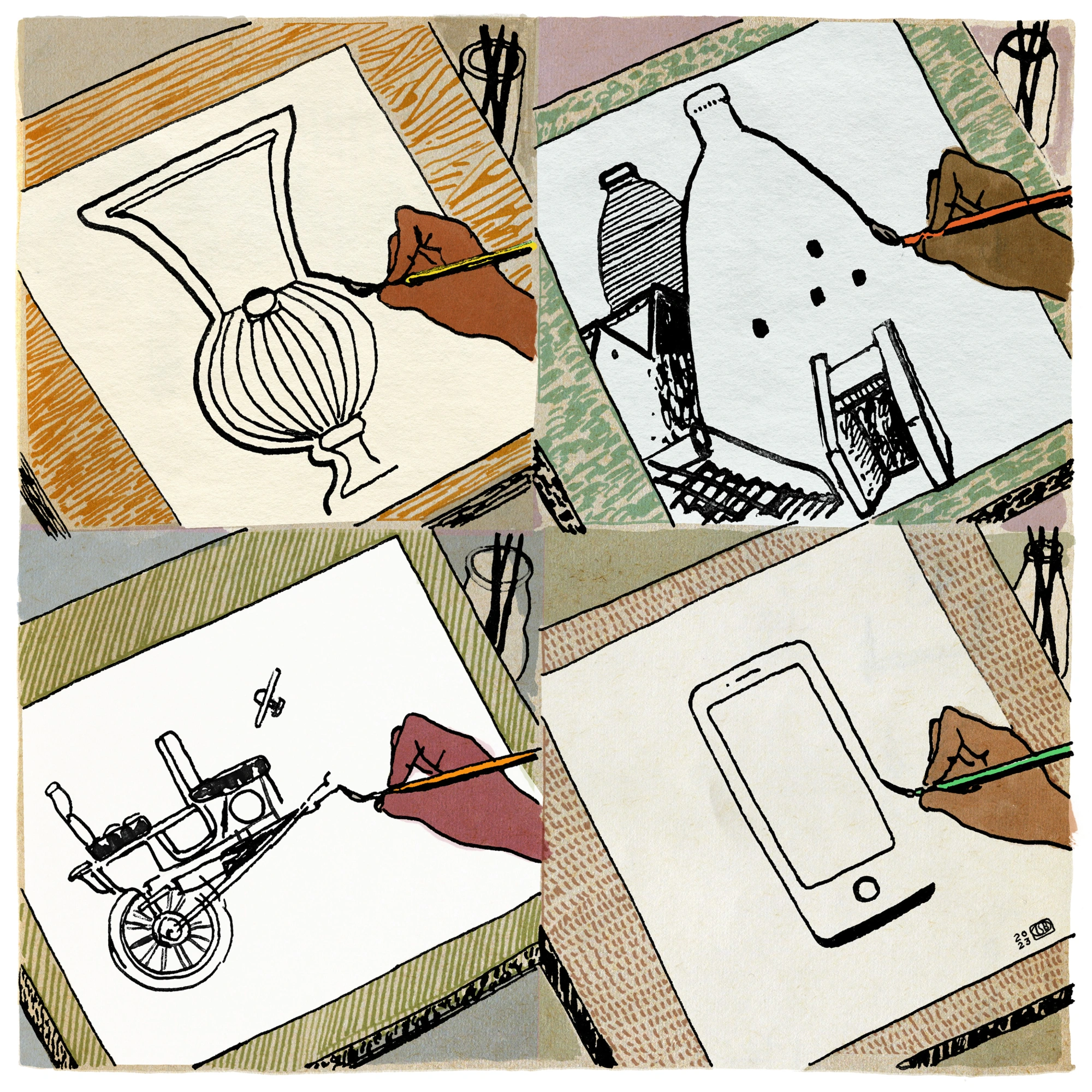
As early as the 16th century, drawings and models of porcelain household items were circulated between kilns in Europe and Jingdezhen, China, helping to specify the forms and patterns of decoration, what we now call designs, to create for specific markets. By the 18th century, English pioneer Josiah Wedgwood had deployed artists and “master” potters to produce illustrations and models. The idea was to enable sustained, large-scale pottery production—“machines for making infallible men,” in Wedgwood’s own words. But in addition to removing the margin for error among workers, it also put an end to their personal expression. It was the subsequent mechanization of production that completely separated design and manufacture. This has had a profound impact on the definition of design, both as a word and as a social construct.
 Lauren Simkin Berke
While this concept of design has expanded into our society and economy today, we can take a single industry as an example. It was Henry Ford’s Model T, whose simplified design from 1907 made gasoline-powered cars more than just playthings for the wealthy. In 1924, Alfred P. Sloan made an equally important innovation at General Motors, making design the hallmark of the new model year and introducing different Price and positioning, it’s a wasteful business practice.
So while calling a handbag or sunglasses a “designer” conveys a perception of brand identity over actual value, we still take “design” deeply as it is one of the few that can make modernity’s increasingly complex realities One of the activities that becomes feasible. It’s no coincidence that companies that seek to make products that are both transformative and accessible—Tesla, Apple, and even IBM at the time—declare the elegance of the finish as a sign of (supposed) overall technological sophistication , even if they are also mining the commercial value of style and positioning.
However, despite all the technological changes that have taken place in the world, the basic origin of almost all new buildings remains a set of drawings and specifications, recognizable in 14th century Siena. It also means that the word “design”, as it is commonly used, remains consistent with this ancient definition – even if it extends far beyond architecture. Ironically, drawing is no longer the only means of design. Over the past few decades, architecture and its sister professions have embraced digital tools that have begun to free design from drawing; technologies such as 3D printing and robotic assembly of construction have eliminated the traditional distance between conception and fabrication.
At the same time, this development has coincided—perhaps not coincidentally—with the marketing and adoption of so-called “design thinking,” whose practitioners often work far from the draft desk. The irony of this practice is that tools derived from the pictorial sense of “design”—that is, means of rearranging relationships in sketches, diagrams, and graphs, on post-it notes or otherwise—often prove to be Apply successfully to more abstract problems than the immediate physical or visual environment.
However, it’s not just the success of design consultancies that should drive us back to a broader design perspective . The waning of design’s post-industrial significance is inseparable from the reduction of the earth’s finite resources, whether it’s the quarry stones that piled into Siena’s palaces or the rare earths that anchor the image of the iPhone. While design can have enormous benefits, it is also responsible for our current ecological crisis; everything new may not be much better than the old.
If today’s designers move further downstream from the delineated confines, through prototyping and direct manufacturing, we also gain a lot by requiring design to move further upstream. This means the focus groups and surveys involved in product creation, the legal and developmental decisions involved in architecture, the resources and decisions the world of design relies on.
From the continued reuse of materials in the “circular” economy, from the shift in focus in architecture to adaptive reuse, to the redesign of food, from the unsustainable focus on meat, we must reinvent not just objects, but There are cultures and institutions that create them. It is no coincidence that such works recapture the original meaning of dē-signo: not just to find more beautiful shapes, but to shape a more beautiful and sustainable world.

Why is gold golden?
→ Original link : Why is Gold yellow? Spoiler alert: Einstein again — Mihai Andrei / ZME Science / 2023-02-08
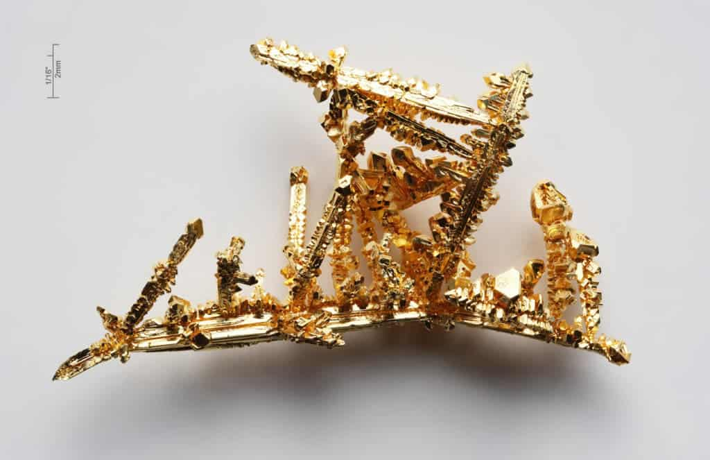
You might not have thought about it, but the reason gold is yellow (or golden) is ingrained in its atomic structure — and it’s because of something called relativistic quantum chemistry. Simply put, because it is a very large atom, gold’s electrons move so fast that they exhibit relativistic contraction , shifting the wavelength of absorbed light to blue and reflecting the opposite color: golden yellow.
Read on to learn more about the fascinating chemicals that give this luxurious symbol of wealth its precious color.
 Pure Gold / Wikipedia
What exactly is color?
If we want to understand why gold is yellow, we first need to understand why things have color. White light—what we often simply call light—is a mixture of many colors, all of which have their own wavelengths. When light bounces off any object, it is reflected, scattered and absorbed (to some extent). Thus, one wavelength may be absorbed by a surface, but other wavelengths may be reflected. The human eye absorbs wavelengths reflected from different surfaces in the environment and sends the signal to the brain, where it is processed into color by the visual cortex. It should be noted that all surfaces have their own physical color, but the color our eyes perceive may vary from person to person, depending on a range of context (i.e. viewing angle) and biophysical cues (i.e. any disabilities).
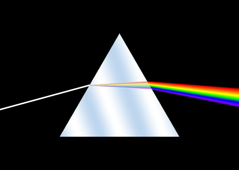 Prisms break white light into its component individual wavelengths, which we perceive as distinct colors
It wasn’t until Newton that we realized that light is the source of color. This has fascinated countless scientists and artists, including James Clerk Maxwell, Hermann von Helmholtz, and even Johann Wolfgang von Goethe von Goethe, who greatly improved our understanding of color and how it affects us. They happened to revolutionize physics in the process, but that’s another story. Now let’s go back to gold.
→ Further reading : Why is gold considered valuable even today?
chemistry of gold
If you look at gold (Au) on the periodic table, you might not think much of it. It has an atomic number of 79 and sits almost silently at the end of a group known as transition metals (can you spot it?) But if you look closely at it, you start to notice a few things. First, it’s just below copper (Cu) and silver (Ag), two very important metals in human history and two metals with which it shares important characteristics.
“Comparing metallic copper, metallic silver, and metallic gold to their numerous neighboring metal atoms has never been a problem, because pure metals have existed for thousands of years,” says Prof. Bernd Straub, He published a scientific paper on the origin of gold’s color.
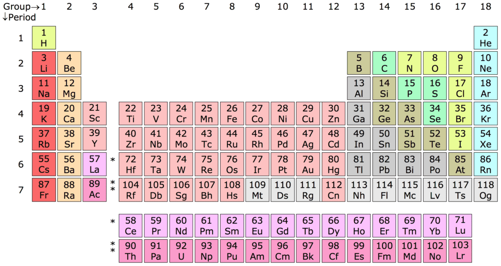
But unlike silver, copper, and nearly every other metal, gold doesn’t have a tint of silver. Gold is yellow, so that doesn’t explain much. Perhaps more interestingly, it lies right in front of Mercury (Hg), the only liquid metal. The yellow color of gold and the fluidity of Mercury actually have a lot in common.
relativistic color
In chemistry, some things just don’t make sense — especially with the heavier elements of the periodic table — without taking into account quantum mechanics and special relativity. As a result, the chemical community quickly incorporated these theories into what is known as “relativistic quantum chemistry”. In this branch of chemistry, the most important point is relativistic motion.
When objects start moving at the speed of light, we look not only at their mass, but also at their relativistic mass. Basically, when objects start moving fast, the extra energy doesn’t increase their speed much; instead, their mass starts to increase. Technically, everything has relativistic mass, but since everyday objects move much slower than the speed of light, this mass is completely negligible. Not so with atoms. Well, at least some atoms.
Arnold Sommerfeld calculated that for a single electron of a standard hydrogen atom, the velocity is v ≈ Zc/137. Don’t be intimidated by this seemingly cryptic equation, it’s pretty simple.
This formula basically says that the electrons within an atom will move at a speed approximately equal to the atomic number divided by 137. For gold, we already know the atomic number is 79. So in this case the electrons would be moving at 58% of the speed of light, which is quite a speed. For electron orbitals close to the gold nucleus, as in the case of the inner electron shells, their speed reaches about 90 percent of the speed of light. This means that relativistic effects are evident for gold, and these effects are affecting its colour .
So, we’re about to uncover…
connect everything
So, now that we understand what color is, we have some basic ideas about the chemical composition of gold, and we know that relativistic effects are at work, it’s time to get to the bottom of things.
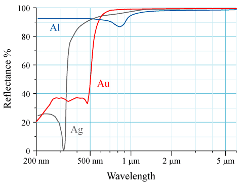 Reflectance vs. Wavelength Curves of Aluminum (Al), Silver (Ag) and Gold (Au) Metal Mirrors at Normal Incidence
The electrons in the outermost shell of an atom determine its color. When light hits an atom, some electrons in the outer shell absorb energy, jumping to a higher energy level. When they return to their original energy levels, they release the absorbed energy in the form of light, giving the atoms their color.
Take silver as an example: you need a high-energy UV photon to move the valence electrons, but the lower-energy visible-light photon just gets reflected back, which is why silver acts like a mirror.
However, the electrons in gold’s outermost electron shell move much faster than silver’s, so they move at relativistic speeds. This shell is responsible for chemical reactions and many physical properties, including color.
The human eye spectrum has wavelengths ranging from 390nm (blue) to 700nm (red). If you look at the reflectance curve above, you can see that gold absorbs a lot of lower wavelength blue light. Electromagnetic radiation with a wavelength close to 600 nanometers is seen by the human eye as yellow – that’s what gold reflects, and that’s what we see. It is worth noting that pure cesium (Cs) also has golden streaks for the same reason.
So, the next time someone shows off their new gold jewelry, you might just remind them of Einstein. It might not be the best way to break the ice, but it sure beats vanity.

-
 Productivity: How to Outperform the 99% (Start Today)
 -
 History:The Parthenon Marbles’ bizarre journey to the British Museum
 -
 Humanities: “The World of Science Fiction” and China’s Science Fiction History
  Technology: The Art of Computational Storytelling
  Philosophy: Scars of Identity: The Philosophical Legacy of Alexander Kojève

 If you like CyberClip and want to help me run it better:
- Forward to a friend or social network
- See the Advertise page Contact me to advertise
- Give me appreciation in Aifafa or WeChat, welcome to note title, email
- Click below with
 Marked promotion links, I can receive a meager sponsorship for every valid click of yours
 - In case you have a need, pass the following with
 Marked promotion link registration fee, I will be able to get a certain percentage (marked) rebate from your payment. Please do what you can and consume rationally.
 Thank your for your support!

 ShutterStock – Unique Collection of Royalty-Free Stock Photos, Videos, and Music [Payout Rate: 15%] Looking for high-quality, royalty-free stock photos and videos? Just take a look at Shutterstock. With Shutterstock’s massive database of over 350 million assets, there’s something for every creative project.
  Alts.co – The World’s Largest Alternative Investor Community Alts.co is the world’s largest alternative investor community. We like unique, out-of-the-ordinary things. We have over 50,000 subscribers and getting new subscribers is like cutting butter with a knife.
  Revolut – Sign up and get 3 months of free Revolut Premium service When you shop abroad or send money internationally, banks will charge you fees, but we don’t, that’s why more than 4 million people switch to Revolut.
Note: marked with
The link is a click link, and I can receive a meager sponsorship for every valid click of yours; marked with
The link is a promotion link, I will be able to get a certain percentage of rebates from your payment

Was this email forwarded by a friend or seen on a social platform? If you think it’s not bad, welcome to subscribe !
If you are interested in advertising on CyberClip, please see our Advertise page and get in touch with me.
CyberClip is a cyber clipping that selects valuable content on the Internet. Every two weeks, it covers new anecdotes, hot issues, cutting-edge technology and other things about life and the future.
 Thank you for reading, welcome to reply, and praise Shi Qi.
 Past content | Discussion group | Personal blog

This article is transferred from: https://shyrz.me/cyberclip-31-colorful-colors/
This site is only for collection, and the copyright belongs to the original author.