The two articles introduced in this issue are both about Design Space. The two articles have certain commonalities in the content of the discussion and writing style, so they are discussed and compared together.
Data video is a genre of narrative visualization that combines visualization with motion graphics to tell data-driven stories. When creating data videos, designers often use animation to encode data attributes, to reveal relationships, show uncertainty or convey emotion.
Animated illustration is a genre of graphic design that uses dynamic visuals to convey a specific, contextualized message. As an emerging medium, animated illustrations often use dynamic visuals to show stories, often lasting less than 15 seconds.
The research team from Tongji University analyzed 82 data videos and 121 high-quality animated illustrations, and concluded the design space of these two narrative mediums.
This work [1] analyzes a corpus of 82 data videos: first, the authors encode the data videos to construct the initial design space; second, the authors validate and refine the data videos by creating two data videos with a team of professionals design space. Specifically, their research questions are (1) what animation techniques (encoding methods) are used for these data videos? (2) What narrative strategies do these animation techniques (encoding) offer?
Through multiple iterations, the work identified 47 animation techniques categorized by 7 narrative strategies.
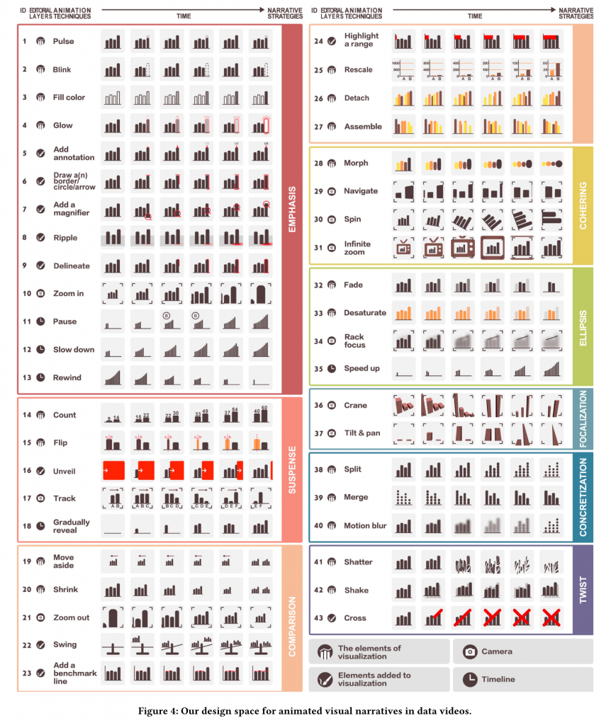 Figure 1 7 narrative strategies and 47 animation techniques for data video
Emphasis is one of the most popular storytelling strategies in data video, as shown in Figure 1, 1-13, emphasizing is like using visual signals to say “look here” to you, such as Pulse and Glow, two animation techniques, can emphasize key elements of a visualization by moving and highlighting brightness, respectively.
Suspense, which often uses delay to create tension and anticipation, has previously been widely used in filmmaking. As shown in 14-18 in Figure 1, animation techniques such as Count (Count) will present the entire process of data rising, not just the final result, which creates a kind of suspense. Unveil hides the data first, and finally uncovers the suspense.
Comparisons help explain similarities and differences. As shown in Figure 1, pp. 19-27, when comparing two or more visualizations, designers often use animation techniques such as Move aside, Zoom out, etc.
Cohering increases the continuity of the story by creating smooth transitions between the various components. As shown in Figure 1, Nos. 28-31, in the data video, designers can achieve seamless transitions by morphing, such as the shape change from bars to bubbles.
Ellipsis compresses the amount of information in the story so that the audience does not feel overloaded with information. As shown in Figure 1, 32-35, animation techniques of Fade and Desaturate are usually used to reduce trivial information in the visualization and avoid distraction.
Focusing (Focalization) is to enrich the storytelling, as shown in Figure 1 36-37, when the camera moves up and zooms out (Crane), it will give people a sense of awe. Focus-related animation techniques are often used in conjunction with 3D visualization.
Concretization uses concrete objects to illustrate abstract concepts. As shown in Figure 1, pp. 38-40, a visualization can be split into pieces (Split) to show what it is made of, and vice versa, to merge individual data points into an aggregated graph to help the viewer Increase perception and engagement.
Twist refers to a change in narrative direction, usually a turning point in a story. In data videos, creating a twist is often a conflict or negation of the previously told data story, as shown in Figure 1, pp. 41-43, Shatter simulates a tap on the screen and breaks the visualization into pieces, Cross draws an “X” mark in the visualization to indicate negation.
Another work [2] analyzes a corpus composed of 121 animation illustrations. The author codes the animation illustrations from three aspects, including (1) What animation techniques are used? (2) What types of objects are these animation techniques? and (3) what is the narrative intent of these animation techniques?
By extracting a set of key narrative intents (such as animations that can help explain key ideas in a story), the authors developed a design space that systematically described these design patterns through multiple coding iterations.
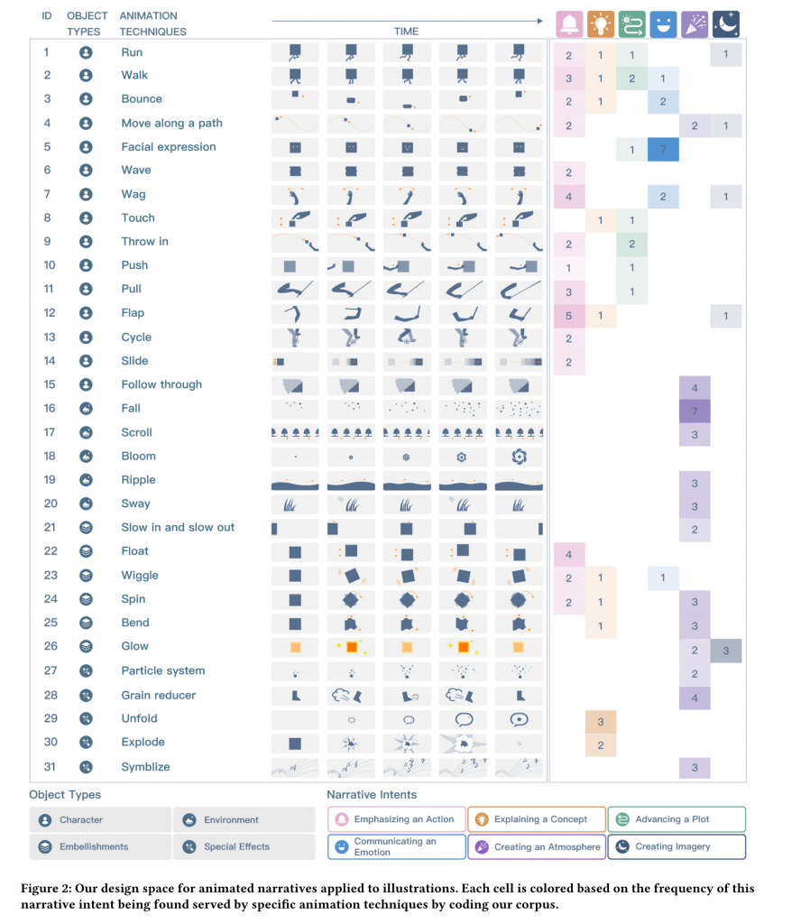 Figure 2 6 narrative intents, 4 object types, and 31 animation techniques for animated illustrations
Object is the most basic unit of animation illustration, including Character, Environment, Embellishments and Special Effects.
The design of animated illustrations often depends on Narrative Intents. The author analyzes 31 animation techniques through the sub-lens of animation illustrations, and determines 6 kinds of narrative intentions. As shown in Figure 2, most animation techniques can realize multiple narrative intentions at one time.
Emphasis is one of the most popular narrative intents in animated illustration, which adds dynamics to a narrative by simulating a specific action, movement, or gesture. For example, animation techniques such as Slide and Wiggle can be used to present exaggerated and fictional movements without strictly following the rules of physics.
Explanation refers to explaining a concept, often used to introduce abstract concepts or complex processes. For example, in order to explain the concept that 2016 is a “leap year”, the designer used animation techniques such as Bounce and Push to make the character of the rabbit jump between February 28 and March 1. to explain the concept of an added day.
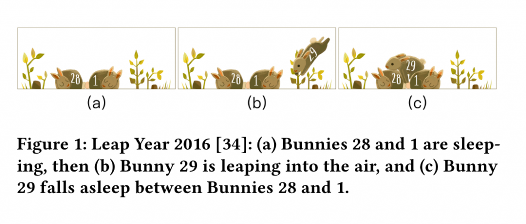 Figure 3 The designer uses the rabbit’s bounce (Bounce) to explain the concept of “leap year”
Advancing a Plot triggers anticipation of events by describing ongoing events. It does this by manipulating the relationships between different elements of a narrative, such as Google Doodle using features such as Run, facial expressions, Wag, Wiggle, and particle motion ( Particle System) to describe how the protagonist (a sheep) celebrates New Year’s Eve.
Communicating an Emotion is another common narrative intent, often through facial expressions, to enable the audience to develop empathy for the plot of the story.
Creating an Atmosphere refers to creating a narrative mood (such as relaxation, memory, horror), which is usually established through the environment and often evokes an emotional response from the audience.
Creating Imagery. These images often use metaphors and symbolic language to form perceptions or change the audience’s attention.
It is worth mentioning that in the user experiment part of the two studies, the authors recruited participants through workshops and developed mature tool cards to help participants become familiar with these design spaces.
references:
[1] Y. Shi, X. Lan, J. Li, Z. Li, and N. Cao, ‘Communicating with Motion: A Design Space for Animated Visual Narratives in Data Videos’, in Proceedings of the 2021 CHI Conference on Human Factors in Computing Systems , Yokohama Japan, May 2021, pp. 1–13. doi: 10.1145/3411764.3445337.
[2] Y. Shi, Z. Li, L. Xu, and N. Cao, ‘Understanding the Design Space for Animated Narratives Applied to Illustrations’, in Extended Abstracts of the 2021 CHI Conference on Human Factors in Computing Systems , Yokohama Japan , May 2021, pp. 1–6. doi: 10.1145/3411763.3451840.
This article is reproduced from: http://vis.pku.edu.cn/blog/%E6%95%B0%E6%8D%AE%E8%A7%86%E9%A2%91%E4%B8%8E%E5% 8A%A8%E7%94%BB%E6%8F%92%E5%9B%BE%E7%9A%84%E8%AE%BE%E8%AE%A1%E7%A9%BA%E9%97% B4%EF%BC%88design-space-for-data-videos-and-animated-illustrations%EF%BC%89/
This site is for inclusion only, and the copyright belongs to the original author.