Original link: https://innei.ren/posts/design/talk-about-kami-ui-design-and-ux-with-animation
The rendering is generated by marked, and there may be some incomprehensible sentences or typographical problems. For the best experience, please go to: https://innei.ren/posts/design/talk-about-kami-ui-design-and-ux-with-animation
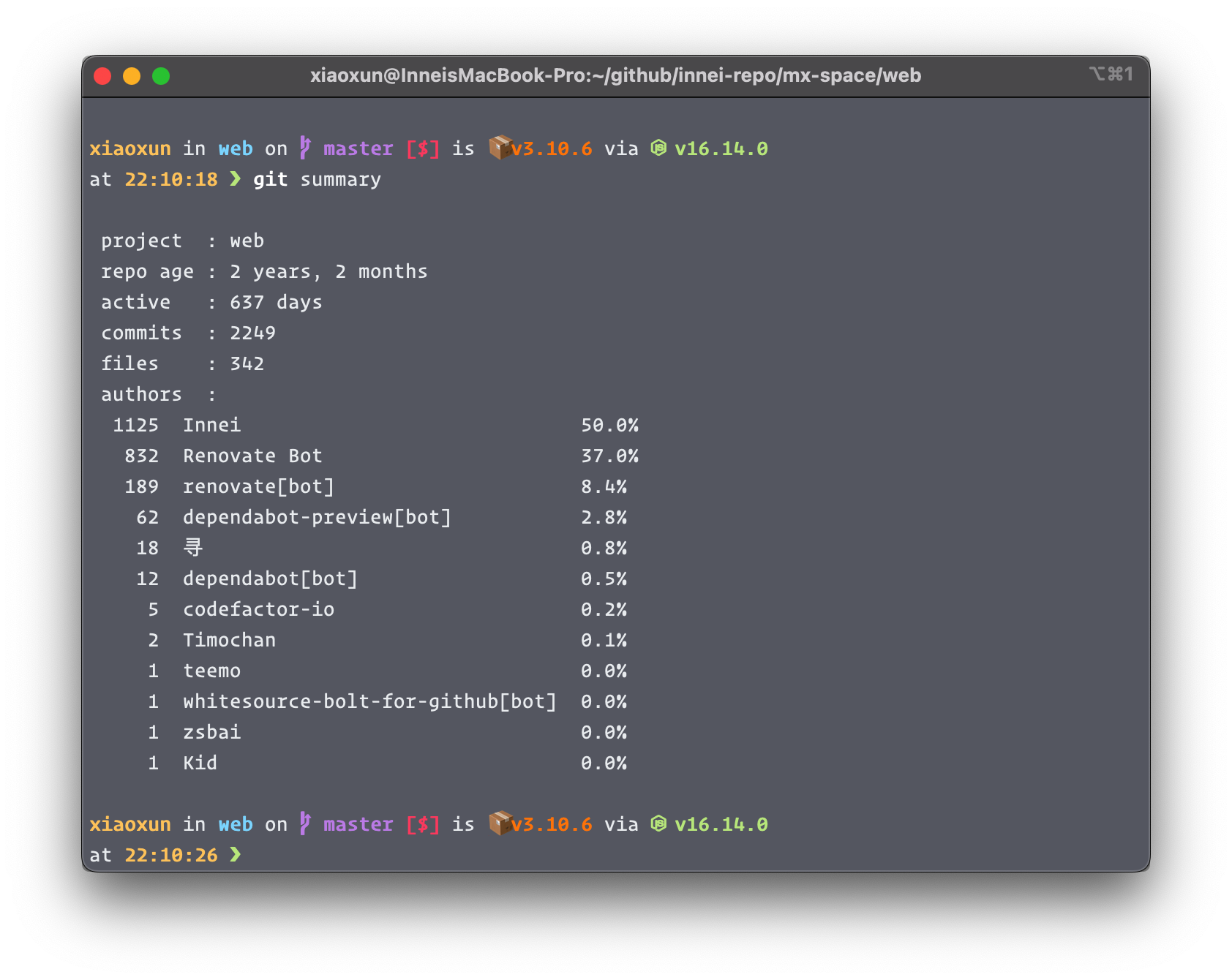
Before you know it, Kami has been iteratively developed for more than two years, undergoing many refactorings and UI modifications. The amount of code has also increased to 15K+, and it has experienced 1K+ submissions. Some people may ask, why a personal site has such a huge Codebase, isn’t it just a blog site, at most a few thousand lines. I want to talk about what’s inside of Kami, starting with the details of the motion.

number of submissions
Looking back at the earliest version, it was a ported style that directly copied Paul’s CSS styles. In order to quickly prototype the whole look, the Antd UI library is used, but the UI is not very suitable. After that, Antd was removed for a more unified style, and the components were completely rewritten. Today (v3.10.6), there are 36 common components (not coupled with business). C-side components, mainly taking into account visual and interactive. The B-side components focus on functionality.
A few days ago, I updated the definition of Kami, which is a focus on Colorful (colorful), Flat (flat), Cute (cute), Comfortable (comfortable).
Next, around the top, talk about some design details and interactive experience.
animation
From start to finish, I found iOS to be the most comfortable with motion. There are always people who use non-linear animation to talk about things, especially the wrong indoctrination again and again in various domestic conferences. In fact, it is only because the animation curve of iOS conforms to the natural laws of physics. In nature, any collision will trigger elastic deformation, the elastic curve is very comfortable, and a lot of elastic animation (Spring) is applied in iOS. Of course, elastic animation is also a kind of nonlinearity.

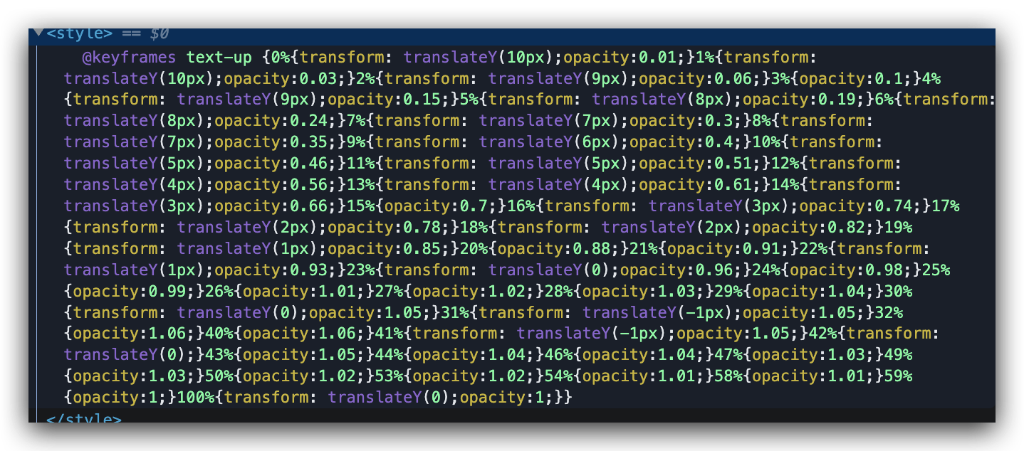
In the React ecosystem, the famous open source animation library React Spring has applied this, and it can be used to make an interactive experience comparable to iOS. The fly in the ointment is that this library is too heavy, and the build product is too large to be criticized on the C side. Since the big guys of React ecology + MobX + Socket.IO have been used, it is not considered to introduce the behemoth. Finally found a css-spring library to create elastic animations by dynamically generating CSS3 Keyframes. Why dynamic generation, because using CSS3 animation to simulate elasticity requires too many animation frames, refer to the following.

CSS3 elastic frame
Through encapsulation, a flexible over-layout is achieved. Found everywhere throughout the site. Even, the scrolling of the anchor points (BackToTop & Toc) is elastic. I really like elastic animation because it looks so comfortable. For specific experience, please pay more attention to the dynamic effects that can be seen everywhere.
Okay, I’ve finished talking about the animation today, see you next time.
finish watching? say something
This article is reprinted from: https://innei.ren/posts/design/talk-about-kami-ui-design-and-ux-with-animation
This site is for inclusion only, and the copyright belongs to the original author.