Can you imagine that one of the strongest automotive design teams in the world can produce products like this in the new energy era:
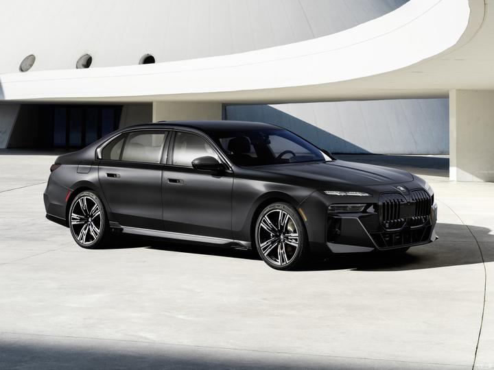
Like a big box.
The biggest focus of the new G70 7 Series is that the front face adopts the design of split lights, and abandons the angel eyes that BMW has insisted on for 20 years.
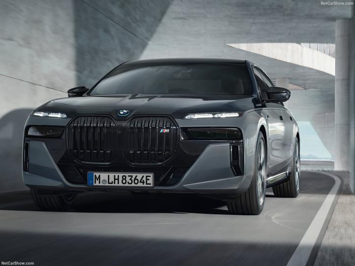
I saw an interview with a designer who said that the size of the single headlight is too large, which limits the design of the design, so I chose a design that separates the DRL and the far and near beam units (which is the layout used by new energy manufacturers)… So this is what BMW’s designers wanted?
The split light is not very free, because the low beam has a legal requirement that the distance from the ground is greater than 500mm, that is to say, the high and low beam module cannot be inserted into the original position of the fog lamp as we imagined, it must be There is considerable height.
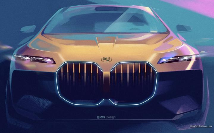
Judging from the results, isn’t such a headlight combination a bigger restriction or even a bigger pit?

Comparison of old and new. The new two lights add up to more than the old one, right? ? ?
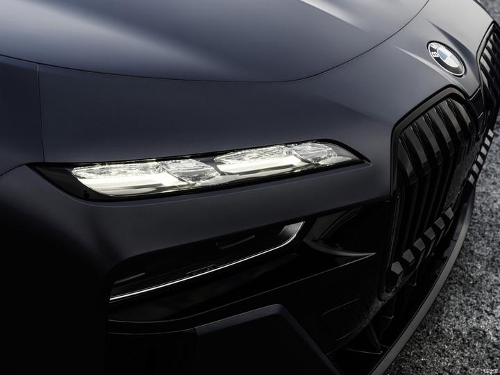
The DRL above is advertised as a collaboration with Swarovski. But for a million-dollar BMW 7 Series, you might as well guess what its customers think of the Swarovski brand?
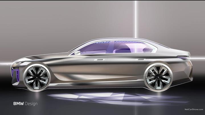
Even from the official sketch, the new 7 series is not good-looking, because the parts are too small and trivial, and the front and rear are too thick to describe… In fact, it is like the same face, with too many eyes. Smaller will make the face look bigger.
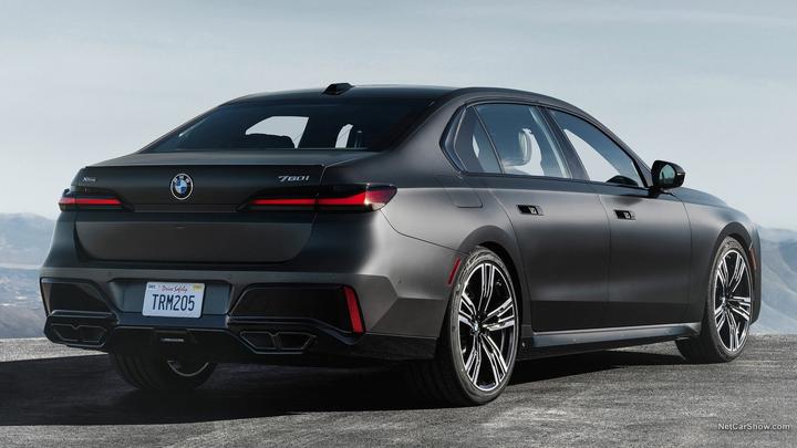
The very successful penetrating taillights of the previous generation 7 Series are also thrown away, leaving a red bar for the so-called “new” taillights… All the design energy seems to be concentrated on the lower bumper and exhaust, exaggerated for exaggeration.
This exterior is really powerless to complain, it is new for the sake of new, and broken for the sake of breaking.
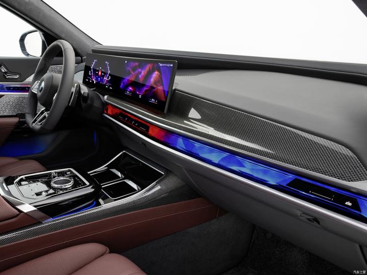
The interior uses a lot of black technology, the most conspicuous, a whole interior trim panel that can change color, man-machine, interaction, these words anyway.
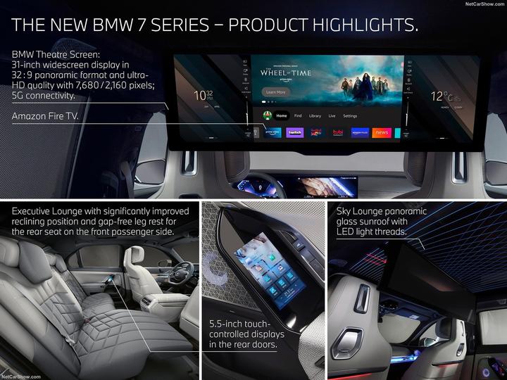
A TV is arranged in the back row, and the Chinese boss can watch Aurora TV in the back seat… The multimedia screen on the driver’s side is an exploration of human-computer interaction in the new era. Audi has a similar interactive design on the side of the main driver’s door on its concept cars throughout the year.
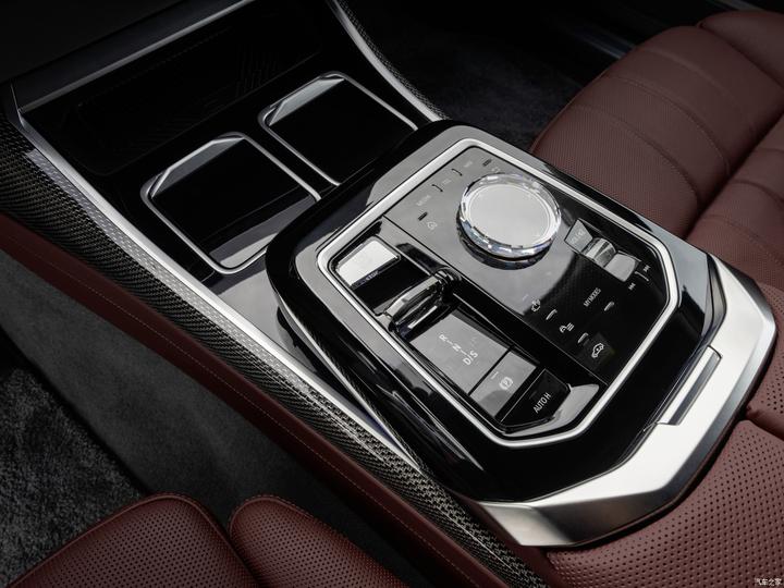
iDrive Action Combo Panel updated. The shape is more concise, and it is fully tactile except for the knobs – better than the Audi that ditched the big MMI knobs.
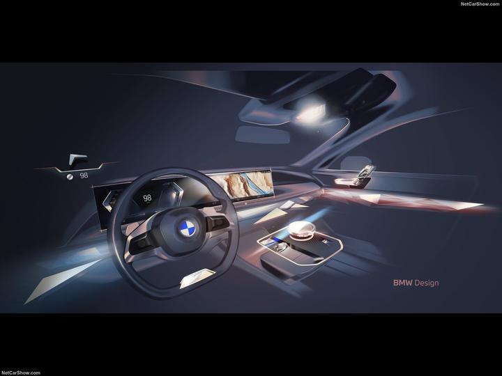
Of course, BMW’s graphics have always been great. You can always trust the pictures drawn by BMW designers.
The new 7 series and the similarly recent A8 facelift really blew my mind. Is there something wrong with my aesthetics?
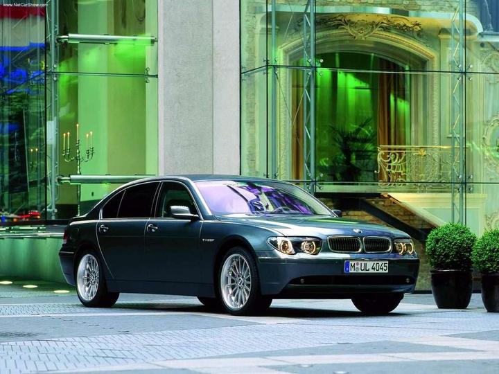
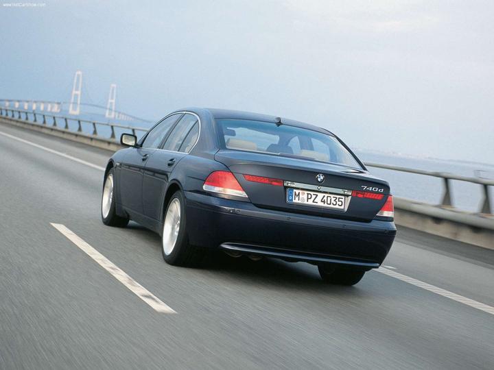
Finally, let’s take a look back at the 2001 Bangor-era E65 7-Series. Not so exaggerated but not arrogant 7 series.
above
Source: Zhihu www.zhihu.com
Author: Zhao Yingnan
[Zhihu Daily] The choice of tens of millions of users, to be a big cow of new things in the circle of friends.
click to download
There are 159 more answers to this question, see all.
Further reading:
Jaguar XJ2.0 and BMW’s new 5 Series 530, and Mercedes-Benz e300l?
This article is reproduced from: http://www.zhihu.com/question/529064619/answer/2451038369?utm_campaign=rss&utm_medium=rss&utm_source=rss&utm_content=title
This site is for inclusion only, and the copyright belongs to the original author.