Original link: https://www.skyue.com/22073020.html
I recently got a new toy, the ARC browser, which is not yet open for download. You can submit an application on the official website . There’s a promotional video on Twitter, and it’s pretty cool.
Try it out this week and talk about the experience.
one,
My Internet age is about 14 years, and the browser I have experienced is the most subversive Chrome. From the perspective of market development, it also proves its forward-looking.
When I first came into contact with Chrome, the most intuitive subversion was interaction, which was much simpler than IE; the second was plug-ins. It turns out that the browser can extend so many functions, and there are indeed many useful plug-ins, such as Gmail unread mail prompts; again, performance , mainly because the network speed was still a bigger bottleneck at that time, and most of the web pages could not be opened, and the network speed was also miserable, and the browser rendering speed would not be blamed.
Back to ARC, from the current usage, its core is Chromium, and the plug-in market directly calls the Chrome Web Store. The performance and plug-in ecology are of the same origin, and there is no difference with Chrome.
ARC mainly works on UI and interaction . There are two core features:
- Use the sidebar to organize and interact with tabs
- Built-in material collection and management capabilities, including Notes, Easel, and Capture
two,
First look at the tab organization, which is the biggest difference from Chrome. The following screenshot fully reflects its characteristics.
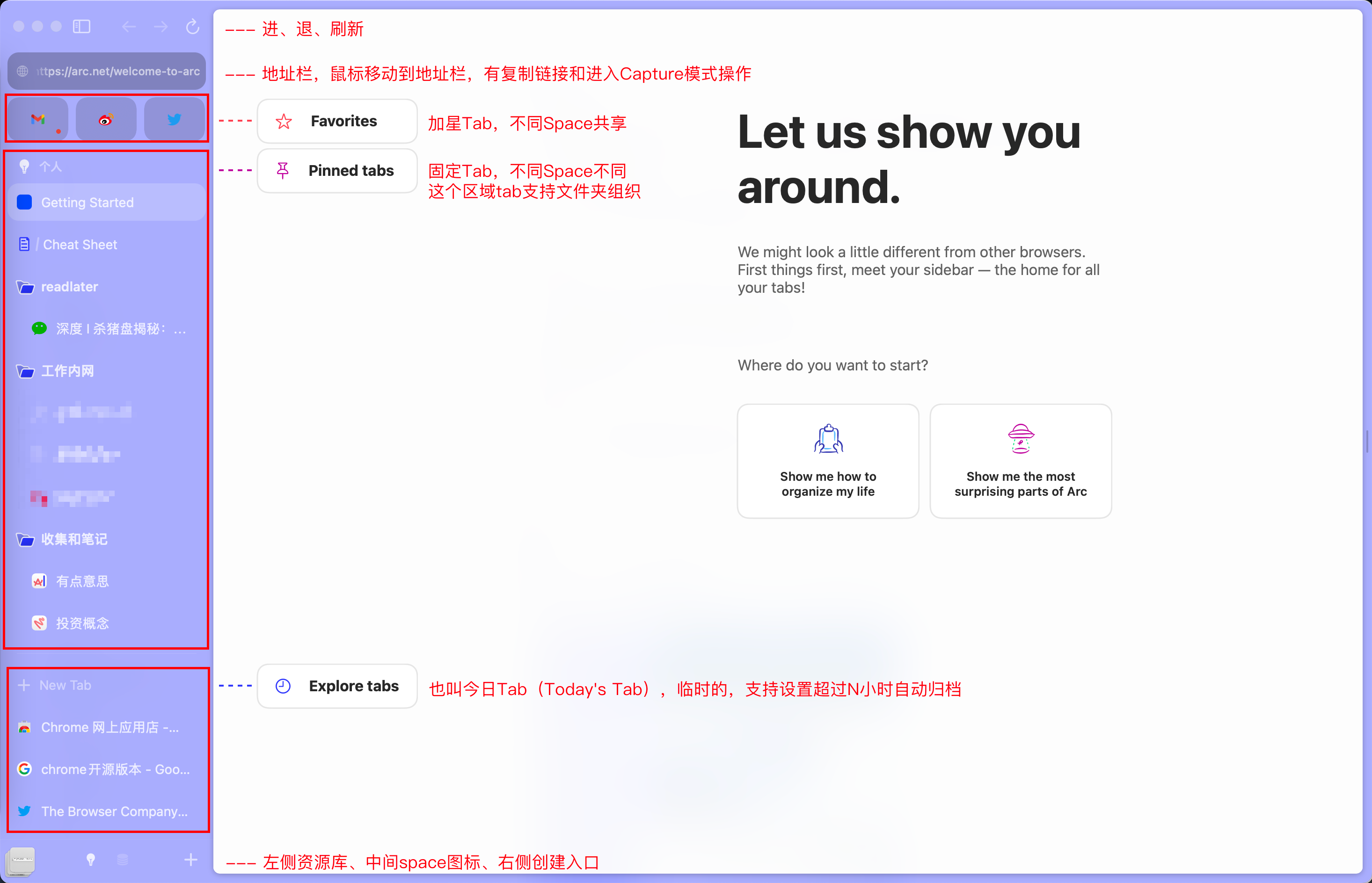
Has the following characteristics:
- Use the sidebar to organize web page tabs, there is no distinction between open tabs and favorites in form, they are all placed in the left column, and to some extent, they are all open tabs.
- The tab is divided into three areas: Favorities (starred), Pinned tabs (fixed) and Explore tabs (temporary tab)
- The concept of space is introduced. For example, you can set up two spaces for work and personal. Different spaces have their own Pinned tabs and Explore tabs, but Favorities are shared between different spaces. The difference between adding a star and being fixed in different spaces is quite intimate.
- Pinned tabs area support folders
- The tabs in Explore Tabs support archiving, which can be manually or automatically archived over 12 hours (changeable time). Similar to Gmail’s Inbox concept.
- Support split window, view and process multiple web pages at the same time
- Command+T does not directly create a new tab, but opens a command window, which is very distinctive. This window is essentially similar to Chrome Omnibox, but stronger than Omnibox. In addition to supporting search history and URLs, it also supports searching various browsers. Order.
Here are some screenshots to get a feel for it.
Split two windows  split two windows
Command + T command 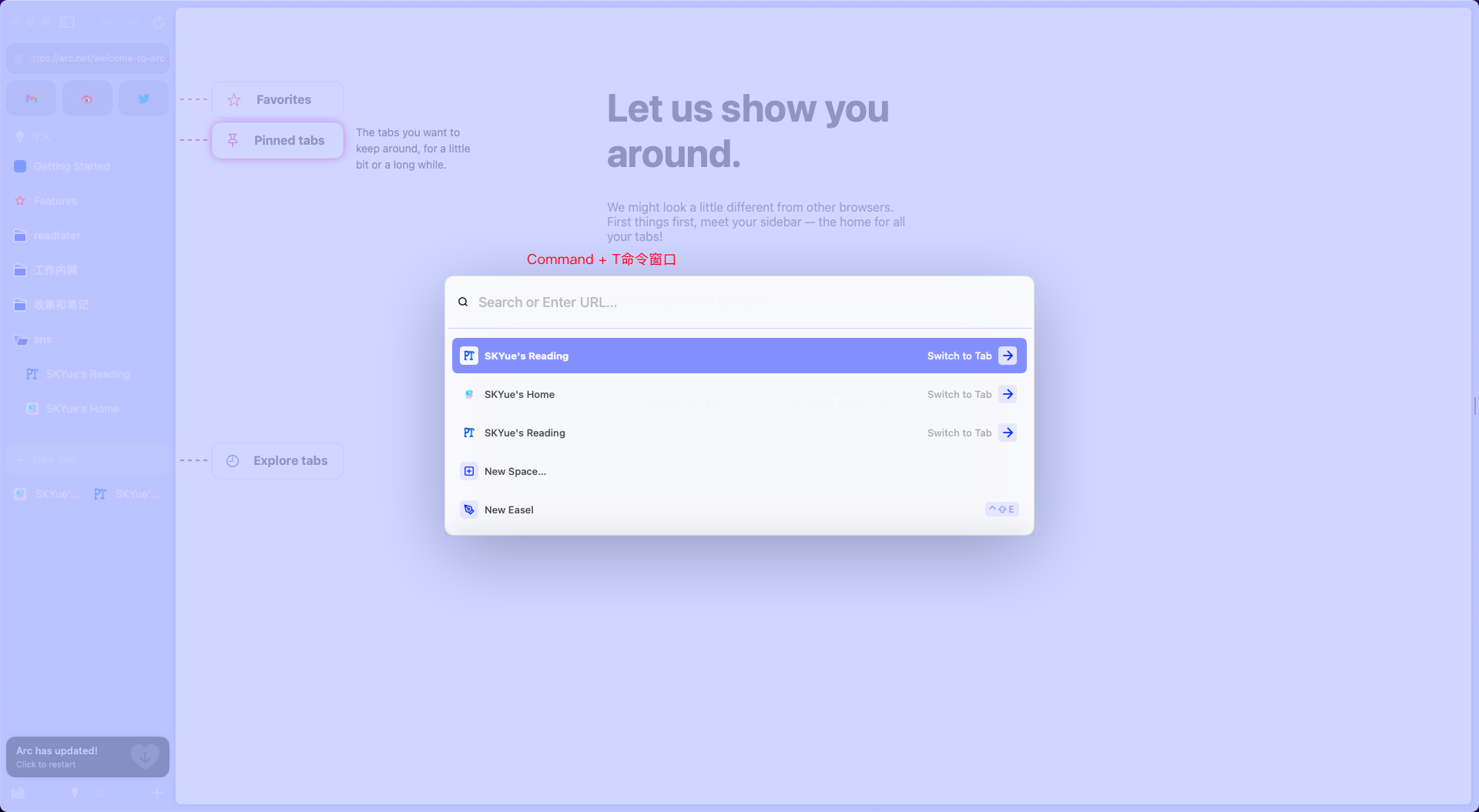 Command + T Command window
three,
In addition to organization, another feature is the built-in three functions of Note (notes), Easel (artboard) and Capture (editing), which are commonly used functions in web browsing scenarios. All created Notes and Easels will also be in the border tab.
In the picture below, Note is on the left and Easel is on the right.
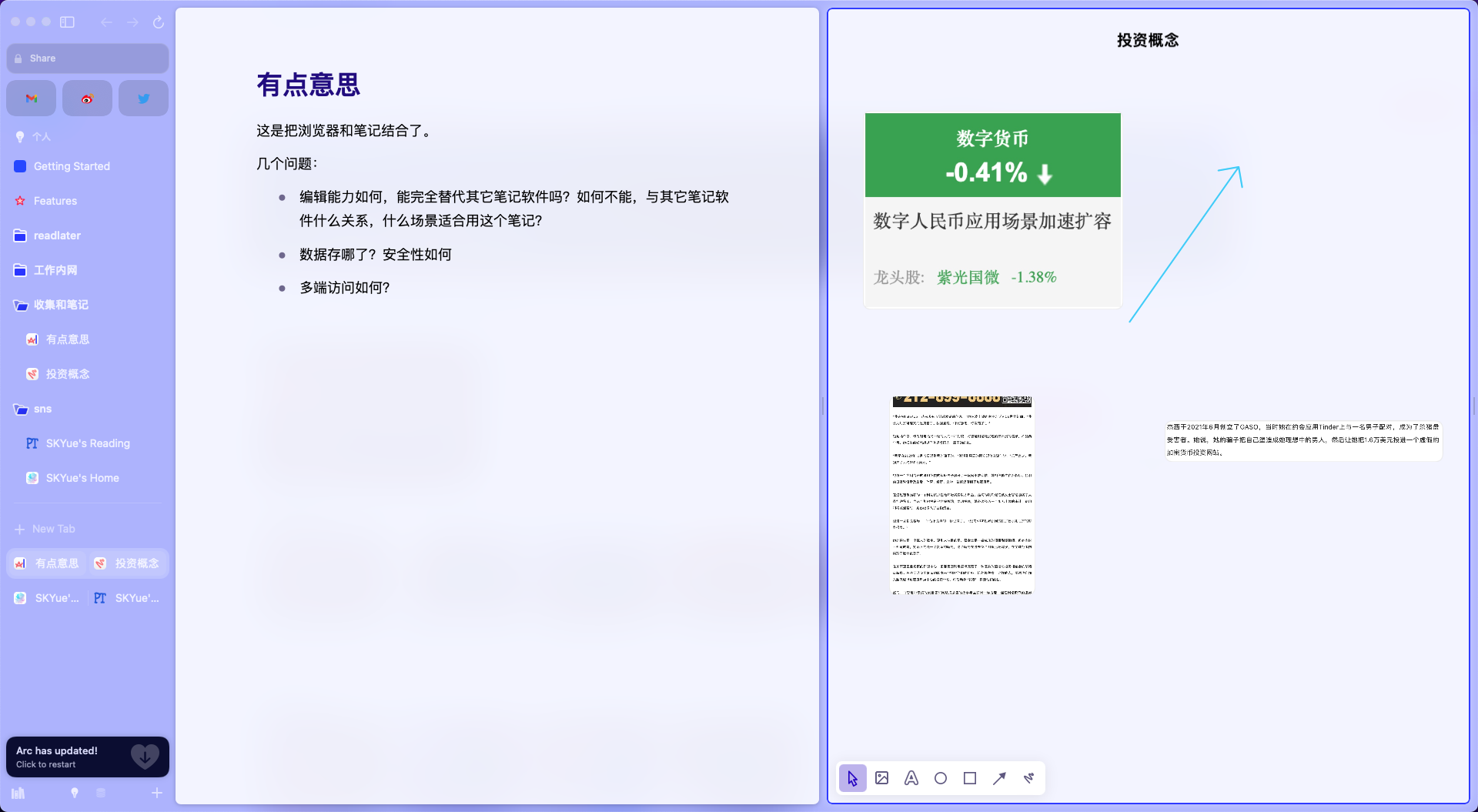
Capture is mainly used in conjunction with Easel. After opening the web page and entering the Capture mode, you can use the mouse to click on the module and save it to the specified Easel. There is a small video below.

Note and Easel are two independent functions that cannot be referenced from each other. And now Note does not support inserting pictures. Including data storage, there is currently no relevant solution for data exchange with other main note-taking software.
Four,
From the experience process, I think the overall degree of completion of the software is very high, some details are well thought out and polished, and some gesture operations and shortcut keys are also very intimate, such as:
- Swipe left and right on the left column to quickly switch Spaces
- Command + T, reuse the shortcut keys of traditional browsers to create tabs. Although it is to open the command window, it can also directly enter URLs and search, which is very smooth.
But I think the sidebar has a more serious problem: it affects the view of web browsing .
Browsers are used to view web pages, and many web pages also have complex interactive elements. Browsers should try to be as concise as possible to reduce their sense of presence and allow users to focus on the web pages themselves . From IE to Chrome, this is the most obvious feeling. Chrome gives as much window space as possible to the web page.
Open Notion with Arc and Chrome to feel it, the two sidebars of Arc will have an illusion.
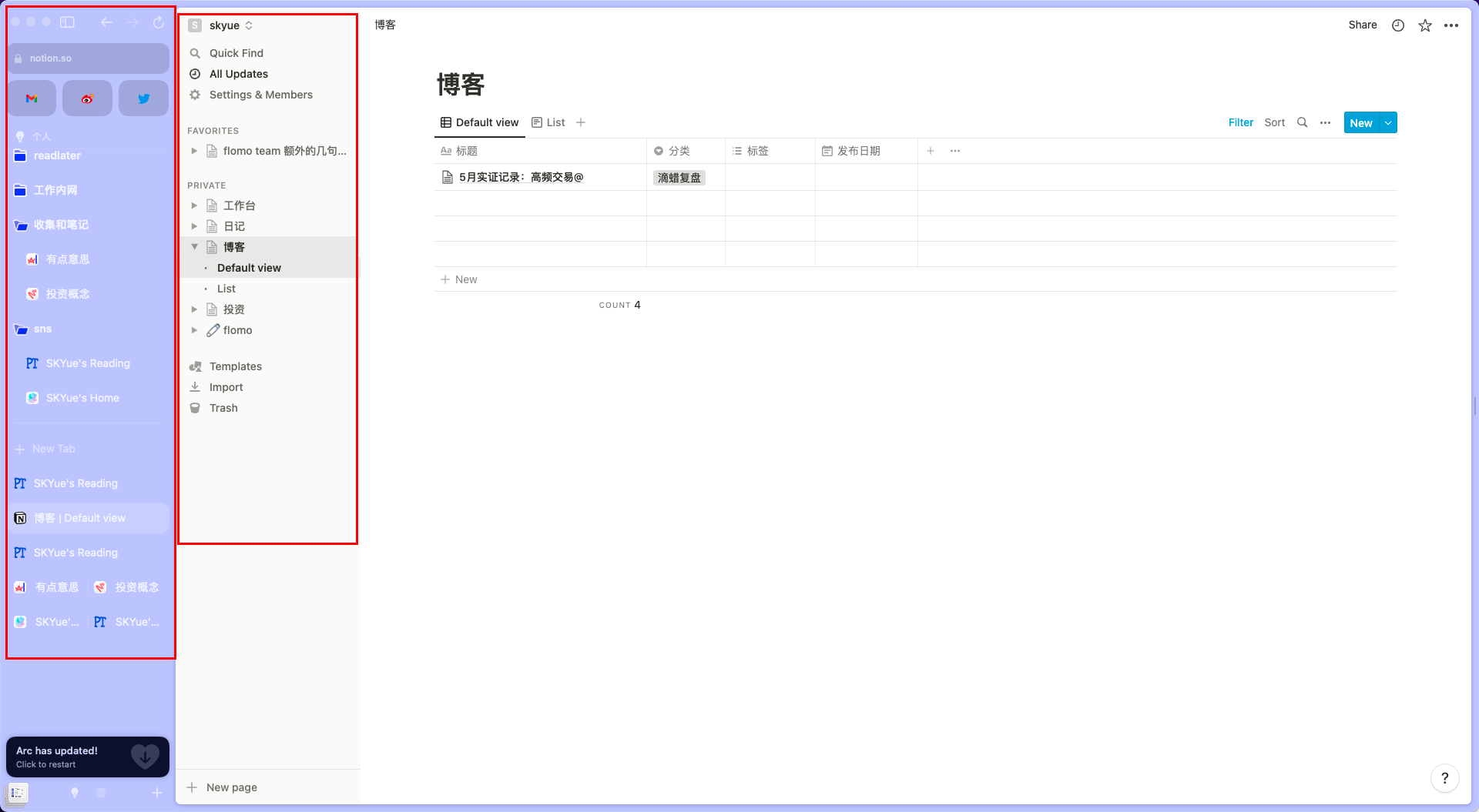
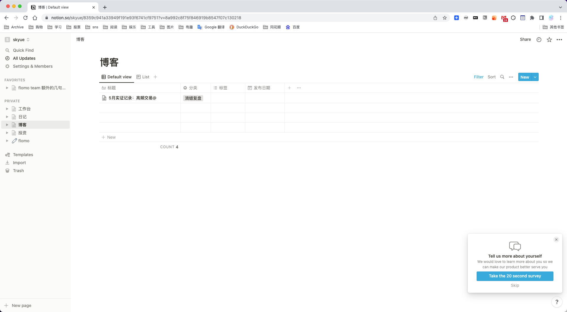
Of course, Arc’s sidebar can be hidden, but switching tabs is a high-frequency operation and is not suitable for hiding. Equivalent to, I want to expose the tab to facilitate quick switching, but also require the tab to be as concise as possible without affecting web browsing. The top tab seems to make the most sense.
I’m probably not a user of it.
This article is reprinted from: https://www.skyue.com/22073020.html
This site is for inclusion only, and the copyright belongs to the original author.