Original link: https://www.zhangxinxu.com/wordpress/2022/09/css-container-rule/
by zhangxinxu from https://www.zhangxinxu.com/wordpress/?p=10554 Xin Space-Xin Life
This article welcomes sharing and aggregation. It is not necessary to reprint the full text. The copyright is respected. The circle is so big. If you need it urgently, you can contact for authorization.

1. The browser officially supports
Chrome 105 and Safari 16 have officially supported @container rules, as shown below.
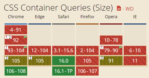
Chrome 105 I upgraded a few weeks ago (released last month), Safari 16 was upgraded last week (released two weeks ago), and the timings are close.
Now to experience @container rules, there is no need to turn on the “support experimental CSS” option. When writing articles at this time, readers can intuitively see the effect when they experience the demo. It is time to introduce @container rules.
//zxx: If you see this text, it means that you are visiting the original site. A better reading experience is here: https://ift.tt/nqy6ueQ (by Zhang Xinxu)
2. What is the @container rule used for?
The @container rule, also known as the @container query, can match the size specified as a container element in real time. Developers can perform specific style settings and layout implementations for internal elements based on different size ranges.
Everyone should know that there is a size match in @media media queries, for example:
@media (max-width:1024px) {}
Then the CSS declarations in this rule will be executed when the screen width is less than 1024px.
The @container rules are somewhat similar, but the matching size objects are different.
@media matches browser forms, while @container matches an element.
Therefore, there is a saying in the industry that @media queries are suitable for macro layouts, and @container queries are suitable for micro layouts.
Demonstration example
There are many examples of needing to know the support, and then changing the layout and layout. I think about it, find a suitable one, and recently encountered an example of button group wrapping, which can be solved by using the @container rule, but this case is not typical and relatively small .
Hmm… ah, after watching the fishing video for a while, I suddenly thought of a technical problem that has been bothering me for a long time, that is, the font-size of the text inside a div element decreases as the width decreases.
Hurry up and make a demo, but…
…people are not as good as gods…
I found that this requirement does not need to use the @container rule, it can be achieved directly by using the container query unit… 
3. Container size units such as cqw and dynamic font size
Along with CSS container queries are CSS container query units, including: cqw , cqh , cqb cqi cqmin and cqmax .
in:
| company name | Paraphrase |
|---|---|
| cqw | Indicates the proportion of Container Query Width. 1cqw is equal to 1% of the container width. Assuming that the container width is 1000px, then the calculated value corresponding to 1cqw is 10px. |
| cqh | Indicates the proportion of Container Query Height. 1cqw is equal to 1% of the container height. |
| cqi | Indicates the proportion of Container Query Inline-Size. By default, Inline-Size refers to the horizontal direction, which corresponds to the width. Therefore, 1cqi can usually be regarded as 1% of the container width. |
| cqb | Indicates the proportion of Container Query Block-Size. By default, Block-Size refers to the vertical direction, which corresponds to the height. Therefore, 1cqb can usually be regarded as 1% of the height of the container. |
| cqmin | Indicates the proportion of the smaller size of the container query (Container Query Min). For example, if the container size is 300px*400px, then 100cqmin corresponds to the smaller width of 300px, not the height. |
| cqmax | Indicates the proportion of the larger size of the container query (Container Query Min). |
To a certain extent, cqw , cqh , cqmin , cqmax units and vw , vh , vmin , vmax units have the same syntax and meaning, but one is relative to the container size, and the other is relative to the viewport (ViewPort) size .
True Demonstration Example
Going back to the demo requirements above, it is actually very simple to realize the requirement of changing the font size based on the width of the browser. Two lines of CSS code are enough. Suppose the HTML is as follows:
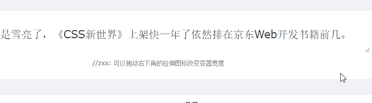
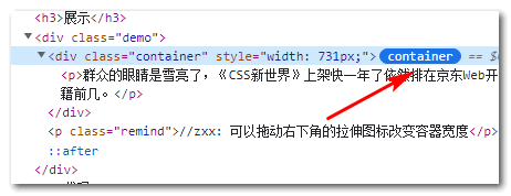
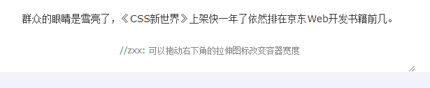
<div class="container"> <p>The eyes of the masses are sharp, and "CSS New World" has been on the shelves for almost a year and is still ranked in the top few web development books on JD.com. </p> </div>
CSS does this:
.container { container-type: inline-size; } .container p { font-size: clamp(.75rem, calc(100cqw / 40), 2rem); }
Indicates that the font size of the text varies between 0.75rem and 2rem, and the font size is 2.5% of the container width. After calculation, 40 Chinese characters can be placed in one line.
The effect achieved is shown in the following GIF:
Seeing is believing, you can hit hard here: CSS @container query to make font size change with width demo
OK, in this example, the container-type CSS property appears, which many people have never seen before.
This CSS property can turn a normal element into a container element (the corresponding logo can be seen in the console elements panel):
At this point the cqw unit is calculated relative to this element, and the @container rule also has a match object.
3. It’s finally the @container rule
If you want the element to have obvious layout or style changes within a certain size range, then you need to use the @container rule.
For example, or the example of the font size change above, if you want the container width to be less than 480px left-aligned and the text to be bold, you can use the following CSS to achieve it:
.container { container-type: inline-size; } .container p { font-size: clamp(.75rem, calc(100cqw / 40), 2rem); text-align: center; } @container (max-width: 480px) { .container p { text-align: left; font-weight: bold; } }
At this point, when the width of the container is small enough, the text will be bolded, as shown in the following GIF:
Seeing is believing, you can hit hard here: CSS @container query to make text style change demo
How it works
Any CSS statement written in the @container rule will look for the nearest container element and match it.
For example, in the above example, the closest container element to the element matched by .container p is the .container element, so the CSS statement in the @container rule will be rendered when the size of the .container element is less than 480px.
If there is no element in the page that is a container element (that is, there is no element with the container attribute set), @container will not be executed, and the cqw unit will be calculated according to the size of the browser form (equivalent to vw).
Therefore, the prerequisite for the @container rule to take effect is that the container element needs to be declared first, using the CSS container property.
Fourth, talk about the container attribute
The container attribute is an abbreviation for the two attributes container-type and container-name .
container-type has been demonstrated above, indicating the type of container, whether it is horizontal (corresponding to width) or vertical (corresponding to width and height).
The syntax is as follows:
container-type: normal; container-type: size; container-type: inline-size;
Among them, normal is the default value, which means that no container element is created, size means that both the horizontal and vertical directions are created, and inline-size is only created in the horizontal direction, and the layout, style and inline-size container states are applied to the element at the same time (for this, you can For details, see the introduction to the contain property in CSS New World, on page 535).
The role of container-name
The role of container-name is to name the container element. This attribute is useful when there are multiple container elements in the page.
Suppose the following CSS code:
@container (max-width: 480px) { p { font-weight: bold; } }
If there are multiple container elements on the page, font-weight:bold will be applied to the <p> elements in these elements, but our original intention may be that only a certain container element applies the relevant styles. At this time, container-name is very useful. worked.
E.g:
.container-a { container: inline-size aside; } .container-b { container: inline-size banner; } @container banner (max-width: 480px) { p { font-weight: bold; } }
At this point, only the <p> element inside the banner container element will be bolded.
Fifth, say something else
There are a lot of articles about @contianer (probably because the article was written early, when browsers didn’t officially support it), the container element was created using the following CSS code:
contain: layout inline-size;
While the above code also creates container elements, according to my tests, it fails to respond to the @container rule.
Please use the new specially designed contianer attribute to define.
And container query units such as cqw were not called this at first, but “qw”, without the preceding “c”, I tested it with the Chrome browser, and the so-called qw unit is not supported.
OK, that’s all.
Finally, I would like to say that the container size query is very strong. Many effects that used to be achieved with the help of JavaScript can now be easily controlled by pure CSS.
In the future, I will add some classic cases after I practice.
Thanks for reading, welcome to forward!
This article is an original article, welcome to share, do not reprint in full text, if you really like it, you can collect it, it will never expire, and will update knowledge points and correct errors in time, and the reading experience will be better.
Address of this article: https://www.zhangxinxu.com/wordpress/?p=10554
(End of this article)
This article is reprinted from: https://www.zhangxinxu.com/wordpress/2022/09/css-container-rule/
This site is for inclusion only, and the copyright belongs to the original author.