Original link: https://www.zhangxinxu.com/wordpress/2023/06/css-sin-cos-tan-function/
by zhangxinxu from https://www.zhangxinxu.com/wordpress/?p=10901 Xin Space – Xin Life
This article is welcome to share and aggregate, there is no need to reprint the full text, respect copyright, the circle is so big, if you need it urgently, you can contact for authorization.

I. Introduction
As of late, all modern browsers support trigonometric functions in CSS math functions, including the following:
- sin()
- cos()
- tan()
- asin()
- acos()
- atan()
- atan2()
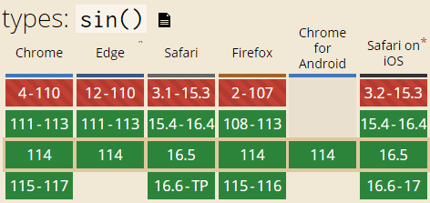
See the figure below for compatibility, taking the sin() function as an example.

Among the 7 trigonometric functions, some functions return the corresponding radian value according to the angle, and some return the corresponding angle value according to the radian value (those functions starting with the letter a).
hint:
 /* sine function */

width: calc(100px * sin(45deg));

/* arc sine */

transform: rotate(asin(-0.2));
First, through a simple case, look at the rendering performance of trigonometric functions.
Before this case, a special article was written to introduce how to realize the line chart , but it was realized by using JS at that time. Here I will demonstrate how to use CSS mathematical functions to realize it. The code must be much simpler than before.
2. Position and fold line
The requirements are as follows. The coordinates of two points are known, and the two points are drawn, as well as the connecting line between the points.
effect first
You can click here hard: CSS driven polyline effect demo
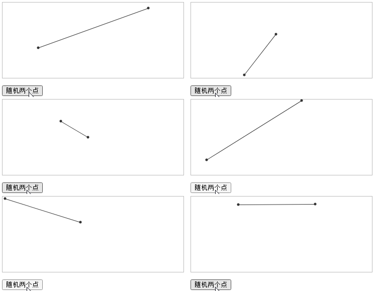
The effect is as shown in the GIF screen recording. Click the button to generate two points randomly, and you can see that the broken line automatically follows.

Among them, trigonometric functions are used.
Implementation
The specific implementation is as follows, the first is the HTML code:
 <div id="box" class="box">

    <i class="dot1"></i>

    <span class="line"></span>

    <i class="dot2"></i>

</div>
The outside is a box element, and there are two dots and a line inside.
In order to facilitate drawing, we can set the coordinate position value on the external container element in the form of CSS variables (CSS variables are naturally inherited).
The function of JS is very simple. Create random point coordinates to show the effect, as follows:
 box.style.setProperty('--x1', Math.round(150 * Math.random()));

box.style.setProperty('--y1', Math.round(150 * Math.random()));

box.style.setProperty('--x2', 150 + Math.round(150 * Math.random()));

box.style.setProperty('--y2', Math.round(150 * Math.random()));
The focus is on the CSS part. First, we can use the CSS math function hypot() to realize the length of the polyline, and we can use the arctangent trigonometric function atan() to calculate the angle of polyline rotation, so the code is as follows:
 .box {

    border: 1px solid #bbb;

    position: relative;

    /* Coordinate plus px unit*/

    --p1x: calc(var(--x1) * 1px);

    --p1y: calc(var(--y1) * 1px);

    --p2x: calc(var(--x2) * 1px);

    --p2y: calc(var(--y2) * 1px);

}

.box > i {

    position: absolute;

    width: 5px; height: 5px;

    border-radius: 100%;

    background-color: currentColor;

}

.dot1,

.line {

    left: var(--p1x);

    top: var(--p1y);

}

.dot2 {

    left: var(--p2x);

    top: var(--p2y);

}

.line {

    position: absolute;

    border-top: 1px solid;

    /* width */

    width: hypot(var(--p2y) - var(--p1y), var(--p2x) - var(--p1x));

    transform-origin: left bottom;

    /* Rotation angle*/

    transform: rotate(atan((var(--y2) - var(--y1)) / (var(--x2) - var(--x1))));

}
other
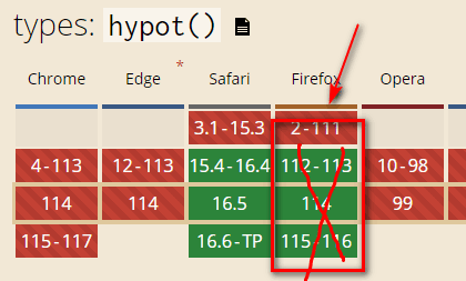
The hypot() mathematical function is currently only supported by the Safari browser. The current compatibility indication on caniuse is wrong (see the diagram below). According to my test, Firefox does not support it (or not this syntax), and the demo page is correct. This has been done for compatibility.

3. Ring layout
Another common application of trigonometric functions must be a circular layout.
Similar to clock numbers, 3D carousel animation.
In the past, the positioning of these elements could only be calculated by JS (or the <textPath> element of SVG to achieve text wrapping ), but now it can be handed over to CSS.
1. 3D carousel
This effect is shown in the introduction of the CSS3 3D transform article .
Among them, the distribution and positioning of each picture is calculated by using JS enumeration, now, there is no need to be so troublesome.
As long as the corresponding trigonometric function is set according to the known angle, the offset size will be obtained automatically.
Relevant HTML code and CSS code (only the core part is shown):
 <div id="container" class="container">

    <img src="1.jpg" class="piece" />

    <img src="2.jpg" class="piece" />

    <img src="3.jpg" class="piece" />

    <img src="4.jpg" class="piece" />

    <img src="5.jpg" class="piece" />

    <img src="6.jpg" class="piece" />

    <img src="7.jpg" class="piece" />

    <img src="8.jpg" class="piece" />

    <img src="9.jpg" class="piece" />

</div>
 .container {

    --size: 128px;

    width: var(--size);

    height: 100px;

    transition: transform 1s;

    transform-style: preserve-3d;

}


.piece {

    width: var(--size);

    position: absolute;

    // 40 is the rotation angle, remember the tan() function to calculate the offset value --z: calc(40px + var(--size) / tan((40 / 180) * 3.14159));

    transform: rotateY(calc(40deg * var(--index))) translateZ(var(--z));

}

.piece:nth-child(1) { --index: 0; }

.piece:nth-child(2) { --index: 1; }

.piece:nth-child(3) { --index: 2; }

.piece:nth-child(4) { --index: 3; }

.piece:nth-child(5) { --index: 4; }

.piece:nth-child(6) { --index: 5; }

.piece:nth-child(7) { --index: 6; }

.piece:nth-child(8) { --index: 7; }

.piece:nth-child(9) { --index: 8; }
Seeing is believing, you can click here hard: CSS trigonometric function and 3D carousel effect demo
Click on the image to see the rotation effect.

2. CSS Clocks
The 12 numbers from 1 to 12 folded on the clock are arranged at equal intervals in a circle, which is also a typical application of CSS trigonometric functions.
Look directly at the effect ( original author stoumann , with deletions).

Seeing is believing, you can click here hard: Clock effect demo drawn by CSS
Other implementation details are not listed, mainly look at the layout positioning of numbers.
 .clock-face time {

  --x: calc(var(--radius) + (var(--radius) * cos(var(--index) * 30deg)));

  --y: calc(var(--radius) + (var(--radius) * sin(var(--index) * 30deg)));

  display: grid;

  place-content: center;

  height: 2em; width: 2em;

  position: absolute;

  left: var(--x);

  top: var(--y);

}


.clock-face time:nth-child(1) { --index: 9; }

.clock-face time:nth-child(2) { --index: 10; }

.clock-face time:nth-child(3) { --index: 11; }

.clock-face time:nth-child(4) { --index: 0; }

.clock-face time:nth-child(5) { --index: 1; }

.clock-face time:nth-child(6) { --index: 2; }

.clock-face time:nth-child(7) { --index: 3; }

.clock-face time:nth-child(8) { --index: 4; }

.clock-face time:nth-child(9) { --index: 5; }

.clock-face time:nth-child(10) { --index: 6; }

.clock-face time:nth-child(11) { --index: 7; }

.clock-face time:nth-child(12) { --index: 8; }
See the demo for the complete code, not detailed introduction.
4. Conclusion and nonsense
Although trigonometric functions are currently supported by the Chrome browser, other mathematical functions, such as the sqrt() function for finding the square root, the pow() function for the power exponent, and the special exponential function exp() for the mathematical constant e that returns the power of a given number, The log() function that returns the logarithm of a number, the absolute value abs() function, the rem() and mod() functions that take the remainder, the round() function that rounds up, and the sign() function that judges positive or negative zero, currently only Safari browser support, Safari 15.4+
It feels like all modern browsers support it, it will take some time.
The appearance of these CSS functions or large-scale application cannot be separated from the support of CSS variables, so the status of CSS variables will be continuously strengthened.
crap time
What are you talking about, in life, it is nothing more than fishing, fishing for three days during the Dragon Boat Festival, and everything is pretty good.
In terms of work, I changed to a new position the day before yesterday, and there is a new team building tomorrow, so there is nothing to talk about.
But in July, I plan to take a self-driving tour, all the way south, and drive to Xiamen.
This year, half of the 20-day annual leave has been used, and half a year has passed, so I need to save some money for the second half of the year.
Why so much annual leave?
Firstly, the length of service is long, secondly, the company’s welfare number, there are gifts, and thirdly, performance rewards.
Oh lah, that’s all for talking, and it depends on your mood.

This article is an original article, welcome to share, do not reprint the full text, if you really like it, you can bookmark it, it will never expire, and will update knowledge points and correct errors in time, and the reading experience will be better.
Address of this article: https://www.zhangxinxu.com/wordpress/?p=10901
(End of this article)
This article is transferred from: https://www.zhangxinxu.com/wordpress/2023/06/css-sin-cos-tan-function/
This site is only for collection, and the copyright belongs to the original author.