byzhangxinxufromhttps://www.zhangxinxu.com/wordpress/?p=11437
This article can be reproduced in its entirety, independent domain name personal website without authorization, but need to retain the original author, source and links in the text, any site can be summarized aggregation, commercial please contact authorization.

I. Some common sense knowledge of the subgrid
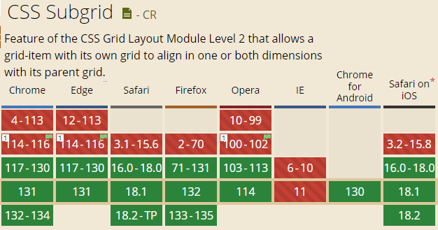
subgrid that sub-grid, this thing is not and Grid layout out together, to lag a few years (CSS Grid Level2 content), its compatibility? …… external project will have to wait a year or two, if it is the internal project of the center stage, you can taste it.

The subgrid is not a CSS property, but thegrid-template-columns和grid-template-rowsAttribute support for the keyword, its use of the scene needs to be outside already have a Grid layout, otherwise …… Well, although the syntax will not be recognized as an exception, but the rendering results are no difference.
Example:
.container {

    display: grid;

}

.item {

    display: grid;

    grid-template-columns: repeat(3, 1fr);

    grid-template-rows: subgrid;

}
Second, when to use subgrid
The Grid layout is responsible for the larger organizational structure, while the more detailed typographic alignment effects inside can use the subgrid layout.
In fact, the subgrid layout is not necessary, because the Grid layout formed by the size of the calculable size, and then the use of Flex layout can also achieve many similar effects.
This is actually a big reason why the current subgrid layout discussion is not very loud and the community demand is not urgent.
So, for subgrid, I do not intend to introduce too deep and complex case, only a list of the most suitable to use its layout of the scene, but also recently I do a project, just as a case to use.
Use Cases
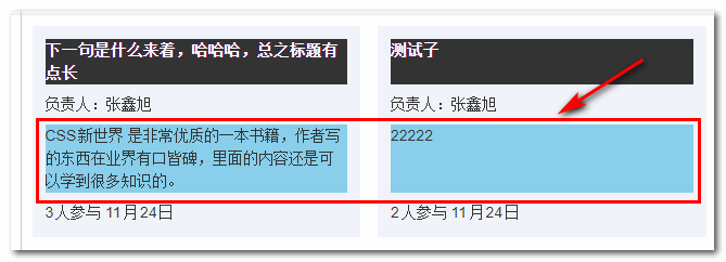
A project list page, which list which there are many items, and which describes the content of more or less, regardless of how much content, the height of each line of this block should be consistent, as shown in the following screenshot:

A list layout with rules like this one is best suited for a Grid layout, and we can set it up that way on the list container:
.container {

  display: grid;

  gap: 1rem;

  grid-template-columns: repeat(auto-fill, minmax(360px, 1fr));

}
Here.repeat(auto-fill, minmax...is a must-have implementation for all front-end developers, and the list class elastic layout best practice code about the hererepeat()function, see this article:”CSS repeat() function details”。
The above implementation is known to many front-enders, but what about the associated alignment of the content inside the list?
This scenario is a typical subgrid layout.
Assume that the HTML is as shown below:
<div class="container">

    <section class="item">

        <h4>标题</h4>

        <p>负责人:张鑫旭</p>

        <blockquote>描述...</blockquote>

        <footer>3人参与 11月24日</footer>

    </section>

    ... <!-- 重复N次 -->

</div>
Then we can handle it this way, in which the second half of the CSS to add a background color has nothing to do with the layout, mainly to facilitate the distinction between the size of the area occupied by each element.
.container {

    display: grid;

    gap: 1rem;

    grid-template-columns: repeat(auto-fill, minmax(240px, 1fr));

}

.item {

    display: grid;

    grid-template-rows: subgrid;

    grid-row: span 4;

    gap: .5rem;

}

/* 以下CSS与布局无关 */

.item {

    padding: .75rem;

    background: #f0f3f9;

}

.item blockquote {

    background-color: skyblue;

}

.item h4 {

    background-color: #333;

    color: #fff;

}
At this point, you can see that the heights of all the child elements of the Grid child items are equal in each row, as shown in the following screenshot:

Seeing is believing and you can click hard here:Using subgrid to achieve Grid sub-item alignment demo
Three, so and so, so and so, end~
At this point, the main text is pretty much done, don’t want to get too far into it, all that’s left is some detailed knowledge.
Other notes
First, the first subgrid inherits the size of the gap calculation value from the ancestor Grid layout.
For example, in the case above in this paper, if.itemelement if it does not set thegap:.5remthen it will follow the parent element’sgap:1remPerform the rendering.
Second, the subgrid needs to specify the span range.
We can use thegrid-row或grid-column(look at the direction of the subgrid setting) property setting.
If a child of a subgrid element spans more than one horizontal or column, it is necessary to use thegrid-row或grid-columnproperty is set.
Specifics will not be expanded.
Oh, yeah. End of story.
As mentioned earlier, the case effect demonstrated in this article can be approximated using a Flex layout, for example, by setting up the blockquote element of the descriptionflex:1If you make full use of the remaining space, you can take care of most scenarios.
Subgrid is more suitable for all the children need to keep the size of the alignment of the use of the time, that is, the kind of more regular multi-level nested layout.
Well, that’s all there is to it.
It’s late and it’s been a while since I’ve written a post until almost 1:00am.
The CSS World in a Nutshell video hasn’t been cut yet, so I’ll take some time tomorrow to deal with it.
Okay, that’s it. Feel free to share. I’m going to bed.
???
This article is an original article, will often update the knowledge as well as to correct some errors, so reproduced please retain the original source, easy to trace back to avoid the misguided knowledge of the stereotypes, while having a better reading experience.
The address for this article:https://www.zhangxinxu.com/wordpress/?p=11437
(concluded)