Original link: https://nexmoe.com/2PRR1J7.html
What is layout offset
A short video of ten seconds explains it clearly.
A more detailed explanation is: Layout offset refers to the phenomenon that the content position on the page moves unexpectedly when a sudden change occurs on the web page. This situation is often troubling because it can lead to interrupted reading or incorrect operation. Layout shifts are often caused by resources being loaded asynchronously or dynamically added to DOM elements on the page. Possible causes include an image or video with unknown dimensions, a font that is different from its alternate font rendering size, or a third-party ad or widget that resizes dynamically.
Unfortunately, the functionality of a website during development is often very different from the user experience. Personalized or third-party content often behaves differently in development than in production, test images are often already present in the developer’s browser cache, and API calls running locally are often very fast with barely noticeable latency.
What is CLS
Cumulative layout shift CLS (Cumulative Layout Shift) is an indicator.
Is a measure of the maximum layout change fraction for each unexpected layout change that occurs throughout the page’s lifetime.
CLS helps solve layout drift problems by measuring how often real users encounter layout drift. It helps developers understand how layout drift occurs among real users so they can take appropriate steps to fix it.
Why optimize CLS
Layout offset is a problem that greatly affects user experience. It can also be understood through the short video above.
Layout shifts often lead to accidental clicks, loss of page orientation, and ultimately user frustration. Users tend not to stick around for long. Sometimes it also causes users not to follow the expected product process.
Usually, optimizing the layout offset can improve user stickiness, user dwell time and other indicators.
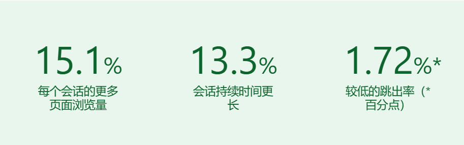
Yahoo! JAPAN News achieved the following results by reducing CLS by 0.2 points.
How to lower CLS
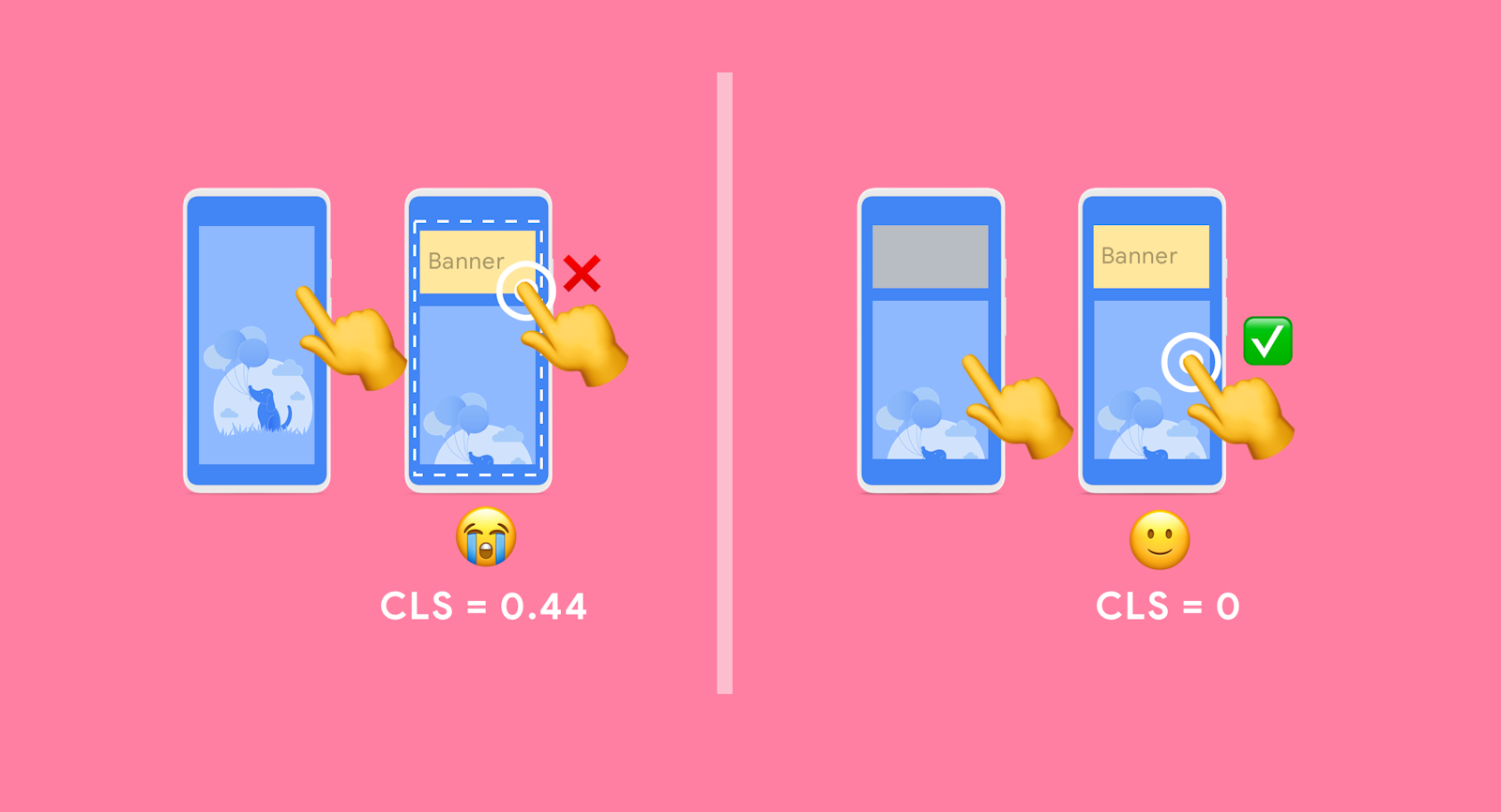
Pictures and other media elements placeholders
Always include width and height size attributes in media resource elements such as images and videos. Or use min-height , aspect-ratio or similar methods in CSS to reserve the required space.
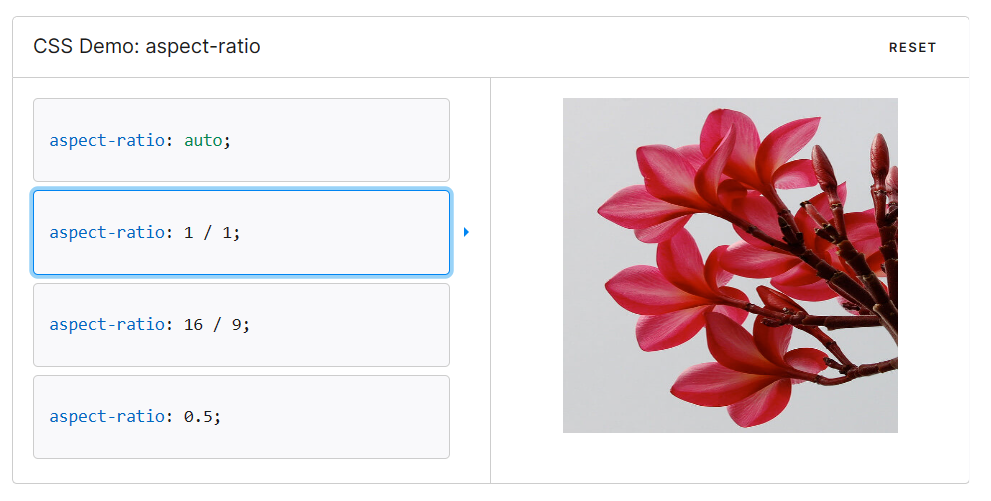
aspect-ratio
Can be used to directly specify the proportion of the current element.
https://developer.mozilla.org/zh-CN/docs/Web/CSS/aspect-ratio
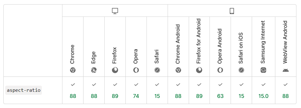
Browser support:
padding-bottom
If you consider browser support issues, you can still consider using a widely accepted basic solution “Padding-Top Hack”. This solution requires a parent element and an absolute child element. Then calculate the aspect ratio percentage to set as padding-top . For example:
|
|
Use CSS that is less prone to offset
Among them, transfrom performs very well. Here are a few examples.
Use cases can be found here: https://play.tailwindcss.com/26PxFA6UVI
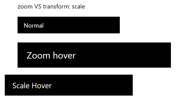
zoom VS transform: scale
While zoom expands the page and shifts it to the right, transform: scale just zooms in place.
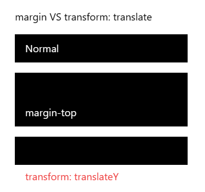
margin VS transform: translate
margin causes the parent element to become larger, transform: translate just makes the current element move.
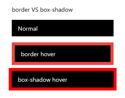
border VS box-shadow
border will support the parent element, but box-shadow will not.
Be careful with your lazy loading
Lazy loading will cause layout offset. If you jump in a long list of lazy loading, please be careful!
Jumping without animation can avoid this problem to a certain extent.
Be careful with transition: all
When the page is loaded for the first time or the page is jumped, transition: all may cause padding of elements to start rendering from the parameter 0, causing the page to jitter.
This is all pain:
Commit: Table and friendly link icons shake
Commit: Fix navigation bar jitter problem
Offset issues caused by label order
Since the main content is displayed first on the mobile terminal, the markup of the sidebar is located behind the main content; on a larger screen, the main content is moved to the middle (that is, the second one) by setting the CSS order for sorting. column), the pseudo code is as follows:
|
The browser does not fully parse the DOM when it is first drawn. It only knows the existence of <Main /> , but does not know the existence of <Left /> or <Right /> , so it renders <Main /> into the first column instead of The second column; it is not until the second drawing that the browser renders <Main /> into the second column and <Left /> into the first column.
Chrome does not parse HTML completely at once. In the following two situations, Chrome will pause parsing and start rendering and drawing:
- Chrome parser pauses after reading 65535 bytes of HTML
- After Chrome encounters the
<script>tag, it will continue to read about 50 “Tokens” and then pause.
For more information, please see: Optimizing the Cumulative Layout Shift (CLS) Problem of Blogs
Web page jump and forward and backward caching
By default, all browsers use bfcache, but for various reasons, some sites are not suitable for using bfcache. For more details on how to test and identify any issues that prevent bfcache from being used, read the bfcache article .
bfcache keeps pages in browser memory for a short period of time after you leave, so if you return to them, they will be restored exactly as they were when you left. This means that a fully loaded page is immediately available without any changes.
Today’s SPA applications can also easily ensure the consistency of routing jump page layout. Remember to always keep your table of contents and navigation bar in a fixed location on the page.
font
There are usually two ways to process web fonts before downloading and rendering them:
- Use web fonts instead of fallback fonts (FOUT – Flicker for unstyled text).
- Displays “invisible” text using a fallback font until web fonts are available and the text is visible (FOIT – Flicker of Invisible Text).
Both methods may lead to layout changes. Even though the text is invisible, it still uses the fallback font for layout. This means that blocks of text using that font, and surrounding content, will have their layout changed when the web font loads, exactly like FOUT’s visible font.
The following methods can help you minimize this problem:
- Using
font-display: optionalavoids relayout because the web font will only be used if it is available during initial layout. - Use alternate fonts that match closely. For example, using
font-family: "Google Sans", sans-serif;will ensure that the browser’s sans serif fallback is used when the “Google Sans” font is loaded. If you just usefont-family: "Google Sans"without specifying a fallback font, the default font will be used, and on Chrome the default font is “Times”, which is a worse match than the default sans serif font. - Use the new
size-adjust,ascent-override,descent-overrideandline-gap-overrideAPIs to minimize the size difference between fallback and web fonts, see the ” Improved font fallbacks ” article for details. - Use the Font Loading API to reduce the time it takes to get the fonts you need.
- Use
<link rel=preload>to load critical web fonts early. Preloaded fonts have a higher chance of reaching first draw so that no layout changes occur. - Read the ” Best practices for fonts ” article about best practices for fonts.
Use a real skeleton screen
Measuring CLS Score
Production stage
- Chrome User Experience Report
- PageSpeed Insights
- Search Console (Core Web Vitals report)
- web-vitals JavaScript library
experimental stage
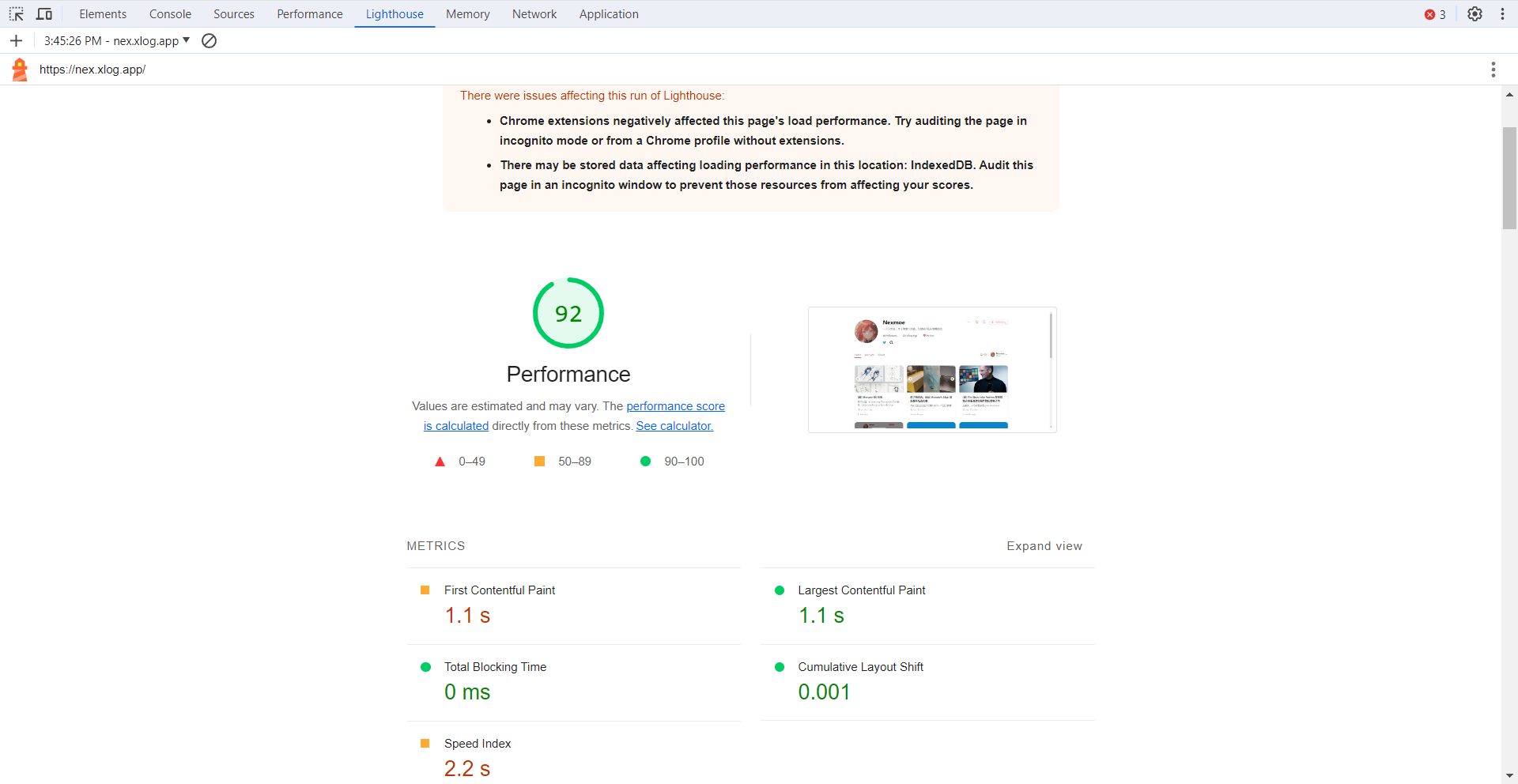
Lighthouse in DevTools
Ability to generate actual performance reports for web pages on mobile and desktop devices and provide recommendations on how to improve the pages.
Running Lighthouse from DevTools during local development is very convenient.
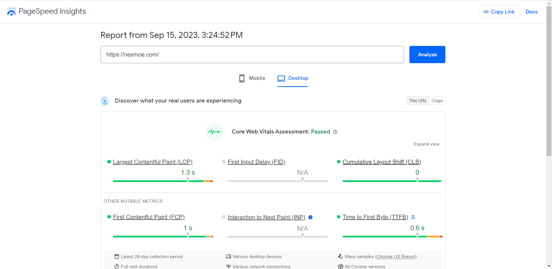
PageSpeed Insights
It should be the online version of Lighthouse.
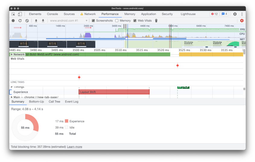
Performance in DevTools
The Performance tab logs all page behavior over a period of time in Chrome’s DevTools profile. A layer labeled “Experience” appears on the timeline, highlighting changes to the layout and the elements that changed.
Web Vitals extension
The Web vital extension is best thought of as a spot-check tool for finding performance issues rather than a full-blown debugging tool—that’s the job of the Performance tab in Chrome’s DevTools.

Conclusion
As a person who has high requirements for his own projects, he usually comes into contact with layout offset optimization or Lighthouse. However, when I was messing around before, I didn’t have the concept of CLS. Now I have a clearer concept of CLS.
As a very basic optimization indicator, CLS is very important in user experience. Any project should be optimized for CLS.
If there are any errata, please point it out in time, thank you!
refer to
- https://web.dev/cls/
- https://web.dev/optimize-cls
- https://developers.google.com/publisher-tag/guides/minimize-layout-shift
- https://web.dev/yahoo-japan-news/
- https://addyosmani.com/blog/infinite-scroll-without-layout-shifts/
- https://blog.skk.moe/post/fix-blog-cls/
- https://developer.mozilla.org/en-US/docs/Web/CSS/aspect-ratio
This article is reproduced from: https://nexmoe.com/2PRR1J7.html
This site is only for collection, and the copyright belongs to the original author.