Original link: https://www.ifanr.com/app/1489092
At the just-concluded Google I/O Developers Conference, a vote of new hardware products such as Pixel 6a and Pixel Buds Pro set off the mood on the scene, while stealing the attention of the original protagonist of the conference, the software.
But that doesn’t mean the software and Android operating system announced at developer conferences are worthless, they’re enhancing our mobile experience in more subtle ways.
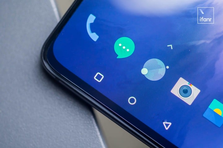
▲Used to go back with gestures, do you still remember the virtual return key?
For example, Google announced at the developer conference that it would modify Android’s gesture return function to make the “return key” easier to use.
The app is too messy, and Google is killing it
It’s 2022, why is Google changing the Android back button?
Isn’t it easy to use, why change it?
Maybe you have a similar question, the fact is the best answer, the Android back button is actually not difficult to use, the problem lies in the applications that abuse the “return” function.
Because the Android return key supports global operations, and you can directly return to the desktop through the return key, such as WeChat, Weibo, and built-in applications in the system, you can swipe directly to return to the desktop.
If you switch to Baidu Maps, Station B and other applications, you need to swipe twice to return to the desktop. Today’s headlines even directly make the return button a “refresh” button. Side-sliding on the application home page is not to exit the application, but not to hang the application in the background. , but refresh the flow of information.
In addition to being more convenient to operate, Toutiao enables the “return button to replace the refresh function” by default, and perhaps it also has the purpose of attracting people to continue to watch content in the app by refreshing new content.
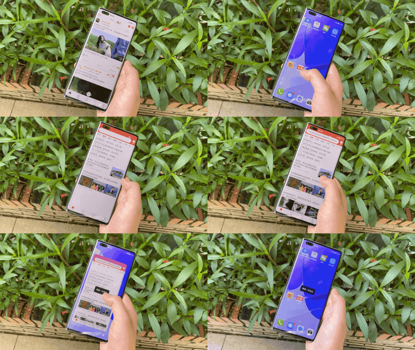
▲ Swipe once to return to the desktop and swipe twice to return to the desktop
The original function of sliding sideways twice to return to the desktop is to prevent accidental touches. In the horizontal screen game scene, frequent operations of the fingers will inevitably touch the small horizontal bar interaction area at the bottom of the mobile phone by mistake to trigger the return function, and the two return verifications are very good. solved this problem.
However, a large number of applications now use this mechanism, which makes it difficult for people to distinguish which applications need to slide twice to return to the desktop, and which applications need to slide once to prevent accidental touches. .
When the destination of the return key is uncertain, people are more confused.
▲ Picture from: GadgetMatch
On the other hand, the functions and content of the apps are getting richer and richer, and the homepage of the app even has dozens of secondary menus, but the secondary menus cannot be increased without limit, and entering a new menu level all the time, not only the operation efficiency is low, but the experience is not good. it is good.
Therefore, both horizontal and vertical operations are favored by major application developers. For example, in today’s headlines, you can slide left and right to switch content columns. In some e-commerce applications, there are even special cards, and slide left and right to switch content.
Compared with physical buttons, gesture operations are obviously more complicated and difficult to understand. The trigger range and sliding length of gesture sliding will affect the use of functions.
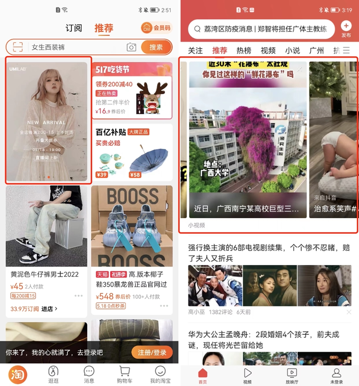
▲Swipe to switch the content of the card in the application, which may conflict with the swipe back gesture.
These applications include the function of swiping left and right to switch content, which to a certain extent forms a “conflict” with the system’s side-sliding return function. Is the side-sliding sliding the content in the card or triggering the return operation?
Google’s latest approach is to introduce “predictable design”. Not only does the ordinary side swipe return with a corresponding arrow symbol to remind people, but when the side swipe returns to the desktop, it will directly display the desktop wallpaper, and use a clear interface animation to remind people that the return key will Take them where to reduce the chance of accidentally closing an app.
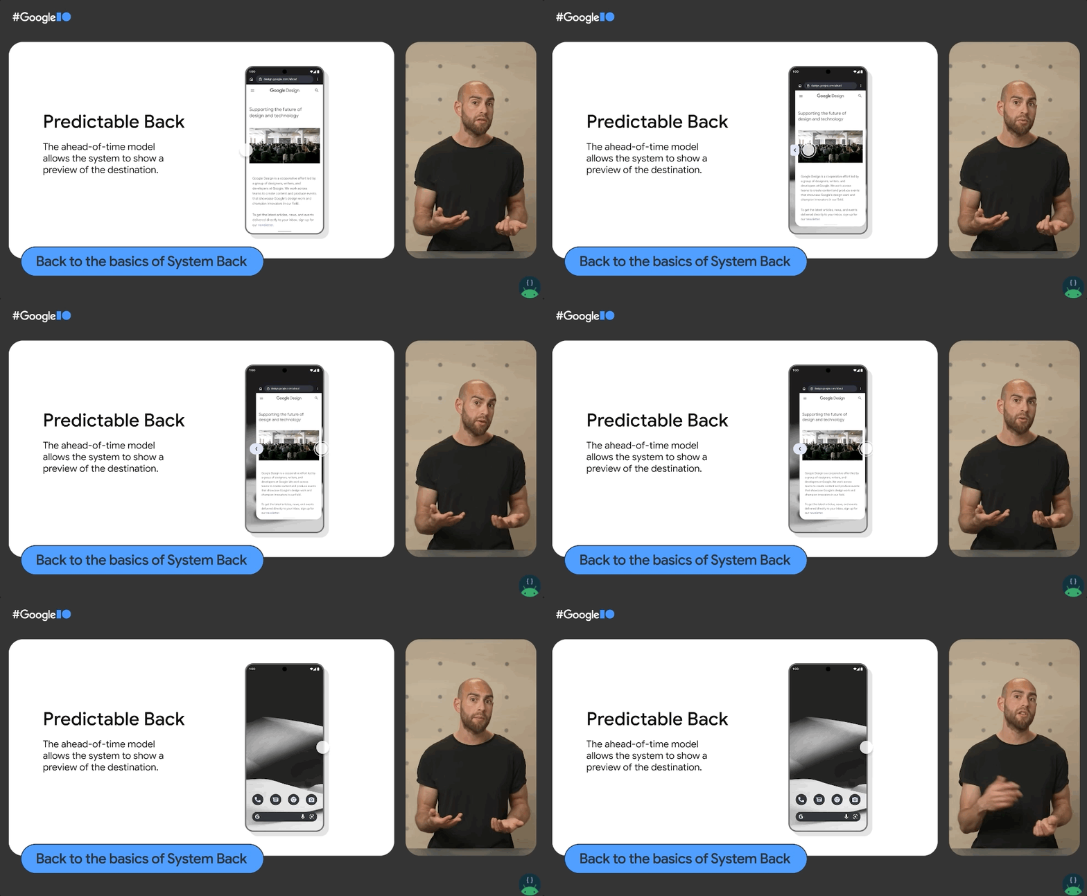
▲ New back gesture. Image from: Google I/O
In the case of the popularity of the full screen and no physical buttons, intuitive and obvious animations and symbol prompts are better solutions.
According to information announced by Google at the I/O conference, the new return feature has been tested in Android 13 and will not become the default until Android 14.
Fragmentation of the Android experience
On the return button, Google has actually been “tossing” for a long time. It has begun as early as the era of button smartphones, and the problem of various experience fragmentation has not been completely solved today.
At first, Google set two definitions for the return key, namely up and return. The former refers to returning to the previous information level, while the latter directly ends the current activity and returns. A more intuitive example is the return on the search interface. Button and phone slide back.
When you swipe back to the side, the phone will first put away the keyboard bar, and you need to swipe sideways again to return to the original interface, while directly pressing the return button next to the search bar will directly return to the original interface. 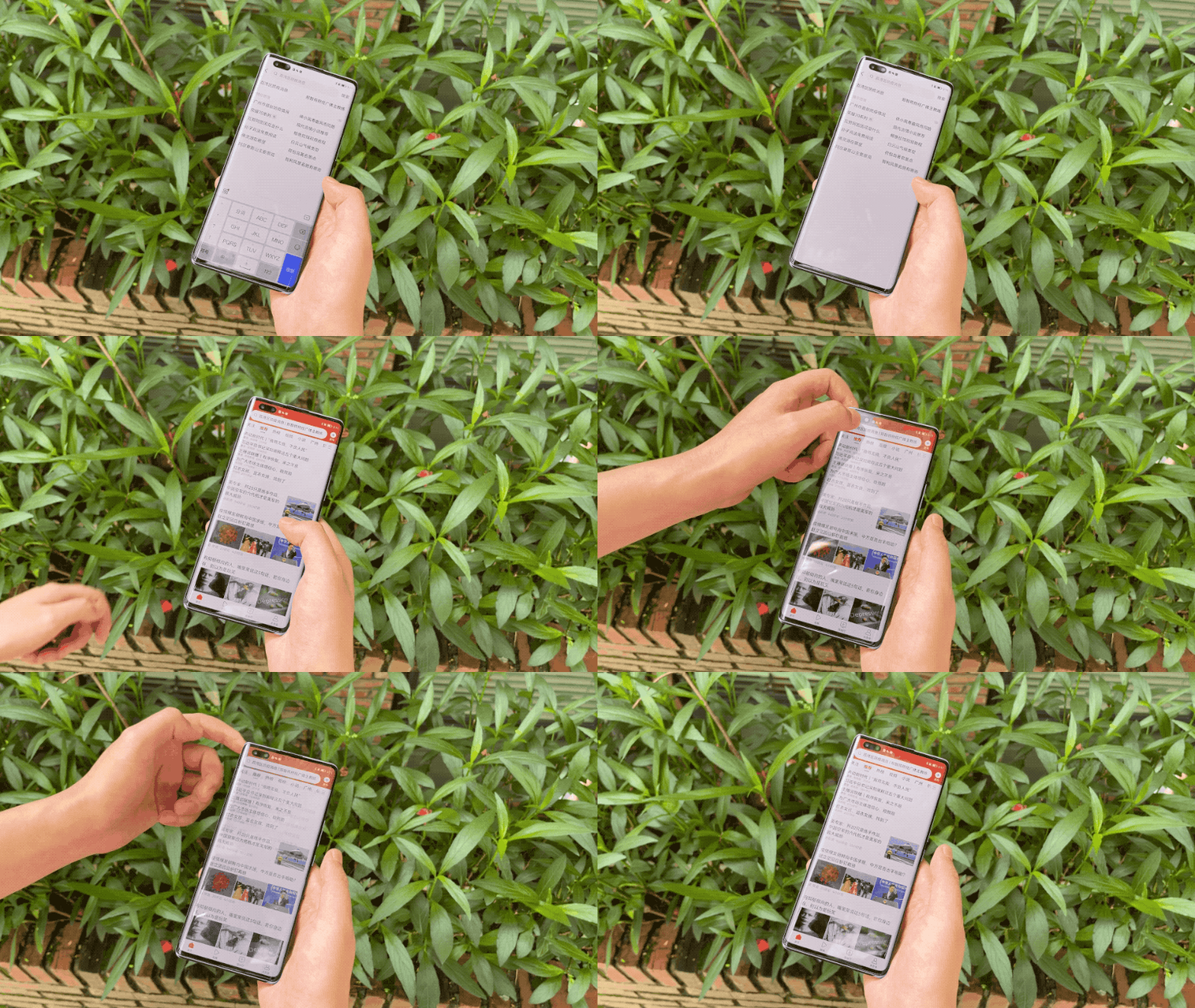
▲Take the return button of the search bar as an example to return and return to the previous information level.
The return button next to the search bar executes to return to the previous information level, while the side sliding of the mobile phone triggers the end of the input activity.
Unfortunately, this design has not been fully popularized, and not every developer can design applications according to the corresponding standards.
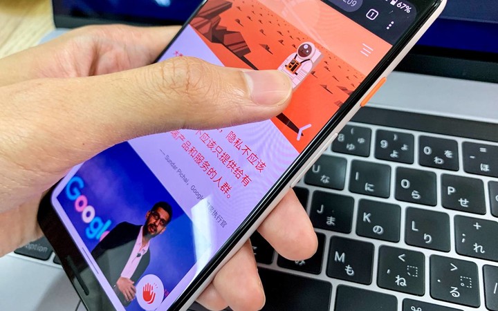
With the increase of the screen of the mobile phone, it is more and more troublesome to click the back button on the top of the mobile phone with one hand, so many applications directly remove the back button in the interface, and all rely on the global sliding back function at the Android system level.
It’s not uncommon for app developers to copy the iOS version of their app interface design, resulting in a poor experience.
Originally, in Material Design, the design language developed by Google for the Android system, the side-to-left swipe was defined as the out-call side menu bar, but a large number of developers did not support this design, which eventually led to bankruptcy, and the side-sliding out-call menu completely gave way to the return function.
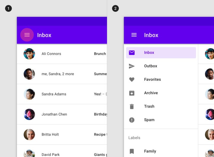
▲ Many apps have given up on sliding out the app menu
The Android version of WeChat does not support the function of sliding out the “article floating window”, while the iOS version supports this function. Obviously, this is one of the effects of the Android side sliding return function. Many domestic mobile phone manufacturers are still adding the return button. “Innovation”, swiping and staying will call out a new application menu.
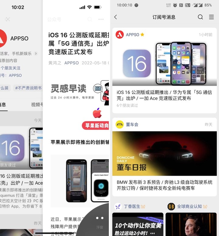
▲ WeChat iOS version supports drag and drop to evoke “article floating window”, while Android version does not support
Google is a latecomer in full-screen and gesture interaction. Xiaomi implemented a full-screen design on the first-generation MIX, completely abandoning the three physical buttons of Android and replacing them with virtual buttons, and then various full-screen models and technologies. The directions are getting richer.
After the trend of full screen, mobile phone manufacturers with custom Android systems stretched their hands to the bottom of the system, trying to define the interaction method of full screen. Xiaomi fixed the back button and the home button directly as the side slide and bottom slide gestures. Different functions can be enabled with different sideslip depths when sideslipping.
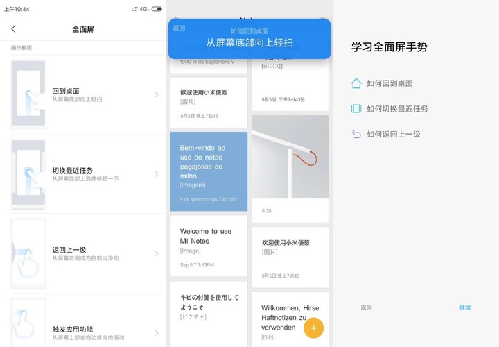
▲MIUI 10 slides the screen to different positions, which will trigger different functions
At this time, Google enabled comprehensive gesture operations in Android 10. As the controller of the Android system, it was grabbed by mobile phone manufacturers in terms of underlying interaction.
From this incident, you can get a glimpse of Google’s control over the Android ecosystem, which is why many people said when the new Android design and Material You were launched:
It looks good, but I definitely can’t use it.
As soon as you see the new design, you will think of the fragmentation problem of Android. How many app developers will support it?
A good change is that Google is working hard to solve this problem, and it has opened up cooperation between chip manufacturers and mobile phone manufacturers. For example, in terms of system upgrades, it has cooperated with Qualcomm to improve the mobile phone system update cycle. OPPO, Samsung and other manufacturers have supported Android for three years. system update.
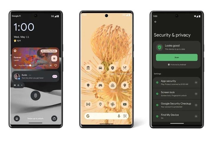
Material You has also promoted this design language through cooperation with mobile phone manufacturers such as Samsung. Android 13 fully supports third-party applications to modify the Material You icon.
Internally, through more self-developed hardware products, we can understand the details of the product experience, truly define the experience by combining software, and promote it as a standard.
Small but very important basic functions such as the return button can be valued and changed, and entered into various mobile phone systems with the Android system update.

This article is reprinted from: https://www.ifanr.com/app/1489092
This site is for inclusion only, and the copyright belongs to the original author.