Original link: https://www.zhangxinxu.com/wordpress/2022/11/about-css-list-style-type-item/
by zhangxinxu from https://www.zhangxinxu.com/wordpress/?p=10607 Xin Space-Xin Life
This article welcomes sharing and aggregation. It is not necessary to reprint the full text. The copyright is respected. The circle is so big. If you need it urgently, you can contact for authorization.

1. Must list-item horizontal elements
A normal ordered list HTML code:
<ol> <li>Project 1</li> <li>Project 2</li> <li>Project 3</li> </ol>
At this point, ordered bullets like 1, 2, and 3 will be displayed in front (the real-time rendering effect is as follows):
- item 1
- item 2
- item 3
I don’t know if you have any in-depth understanding of the mechanism by which the bullets take effect? Which HTML element generated it? And what are the rendered CSS properties?
There is often deep knowledge behind simple phenomena.
First, the bullets are generated by the <li> element, and the resulting CSS is list-style-type , which literally means “list style type”.
Then there is the mechanism, which is like this. For HTML elements, in order to have bullets, in addition to using the list-style-type attribute, there is also a precondition that the calculated value of the element’s display must be list-item (abbreviation of <li> tag). those two words).
For example, in the above li list, if we change the display attribute value of the second <li> element, such as flex, the previous serial number will be lost, for example:
<ol> <li>Project 1</li> <li style="display:flex;">Item 2</li> <li>Project 3</li> </ol>
The effect is:
- item 1
- item 2
- item 3
This rule also applies to normal HTML elements, for example, here is an example:
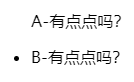
<p class="list-a">A-A little bit? </p> <p class="list-b">B-a little bit? </p>
.list-a { list-style-type: disc; } .list-b { display: list-item; list-style-type: disc; }
At this time, only the front of the second line element will have a dot (the position is outside), the screenshot is as follows:
ol, ul exception
However, there are two exceptions. Although the display value of these two elements is block, setting the list-style-type attribute can still change the bullet type of the child <li> elements, for example:
<ol style="list-style-type: disc;"> <li>Project 1</li> <li>Project 2</li> <li>Project 3</li> </ol>
At this point, several lists in the <ol> element are not preceded by Arabic numerals, but solid dots. The real-time rendering effect is as follows.
- item 1
- item 2
- item 3
I call this phenomenon pseudo-inheritance, only ol, ul elements do this, other HTML elements do not.
So, for CSS reset, don’t have code like this:
/* li is redundant */ ol, ul, li { list-style-type: none; }
Use the code below directly for CSS reset.
ol, ul { list-style-type: none; }
2. Support multiple attribute values
There are many keyword attribute values supported by list-style-type . The screenshot shows:
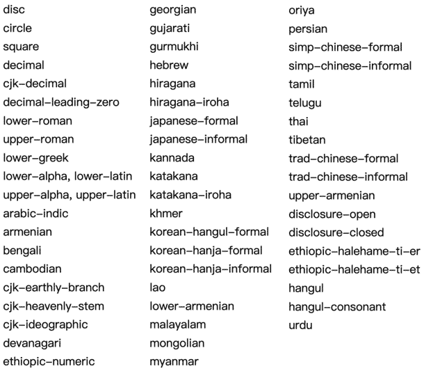
Except for the common dot-disc, hollow circle-circle, and solid square-square, the rest of the keyword attribute values are ordered symbols. The reason why there are so many is because there are many languages in the world, especially those who use Many languages will have a corresponding ordered name.
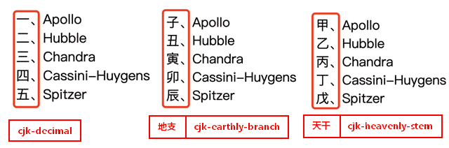
For Chinese users, we may need to pay attention to these names, cjk-decimal or cjk-ideographic, cjk-heavenly-stem (Heavenly stem), cjk-earthly-branch (earthly branch):
cjk is the abbreviation of Chinese/japanese/korea, which means the East Asian language system
String property value
list-style-type also supports custom string attribute values, so-called bullets, for example, using the ❤ symbol as a bullet will have the effect of emoji bullets. The code is indicated as follows:
ol { list-style-type: '❤️'; }
The real-time effect is as follows:
- item 1
- item 2
- item 3
Multiple characters are supported, for example:
ol { list-style-type: '❤️?'; }
The real-time effect is as follows:
- item 1
- item 2
- item 3
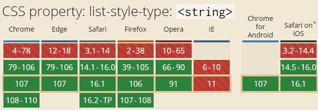
The compatibility of string values is shown in the screenshot below, and it is supported by all modern browsers and can basically be used in projects with confidence.
any customization
list-style-type also supports bulleted lists customized using @counter-style rules.
For example, you can customize the character content of some serial numbers:
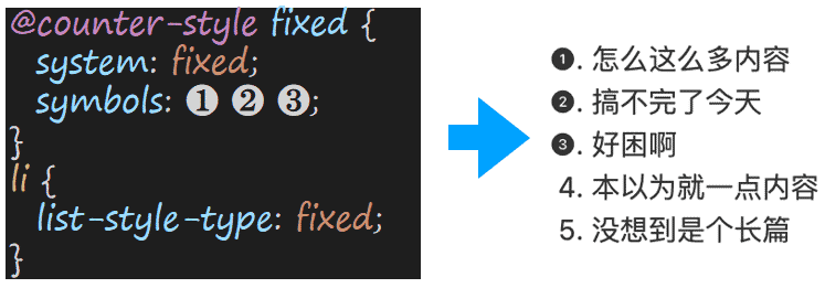
Customize the prefix and suffix of the serial number, etc.:
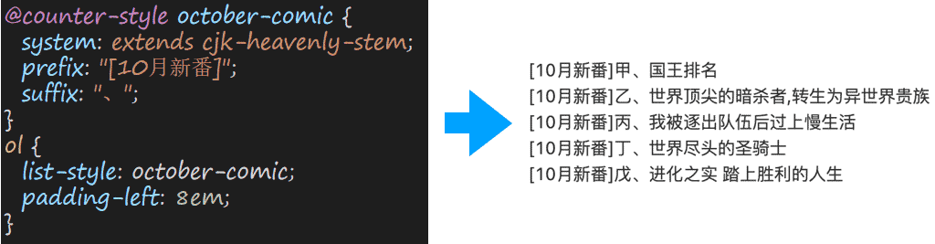
@counter-style rule is very powerful. In a nutshell, the @counter-style rule can help you to achieve any serial number symbol effect you can think of.
Its syntax is as follows:
@counter-style counter-style-name { system: counting system symbols: counting symbols additive-symbols: additional symbols negative: negative symbols prefix: prefix suffix: suffix range: range pad: completion speak-as: how to read fallback: backup counting rules}
If you are interested, please refer to the article ” Detailed Introduction to CSS @counter-style Rules “.
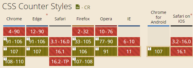
Currently, this feature works well in Chrome and Firefox, but Safari will have to wait for some time.
Three, ol and type attributes
The <ol> element in HTML also supports an html attribute called type, which can specify the type of the ordered list, supporting any of the five values [1, a, A, i, I].
Let’s take the following example:
<ol type="1"> <li>The first content is the sofa<ol type="a"> <li>The first content, the sofa<ol type="I"> <li>The first content, the sofa<ol type="i"> <li>The first content is the sofa</li> <li>Xin Space-Xin Life: This is the second item</li> </ol> </li> <li>zxx: this is the second item</li> </ol> </li> <li>zhangxinxu: this is the second item</li> </ol> </li> <li>Zhang Xinxu: This is the second item</li> </ol>
You can see all kinds of ordered symbol effects.
Note: If the ol element is set with the list-style-type attribute, it will be invalid. Pay attention to the protection when CSS resets. You can use the :not() pseudo-class.
The real-time rendering effect is as follows (supported by all browsers, including the defunct IE browser):
- The first content, the sofa
- The first content, the sofa
- The first content, the sofa
- The first content, the sofa
- Xin Space-Xin Life: This is the second item
- zxx: this is the second item
- The first content, the sofa
- zhangxinxu: This is the second item
- The first content, the sofa
- Zhang Xinxu: This is the second item
Note that the type attribute is only valid for <ol> elements and has no effect on <ul> elements.
In addition to the type attribute, the <ol> element also supports an html attribute named start, which can specify the ordinal value at the beginning of the ordered list, for example:
<ol type="A" start="2"> <li>Project 1</li> <li>Project 2</li> <li>Project 3</li> </ol>
You can see that the serial number starts from B, not A.
- item 1
- item 2
- item 3
It also supports a value attribute value to specify the starting position of the serial number, but this attribute is set on the LI element. Compared with the start attribute, the advantage is that it can be specified separately, for example:
<ol type="A"> <li value="2">Item 1</li> <li>Project 2</li> <li value="5">Item 3</li> </ol>
The effect is shown below. It can be seen that the letter in front of “Item 3” is E, not the D of the normal serial number.
- item 1
- item 2
- item 3
Fourth, ::marker pseudo-element
The CSS ::marker pseudo-element is specifically used to style the list number, such as turning red:
<ol> <li>Project zhang</li> <li>Project xin</li> <li>Project xu</li> </ol>
li::marker { color: red; }
- project zhang
- project xin
- project xu
The ::marker pseudo-element has a disadvantage, that is, it can only set CSS styles related to text, such as font size, font, color, word spacing and other attributes, such as background color, and layout, etc. are not supported, if there is a later requirement , you can use the counter() counter, which will be introduced later in this article.
Content replacement
The ::marker pseudo-element also supports custom bullets using the content attribute:
li::marker { content: '❤️'; }
At this point, in non-Safari browsers, you will see that the serial number in front is a love~ 
- project zhang
- project xin
- project xu
Safari browser does not support this feature (Safari16), so it is recommended to use list-style-type to replace serial number characters in actual development.
More information about the ::marker pseudo-element can be found in my previous article: ” Introduction to the CSS ::marker pseudo-element “.
Five, the use of counters
Counters in CSS are very powerful, and now with the @counter-style rule, it’s simply invincible.
For CSS counters, please refer to this classic article ” CSS counter counter (content directory serial number auto-increment) detailed explanation “.
Usually used to simulate the auto-incrementing serial number of 1, 2, and 3.
Then many people don’t know, the counter() function and counters() function (nested sequence) also support a parameter called style, like this:
counter(name, style) counters(name, string, style)
This style parameter is all the attribute values that the list-style-type attribute can support, including custom ordinal types.
The CSS counter is implemented with the ::before / ::after pseudo-elements. Compared with the ::marker pseudo-element, the ::before and ::after pseudo-elements support almost all CSS properties, and do not need the display value to be a list- item, therefore, the applicable scenarios are very wide.
The only disadvantage is that the cost of learning is relatively high. Most front-end developers need to take a good look at the documentation, or a few high-quality articles to know how to use it.
Therefore, my suggestion is that the simple effect ::marker pseudo-element, if it is an advanced requirement put forward by the product manager (for example, the top three serial numbers on the leaderboard are colored gold, silver and bronze medals), you can use CSS counter + @counter-style rule .
Here is a simple example of how counter() and @counter-style can be used in combination. The HTML and CSS code are as follows:
<div class="rank"> <span>Cade Cunningham (Pistons)</span> <span>Jaylen Green (Rocket)</span> <span>Evan Mobley (Knight)</span> <span>Scotty Barnes (Raptors)</span> <span>Jaylen Suggs (Magic)</span> </div>
.rank { display: grid; grid: auto / auto 1fr; gap: 5px; counter-reset: rank; } @counter-style nbaRank { system: additive; additive-symbols: 3rd overall, 2nd second, 1st champion; range: 1 3; fallback: cjk-decimal; } .rank span { display: contents; } .rank span::before { counter-increment: rank; content: counter(rank, nbaRank); background-color: #333; color: #fff; padding:0 3px; border-radius: 3px; text-align: right; }
The effect at this time is shown in the following figure:
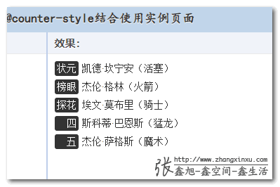
It can be seen that there are not only background colors but also rounded corners behind the serial numbers. The first three serial numbers have been specially processed, and then the layout is still grid layout.
Seeing is believing, you can hit hard here: counter() counter combined with @counter-style demo
6. Conclusion
Although there are more discussions about JS and its related frameworks in the industry, in fact, CSS has been developing continuously, and its speed is much faster than JS to some extent, because there are not so many three schools and three trials.
However, because JS can do so much, CSS doesn’t seem that important.
The content of this article can be well explained. For example, to achieve a special counter effect, for most developers, a loop is directly JS. If there are special processing, such as the first three, an if statement is fine.
The function is realized, the effect is also good, at least it can be used, and the learning cost is also low (that is, simple JS logic processing), not very good!
Why spend so much time learning all kinds of counter syntax, and @counter-style rules, the number of parameters in this thing is more than Vue, how to learn?
Just to improve the user experience a little bit, but I have to spend so much effort, it is not worthwhile, I will not do it, I will not learn, thank you, anyway, the boss and users have the same requirements for the product, it is smooth and can be used. , my KPI will not be improved because of this, and the technology that allows me to finish get off work quickly and get off work is a good technology.
This is the status quo and the reality. In the stage of rapid development of the industry, this is also inevitable. When the Web Internet begins to cool down and there is enough inner circle, when everyone competes for internal strength, maybe these are better for products, but they need more energy to learn things will appear more on stage.
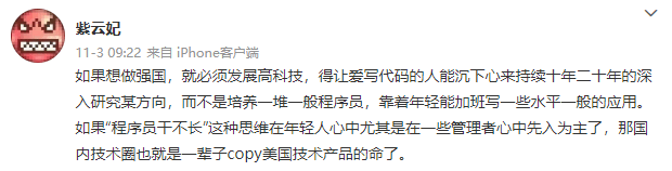
Finally, share a point of view that I agree with:
OK, that’s all, oops, it looks like a simple attribute, but it actually has so much content when you get to the bottom of it.
If you think the content of this article is not bad, welcome to forward (if any), like (if any) and share.
This article is an original article, welcome to share, do not reprint in full text, if you really like it, you can collect it, it will never expire, and will update knowledge points and correct errors in time, and the reading experience will be better.
Address of this article: https://www.zhangxinxu.com/wordpress/?p=10607
(End of this article)
This article is reprinted from: https://www.zhangxinxu.com/wordpress/2022/11/about-css-list-style-type-item/
This site is for inclusion only, and the copyright belongs to the original author.