Google has long made mobile-first design an important factor in the most important mobile searches. Many times, we also do mobile adaptations of websites, web pages, or responsive designs to pass Google’s mobile-friendly tests.
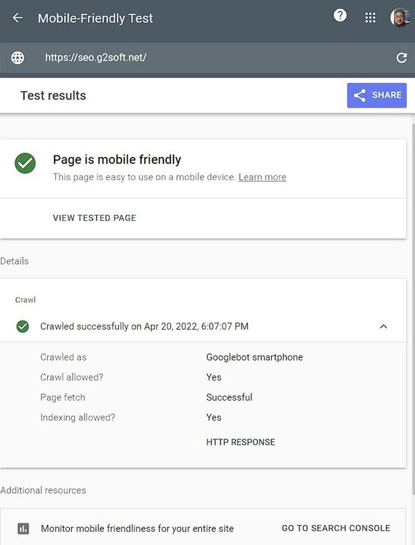
Here’s a mobile-friendly testing tool for Google Search. You can enter the URL or paste the code to test.
For the optimization of websites that are designed first for mobile devices, there may be the following points that need special attention from the beginning of the design.
Improve website loading speed
The loading speed of website pages is always a very important page factor in addition to content. There are generally four angles that can be done.
AMP pages
AMP pages are an open-source standard designed for mobile devices, and are generally a subset of HTML, but much faster than regular HTML pages. The user experience is of course very good.
For specific standards and how to apply, you can refer to their official website. https://amp.dev/
Using WordPress website, you can directly use the plug-in, very convenient.
PWA design
Progressive Web Apps, PWA is an alternative to AMP, the main feature is that the experience is similar to the native app on mobile devices.
Google has a great help site on how to use PWAs.
PWAMP
Frankly speaking, I don’t know much about this. It is roughly a combination of the advantages of PWA and AMP. Maybe this is the future direction.
The last one is that you don’t need to do anything. If your website is already responsive, mobile devices are prioritized, and the loading speed is good, and there are no problems with user interaction design, then what else needs to be done? Just use it like that.
Content displayed on mobile devices
After all, the screen of mobile devices is limited, and many designs use elements such as collapsible menus and drop-down boxes. That’s fine, Google doesn’t penalize this kind of hidden content.
There are a few things to be careful about, namely:
- Don’t use Flash
- Consider the use of pop-ups
- The size of the text, the range that the finger can click
Handling of shopping cart checkout on mobile devices
Studies have shown that more than 80% of customers start browsing products on one mobile phone, and finish shopping on another device, or go to the store. Clearly there are factors that prevent customers from completing the shopping process on the same device.
Take a look at the following points to see if they can improve.
- Improve page load speed
- Reduce the amount of information you need to enter at checkout
- Ease of use of the navigation bar
- Avoid pop-ups
- Give customers a clear option to save their basket and continue shopping on other devices
All in all, at this stage, mobile device-first website design needs a general plan, considering the information processing capabilities of current mainstream mobile devices. Many mobile phones, tablets, and notebooks now have very powerful CPUs, large memory, High-speed LTE Internet access, or 5G Internet speed, so CSS Javasc, pictures and other page elements that will be reduced in the past can now be properly placed, as long as it is conducive to the display of the page and the access of users, Can.
Now that more and more people are using mobile devices such as cell phones, and there are far more people with smartphones than people who only use desktop computers, what else prevents you from designing a mobile-first website?
This article is reprinted from:https://seo.g2soft.net/2022/04/20/mobile-first-design.html
This site is for inclusion only, and the copyright belongs to the original author.