Compared with the more customized TailwindCSS, Bootstrap obviously has more potential for theme and template page development and is easier to develop template pages – after all, various styles have been encapsulated, you can directly use such as btn to define a Button.
I was thinking about providing a TailwindCSS-based StarterKit to quickly develop a set of my own style library based on TailwindCSS, but thinking about it, it doesn’t make much sense. Because there are so many options, it’s not that easy to customize.
Bai Huancheng
When developing Bootstrap, a problem that everyone often encounters is that the pages developed by Bootstrap are the same, a thousand people have a thousand Hamlets, but a thousand Bootstrap pages are exactly the same. The reason behind this is mainly because most people use the standard version of Bootstrap – the officially defined style. Everyone uses the same style, which naturally makes the developed pages look the same.
However, in fact, Bootstrap’s style customization is not difficult.
Recap
In fact, the reason why everyone does not do custom style development is understandable – all the pots must be given to Node Sass. Before Bootstrap 5, Bootstrap used Node Sass to build styles, but Node Sass is an extension written based on C++. This makes the installation of Node Sass very troublesome, and the unique network environment makes the installation of Node Sass fail nine times out of ten. Naturally, everyone is reluctant to use Node Sass to build projects (including myself, will deliberately Select the project built with Less).
However, starting with Bootstrap 5, the Bootstrap project started using Dart Sass for styling . This makes building Bootstrap less painful than it used to be, and thus allows for better style customization. It is undoubtedly good news for students who are still using Bootstrap for project construction.
Customize Bootstrap 5’s style
For how to introduce Boostrap’s Sass into your project to meet your customization needs, you can refer to the official instructions on Customize Sass . The official provides access instructions including Webpack , Parcel , etc. If you don’t even have the basic configuration Too lazy to do it, the official also provides a blank project , which is convenient for you to fork and then modify.
Taking Next.js I use as an example, the configuration is relatively simple:
1. Install related dependencies
Install the required dependencies in the Next.js project root directory
yarn add bootstrapyarn add -d sass sass-loader
2. Create Scss file
Create a new globals.scss file in the styles directory and add the following code to it
// custom variables@import "../node_modules/bootstrap/scss/bootstrap";// custom css code
The custom variables part is for you to add custom variables, such as custom Primary color, custom Padding and other operations, all need to be defined before the introduction of Bootstrap, so as to ensure that your imported variables will take effect .
The following custome css code can be used to define some classes that you wrote yourself and are not covered inside Bootstrap.
3. Introduce the created scss file into the project
Introduce the scss file we just created in the project’s pages/_app.js to ensure that Bootstrap can be automatically built and imported into the project when the application is started.
import '../styles/globals.css'import '../styles/globals.scss' // 这一行是新增的function MyApp({ Component, pageProps }) { return <Component {...pageProps} />}export default MyApp
4. Use the Bootstrap class for development in the project
When you complete the above configuration, you can introduce the corresponding classes in your own project for development.
some tips
Quick style setting with Themestr.app
Themestr is a tool website that helps you quickly generate a set of Bootstrap5 custom styles.
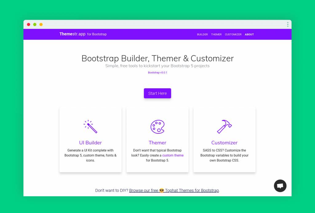
In Themestr, three different tools are provided: UI Builder, Themer and Customizer, among which:
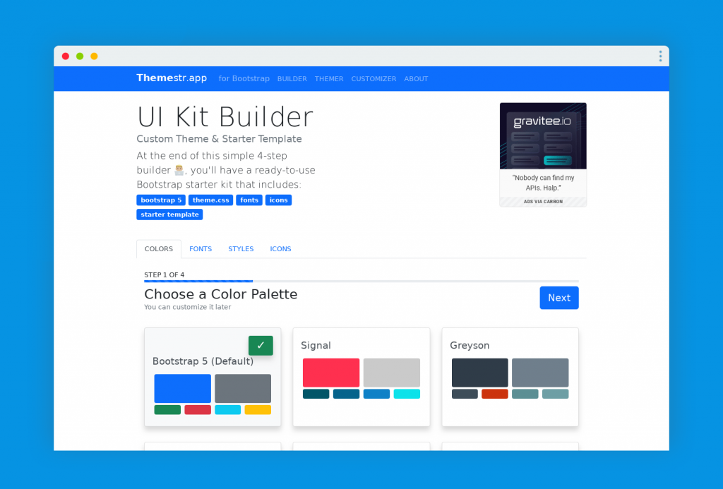
UI Builder provides a simple 4-step selector that lets you define basic colors, fonts, icons, and button styles to form a unique Bootstrap UI.
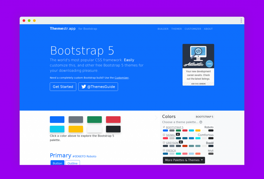
Themer provides a more comprehensive style setting and preview function. You can simply configure the style in the selection interface on the right, and view the effect achieved by your configuration in the automatically refreshed page on the left, which is convenient for you to quickly Find out what you can see with your configuration, simple and intuitive.
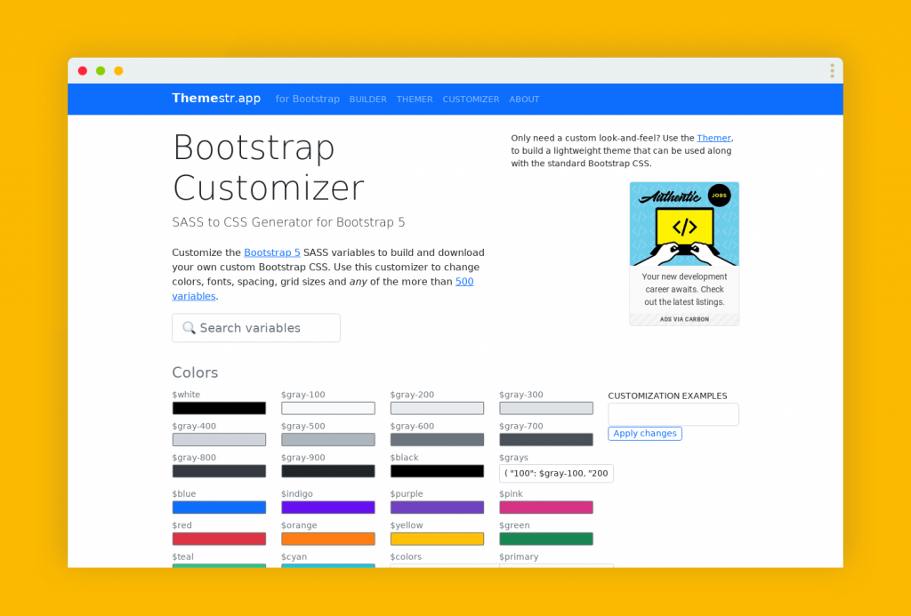
Customizer provides a comprehensive Bootstrap variable, which is convenient for you to quickly find the variable you want to modify, and helps you generate the corresponding Sass configuration file, which is convenient for you to modify the variable here and develop locally.
For different scenarios, Themestr provides different tools to help you develop quickly. It is a very good auxiliary tool for Bootstrap theme development.
How to find the variable that needs to be modified
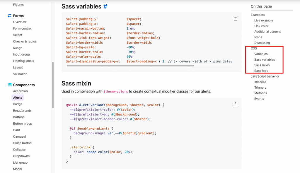
Bootstrap provides a description of the corresponding Sass Variables for each Component in the document. You only need to find the component you want to modify in the document and modify the corresponding variable in your own global.scss to achieve customization. .
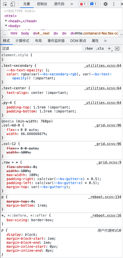
How to find the source code for a specific class
When developing Bootstrap, if you can’t find the styles of some classes, a good way is to open the development environment, and you can see the corresponding scss in the development environment, and in the corresponding scss, click the link to jump Go to the corresponding scss definition to see the source code of the corresponding style.
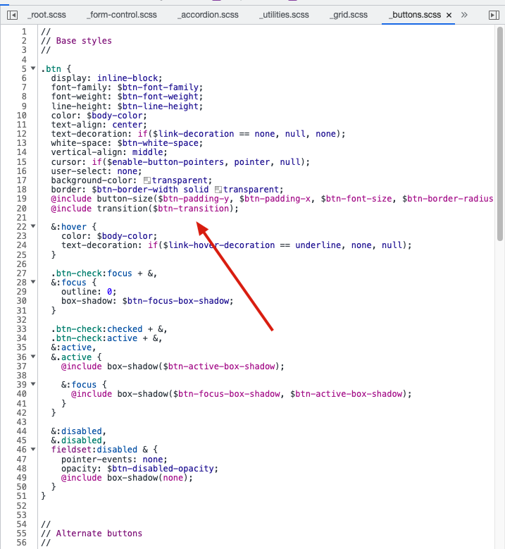
After the jump, sometimes you find that the style is not directly defined, such as the following figure, which means that such a class is generated in batches by map, and you need to modify the corresponding map to complete the customization.
How to customize the theme color, font size, spacing and other batch generated classes
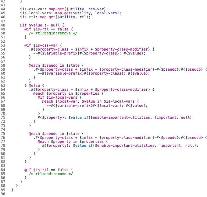
There are some batch-generated classes in Bootstrap, such as theme-color , font-size , font-weight , padding and margin , and so on.
These classes are generated by Bootstrap using @each , and the basis for generation is done by various maps of Bootstrap. Therefore, if you want to define, you need to modify the corresponding Map. You can use map-merge to add new options to the map
// Create your own map$custom-colors: ( "custom-color": #900);// Merge the maps$theme-colors: map-merge($theme-colors, $custom-colors);
And if you want to remove an option, you can use the map-remove method to do it
// Required@import "../node_modules/bootstrap/scss/functions";@import "../node_modules/bootstrap/scss/variables";@import "../node_modules/bootstrap/scss/maps";@import "../node_modules/bootstrap/scss/mixins";@import "../node_modules/bootstrap/scss/root";$theme-colors: map-remove($theme-colors, "info", "light", "dark");// Optional@import "../node_modules/bootstrap/scss/reboot";@import "../node_modules/bootstrap/scss/type";// etc
This article is reprinted from: https://www.ixiqin.com/2022/05/14/customize-the-bootstrap-5-style-implement-a-custom-page-style-development/
This site is for inclusion only, and the copyright belongs to the original author.