Original link: https://shyrz.me/cyberclip-40-brand-carnage/

Issue 40 of Issue 23 08 20
Hello everyone.
In this issue, “Why Twitter’s New Logo X Failed” analyzed the design of Twitter’s recently replaced new logo X, and answered three questions that ordinary users want to know from a professional perspective; Systems Go Wrong in Space describes the mechanisms by which the human immune system collapses in the space environment and the possible implications of this discovery.
Hope to be enlightened.
Enjoy 50% off! Nom Nom’s dog food is expertly formulated by nutritionists to make dogs drool!

Give your dog a healthier, happier life by upgrading your dog’s diet with Nom Nom’s fresh and healthy dog food. Professionals report benefits in as little as one month after switching to Nom Nom – shinier coat, more energy, and better breathing!
(Clicking on the link above can help me run better, and I will receive a meager sponsorship for every valid click from you)
Why Twitter’s New Logo X Failed
→ Original link : How new Twitter X logo fails — Oliver Schöndorfer / PimpMyType / 2023-08-04
The operation of Twitter’s rebranding as X completely robbed the platform of the last joy of it by destroying its visual identity. Is the new logo just a Unicode symbol, or perhaps just taken from an existing font? In this article and video, I’ll dig into the details and show you what to look for when choosing a logo (logo) font.
→ Video Interpretation : How new Twitter X logo fails
In addition to venting emotions  , we will delve into three main questions:
- What does this Unicode character ? stand for?
- Is it possible to simply use the letters from the font as logos?
- What is the effect? What’s good?
Recap
In just one weekend after Elon Musk called for a ” good enough logo ,” one lucky guy was liked and picked by Musk to embark on a hasty and sloppy rebranding.
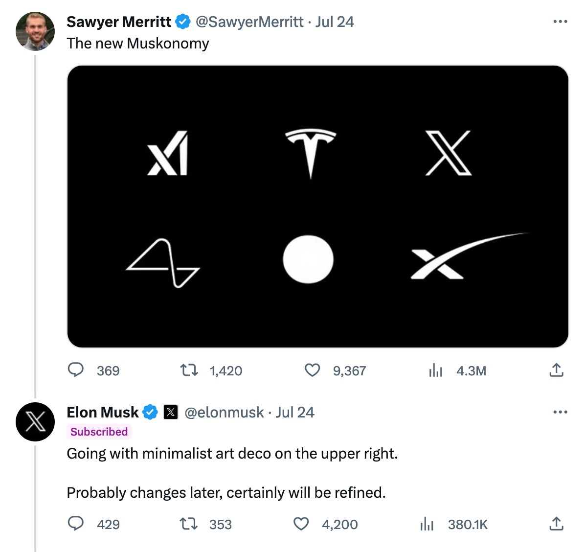 Selected Tweets with an X in the upper right corner
The chosen logo replaced the beloved bird within hours, and the iOS app icon changed a week later.
 Twitter’s new logo X
In the midst of this confusion, someone commented that the logo is just a Unicode character, or perhaps just taken from an actual font? But let’s start with the first statement.
1. Is the Twitter X just a plain text character?
The statement that X uses Unicode characters as flags is a bit misleading. Because Unicode is not a font . The Unicode standard defines characters, assigning each character a unique number. This ensures that the uppercase X is the same character across fonts, languages and scripts. But you need a font to access Unicode characters. Depending on the design of the font, the appearance of the characters may vary.
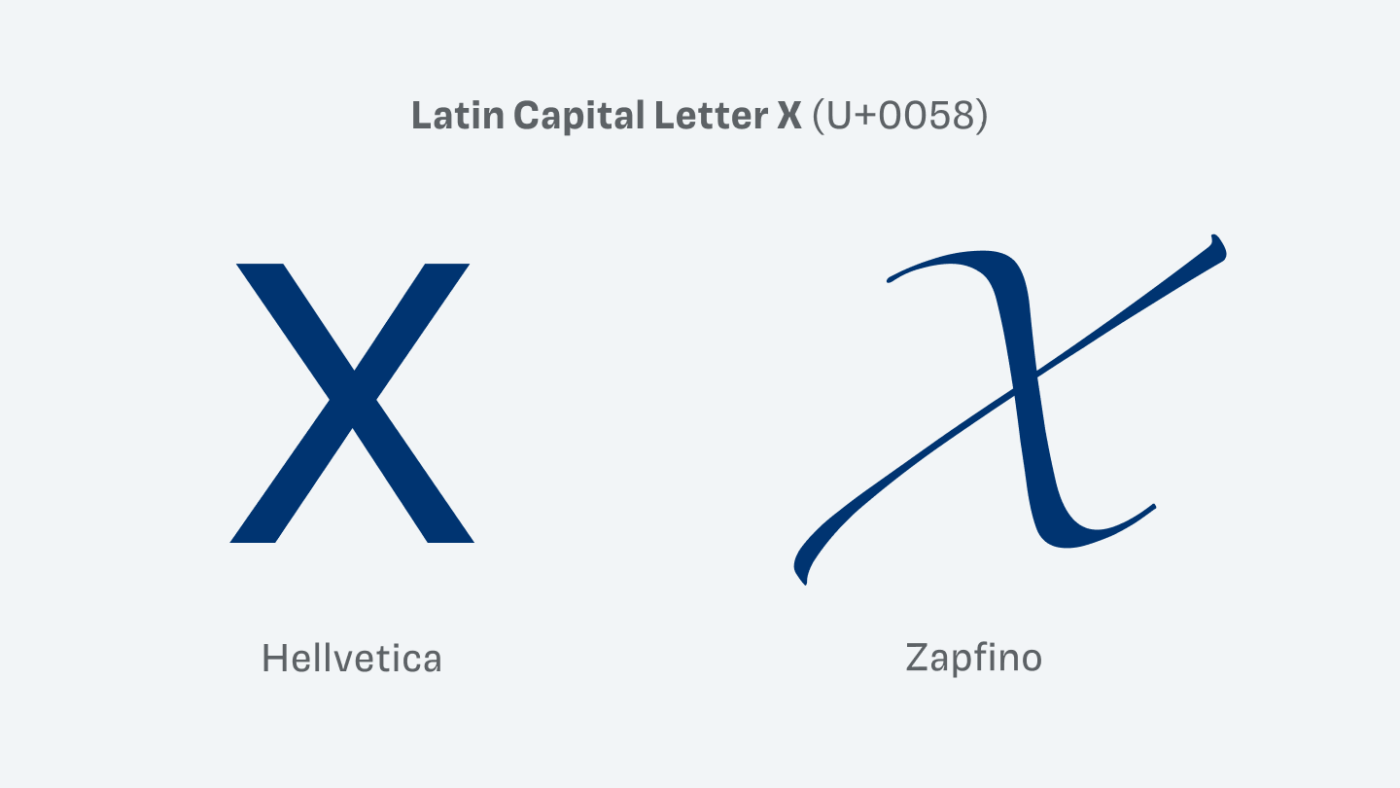 Same Unicode character, different appearance depending on font
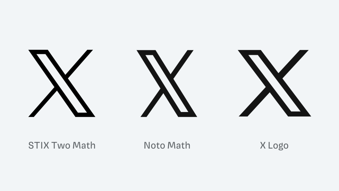
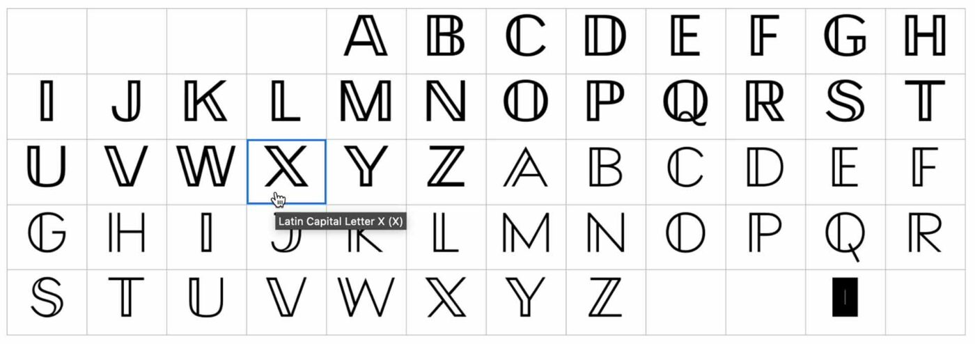
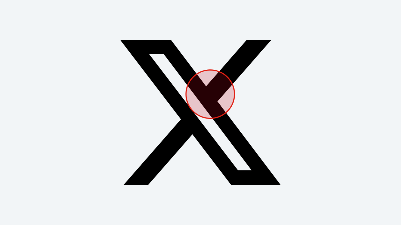
The thing is, the design looks very close to a character from the Unicode table of mathematical alphanumeric symbols, the mathematical double-line capital letter X to be exact, U+1D54F .
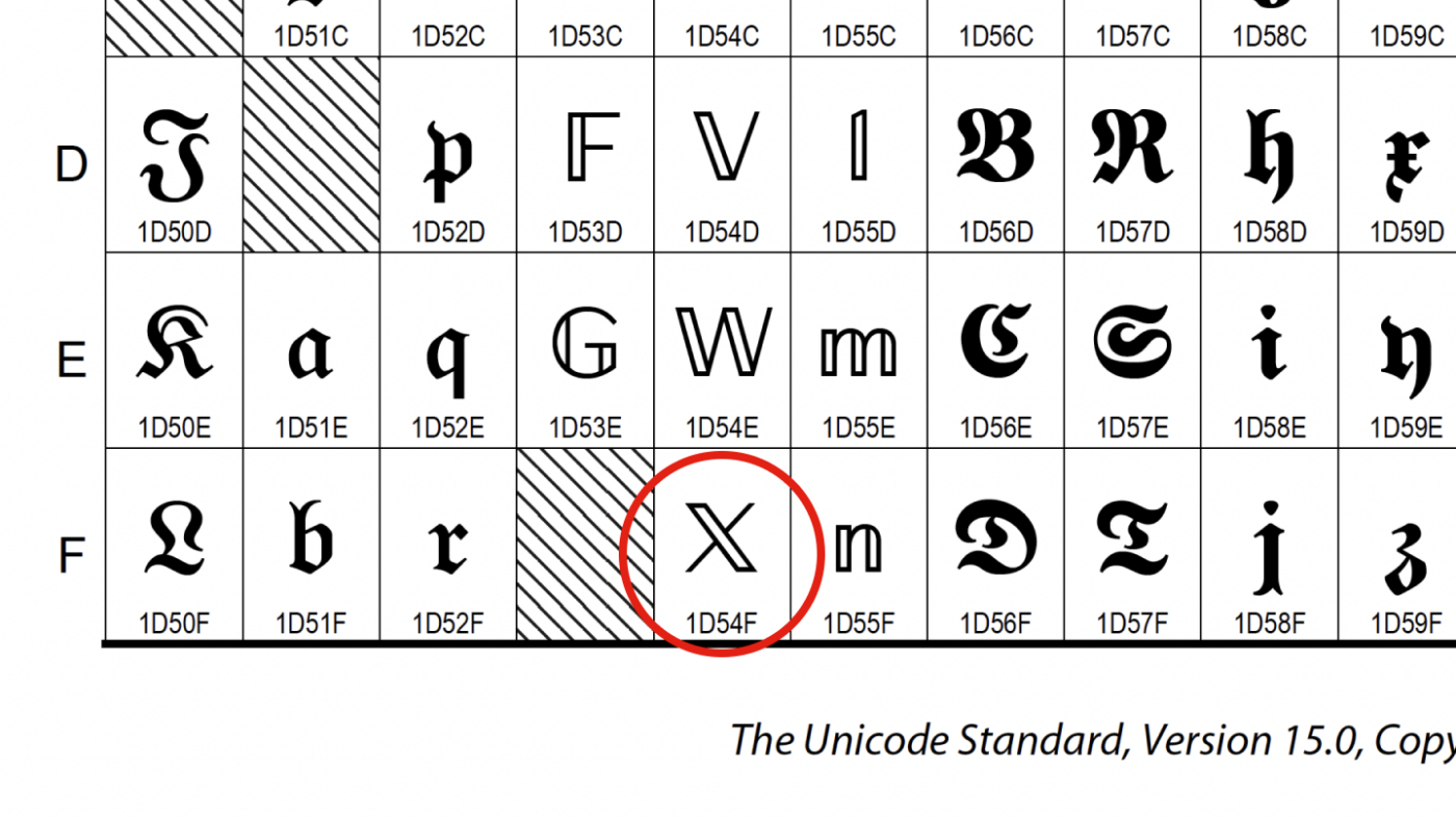 Is the sign X based on this Unicode character?
But how this exact symbol will now appear depends on the font. And most fonts, like Roboto, Arial, or Times New Roman, don’t even have this specific character  .
.
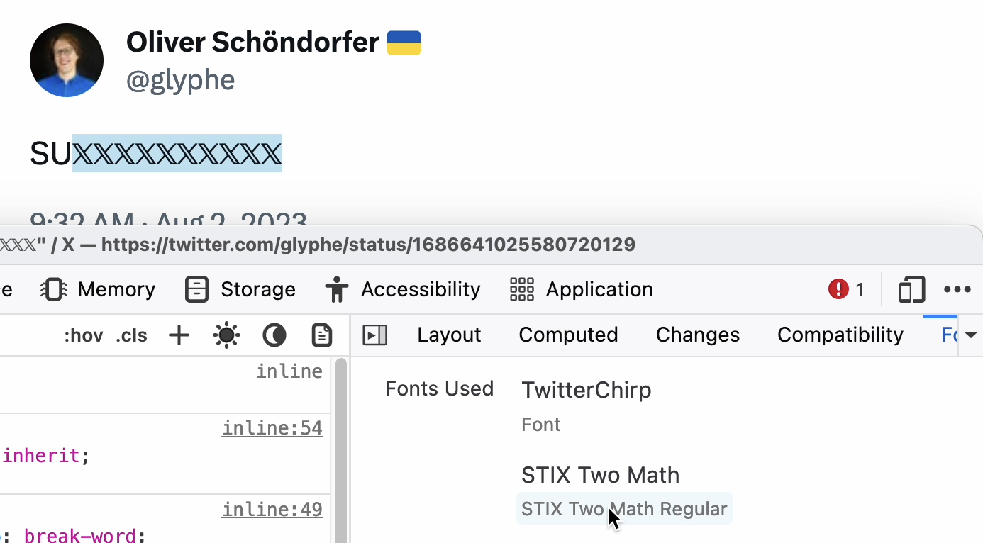 If the font does not contain a character, fallback fonts will be displayed (fallback fonts)
Therefore, if a character is not contained in a particular font, it will fall back to the default font on the device OS in most cases. On macOS or iOS, characters near the logo X appear in the system font STIX Two Math . On other platforms, it may be different, or not displayed at all.
It is not a copy of Unicode characters
When it comes to design, you can’t say it’s uninspired copy, since the exact font will vary from case to case. Basing all the details of a logo on some random character from a (Unicode) table clearly lacks originality – more on that later.
What does ? stand for in mathematics?
But as a mathematical symbol, what does this character actually represent? You’re probably more familiar with the doublet ℙ for prime numbers or ℕ for natural numbers. Memories of math class send shivers down my spine  …however, as far as I can tell , the double line doesn’t mean anything specific .
2. Is Twitter’s logo X taken from the actual typeface?
Another thing that’s been widely discussed is that, as Fontendo claims , Twitter’s logo is just a character from a particular font. When looking at Monotype’s Special Alphabet 4 , the capital X looks like the new Twitter logo.
 Is the logo X taken from Monotype’s Special Alphabet 4?
Can I use letters from fonts as logos?
Is this allowed? This depends on the EULA (i.e. End User License Agreement) and varies from font to font. Most fonts can be used to create logos when purchasing a desktop license, even if not explicitly mentioned. But there are also font makers, such as PangramPangram , that offer logo-specific licenses.
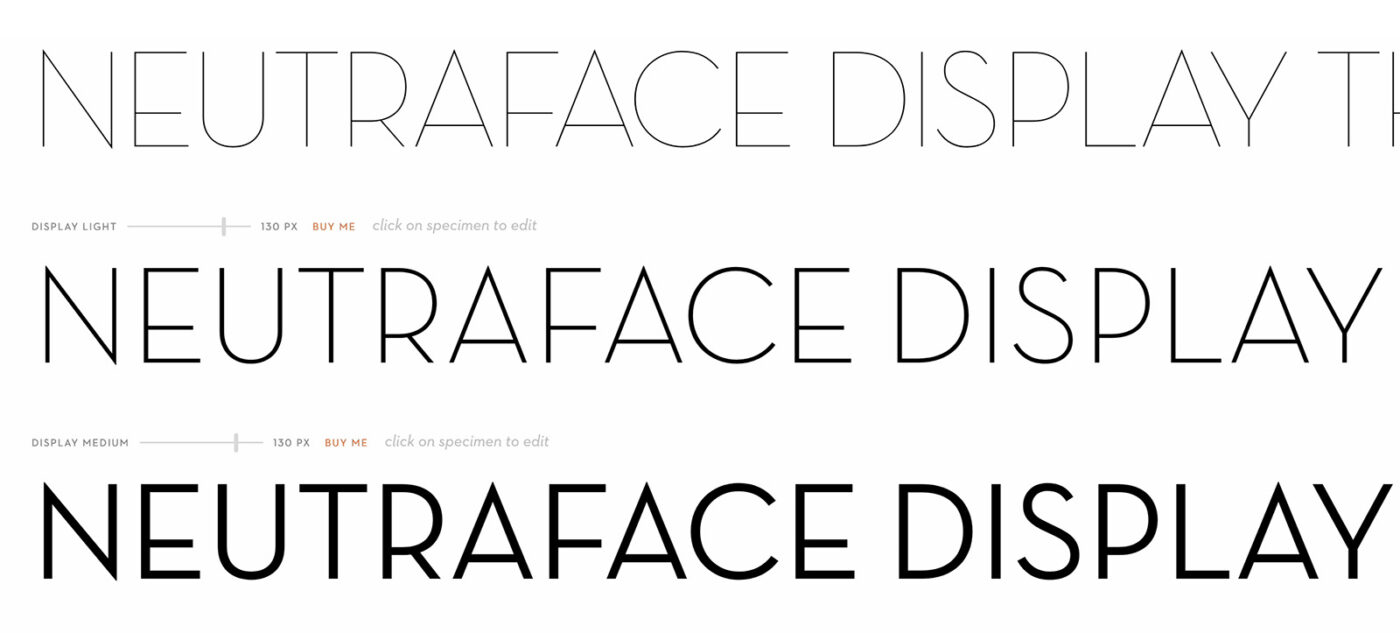 Neutra Face cannot be used for logos when purchasing a desktop license
Sometimes, however, it is expressly stated that individual glyphs, symbols, or any characters from a font are not allowed to be used in a logo. For example, use the gorgeous Neutra Face font by House Industries, which clearly states that it’s not allowed in signs using a desktop license. You need to contact them for additional licenses. So read the license agreement before falling in love with a font.
Logo X is not taken from this font
Special Alphabet 4 could be used as a logo, but the capital X is not exactly the same as the new Twitter logo X. You can see that when you compare them directly: they are slightly different, mainly because the symbol X has a slightly thicker stroke.
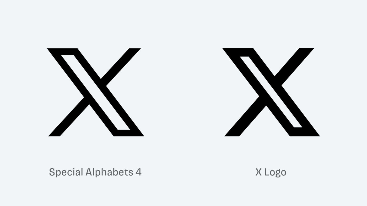 Special Alphabets 4 vs Logo X
It’s okay to use the font if it’s interesting enough
Now you might be thinking, is it bad to use an off-the-shelf font letter in a logo design? Not necessarily, there might be a nice font X here if it’s interesting enough, like this one:
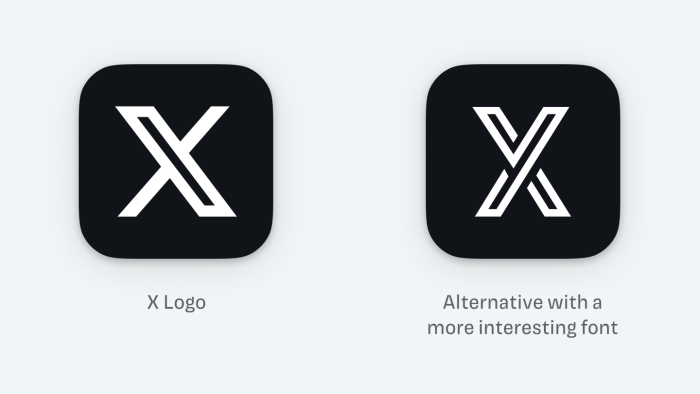 This X is taken from the font Continuo , but more interesting
But keep in mind that it’s still highly fungible, as anyone who owns the font can easily copy it. Which leads to the last question…
3. Is this a good sign?
The original usage of clusterFONT is good enough for a podcast cover , but not enough for a social network. The symbol feels unbalanced and uneven, too wide, and above all dull . When it comes to type design standards, it’s poorly done, and Will Paterson explains it best in this video .
 The diagonal of this logo needs to be optically corrected as shown here
But even with optical correction, it doesn’t help. A good logo should be simple enough to be memorable, but also interesting enough to be unique. The logo is too generic to meet the second criterion. Imagine Twitter simply using the initials, written with double the vertical strokes. That’s not enough for an attractive look, let alone a trademark-worthy logo.
 It’s also a sign of unthinking trash for Twitter
And what about Facebook, the New York Times, or Netflix—do they also use only one character for their app icons? Yes, but the whole brand is hidden under this one character (which they do better by the way).

 Also only characters are used in the icons of these apps, but there is more meaning behind them
That’s it for X. A small exciting white letter placed on a black background. In doing so, it also fits perfectly with that silly, undistinguished new name! Giving an impression of being bland, easily replicable, superficial, trying to be cool, but really just a brand tragedy ! It’s hard to be objective here because Twitter means a lot to me. To be fair, Musk said this is only a temporary fix, so it could evolve.
However, what I find most surprising is how much impact the visual design of a single letter can have. It all happened in just one week, showing just how rough, sloppy and brutal the platform’s heritage can be. Not even retaining the color or even any other visual reference of its origin.
goodbye twitter
Easier to leave after 15 years (X-it → exit). Twitter used to be my favorite social network, and I made a lot of great friends there. It pains me to see how this has all changed. But at least the current logo shows the outside world how it has changed since Musk took over. I can, but wouldn’t agree with that.
Tips for Logo Design
What lessons can you draw from this complaint about font choice to use in logo design? If your project name can be replaced, the characters should at least have something special about them. If the name is interesting enough, it may be possible to choose characters that are less eye-catching but still unique. Think of this advice as a rule of thumb or starting point. You should adopt and apply it according to the specific situation.
 Demo: Font Beatrice by Sharp Type
  Demo: SFT Schrifted Sans by Schrifteria, with F modified to make it more unique
However, don’t just copy a known symbol without making any changes. When using a certain font, please check whether it is authorized in the license agreement.
Astronauts’ immune systems suffer in space, study suggests
→ Original link : Research shows astronauts’ immune systems falter in space — Abdul-Rahman Oladimeji Bello / Interesting Engineering / 2023-07-02
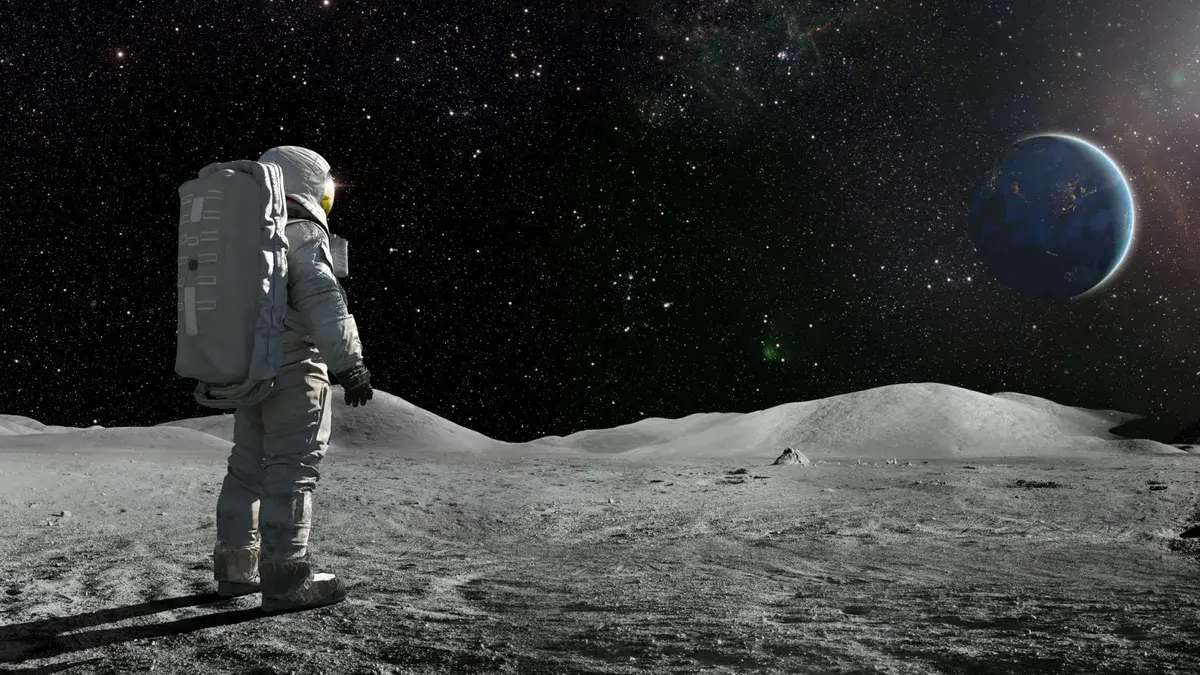 Astronaut in space / iStock / peepo
In a study involving 14 long-duration astronauts aboard the International Space Station (ISS), scientists have discovered the mechanism by which the immune system collapses in space. The research, published in the journal Frontiers in Immunology, provides important insights into why astronauts are more susceptible to infections during missions, revealing a weakening of their bodies’ defenses against pathogens.
The study, led by molecular biologist Odette Laneuville at the University of Ottawa in Canada, examined gene expression in white blood cells (leukocytes, also known as white blood cells) isolated from astronaut blood. The team, comprising researchers from the Canadian Space Agency and NASA, took blood samples before the flight, while the astronauts were on the space station and after returning to Earth.
Extended reading
- World’s first astronaut with disability to begin training World’s first astronaut with disability to begin training
- Long space voyages may cause astronauts’ brain cavities to expand
- Scientists discover how cancer cells evade immune system
The findings showed that gene expression in white blood cells dropped significantly after reaching space, reaching about one-third of normal levels. This decline occurred during the first few days in space and remained steady throughout the mission. However, after returning to Earth, the genes gradually returned to normal within about a month.
“White blood cells are very sensitive to the space environment. They use their specialized immune functions to take on cell maintenance or housekeeping roles. Before this paper, we only knew about immune dysfunction, but not the mechanism,” explained study co-author. Gay Guy Trudel is a rehabilitation medicine specialist at Ottawa Hospital.
This behavioral change in white blood cell genes may be due to a phenomenon known as “fluid shift,” in which the absence of Earth’s gravity causes blood to be redistributed from the lower to the upper parts of the body. However, increased exposure to solar radiation in space does not appear to be the primary cause of the weakened immune system.
Implications of this discovery
The implications of these findings are significant. Weakened immunity increases the risk of contracting diseases that impair an astronaut’s ability to perform demanding jobs in space. Additionally, astronauts in space face limited access to care, medication, or evacuation should an infection or immune-related condition escalate to a serious condition requiring medical intervention.
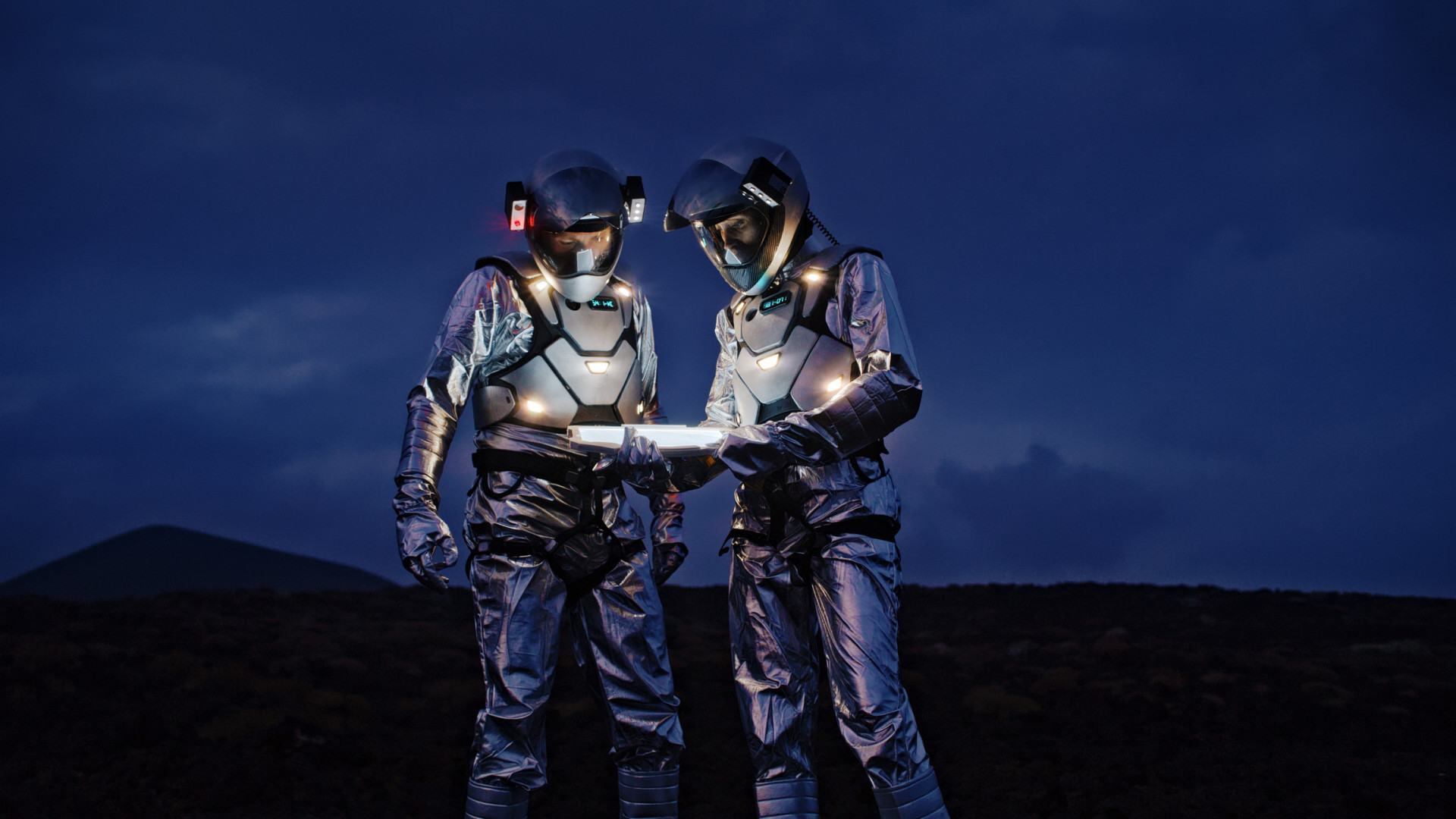 Astronauts in space / iStock / janiecbros
This isn’t the first time scientists have observed immune dysfunction in space. Astronauts have previously experienced reactivation of latent viruses, including Epstein-Barr (Epstein-Barr virus, also known as human herpesvirus type 4), varicella zoster virus, and herpes simplex virus. In addition, viral particles shed in biological fluids such as saliva and urine are more prevalent among astronauts, increasing the risk of pathogen transmission to astronauts. Other crew members with weakened immune systems.
The team’s next focus is to develop specific countermeasures to prevent immune suppression during long-duration spaceflight. Understanding the mechanisms of immune dysregulation in space could not only address health risks faced by astronauts , but could potentially contribute to personalized medicine on Earth.
As we further explore the mysteries of space, it becomes increasingly clear that our bodies are not equipped to handle the harsh conditions beyond Earth. The study’s findings highlight the urgent need for protective measures and innovative solutions to safeguard the health of astronauts during space exploration.
 Environment : Extreme weather and climate change coverage
The World Climate Attribution Organization WWA prepared a report focusing on answering our questions after extreme weather events: “Is this event caused by climate change?” Design : Which fonts should be used in diagram design
How should text appear in data visualizations? The article focuses on a detail related to legibility in chart design. Read : Vol.156|If you are looking for meaning, don’t read books|Liu Qing×Alai×Ye Zi
In the Internet age, massive amounts of information can be quickly presented to the public in various forms. We seem to know everything, but why do we feel anxious? Efficiency : Heptabase vs Notion vs Obsidian
Zhan Yu’an, the founder of Heptabase, wrote an article to talk about the similarities and differences between the three most popular note-taking software, especially the product thinking. By the way, Makoto Shinkai recently tweeted a photo of him using Heptabase on Twitter, and praised it later. History : Did Finland help the Japanese invade China? Finland, the Soviet Union and the Anti-Japanese War
What role did Finland and the Soviet Union play in the Anti-Japanese War?
 If you like CyberClip and want to help me run it better:
- Forward to a friend or social network
- See the Advertise page Contact me to advertise
- Give me appreciation in Aifafa or WeChat, welcome to note title, email
- Click below with
 Marked promotion links, I can receive a meager sponsorship for every valid click of yours
 - In case you have a need, pass the following with Marked promotion link registration fee, I will be able to get a certain percentage (marked) rebate from your payment. Please do what you can and consume rationally.
 Thank your for your support!


Was this email forwarded by a friend or seen on a social platform? If you think it’s not bad, welcome to subscribe !
If you are interested in advertising on CyberClip, please see our Advertise page and get in touch with me.
CyberClip is a cyber clipping that selects valuable content on the Internet. Every two weeks, it covers new anecdotes, hot issues, cutting-edge technology and other things about life and the future.
 Thank you for reading, welcome to reply, and praise Shi Qi.
 Past content | Discussion group | Personal blog

This article is transferred from: https://shyrz.me/cyberclip-40-brand-carnage/
This site is only for collection, and the copyright belongs to the original author.