Original link: https://www.zhangxinxu.com/wordpress/2023/06/css-noise/
by zhangxinxu from https://www.zhangxinxu.com/wordpress/?p=10872 Xin space – Xin life
This article is welcome to share and aggregate, there is no need to reprint the full text, respect copyright, the circle is so big, if you need it urgently, you can contact for authorization.
1. Before my realization
1. canvas implementation
I used canvas to realize the noise background effect before. The article introduces it here: ” Starry Sky, Noise and Smoke Effects of Canvas Graphics Drawing “
The address of the demo page is this: Noise effect demo implemented by canvas

2. SVG implementation
SVG can be implemented using the feTurbulence filter. This filter is very practical and can simulate natural random effects. I have studied it before. For details, see the article ” In-depth introduction to the SVG feTurbulence filter “.
The specific implementation is as follows:
 <svg

  width="300" height="150"

  viewBox="0 0 300 150"

  xmlns='http://www.w3.org/2000/svg'

  style="background: black; filter: grayscale(1);"

>


  <filter id='noiseFilter'>

    <fe Turbulence

      type='fractalNoise'

      baseFrequency='0.65'

      numOctaves='3'

      stitchTiles='stitch' />

  </filter>


  <rect

    width='100%'

    height='100%'

    filter='url(#noiseFilter)' />

</svg>
The real-time rendering effect is:
Unexpectedly, the original CSS can also achieve a similar effect.
Second, CSS achieves white noise
The code is surprisingly simple, as follows:
 canvas {

  background: linear-gradient(#000a, #000a),

    repeating-radial-gradient(#000 0 0.0001%, #fff 0 0.0002%) 50% 0 / 2500px 2500px,

    repeating-conic-gradient(#000 0 0.0001%, #fff 0 0.0002%) 60% 60% / 2500px 2500px;

  background-blend-mode: normal, difference;

}
The actual rendering effect is as follows:
It’s amazing, isn’t it? Let’s talk about the implementation principle below.
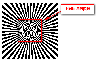
3. Implementation principle
Let’s first draw an ordinary tiled tapered gradient, 1% angle, half transparent, half pure black:
 div {

     background: repeating-conic-gradient(#000 0 1%, #0000 0 2%)

}
Because the radial angle is relatively small, the graphics in the middle area are distorted together under a certain algorithm due to insufficient pixels, as shown in the following figure:
Using this feature, we only need to make the gradient angle small enough, then the whole area will be this kind of “random point”, for example:
 .square-1 {

  width: 200px; height: 200px;

  background: repeating-conic-gradient(#000 0 0.0001%, #0000 0 0.0002%)

}
The real-time rendering effect is as follows:
It feels that way, right? However, the traces of the diagonal lines can be clearly seen, as shown in the screenshot below (Chrome 1x display):
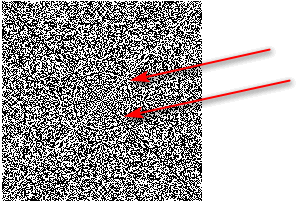
At this point, we can properly scale the background and change the position of the center point to eliminate such traces, for example:
 .square-2 {

  width: 200px; height: 200px;

  background: repeating-conic-gradient(#000 0 0.0001%, #0000 0 0.0002%) 60% 60% / 2000px 3000px

}
The current visual performance of the browser is as follows:
Basically, there are no traces of any regularity.
At this point, we can go a step further and blend in with the radial gradient, doubling it randomly.
The following is the ultra-small angle radial gradient schematic code and effect:
 .square-3 {

  width: 200px; height: 200px;

  background: repeating-radial-gradient(#000 0 0.0001%,#0000 0 0.0002%) 60% 60%/3000px 3000px;

}
Next, use the difference blending mode to mix the two, and you will naturally get random noise.
hint:
 .square-4 {

  width: 200px; height: 200px;

  background: repeating-radial-gradient(#000 0 0.0001%, #fff 0 0.0002%) 60% 60%/3000px 3000px,

    repeating-conic-gradient(#000 0 0.0001%, #fff 0 0.0002%) 40% 40%/2000px 3000px;

  background-blend-mode: difference;

}
Style performance result:
Finally, cover with a layer of black translucency to have the final effect.
3. Expansion effect
With noise, we can achieve some characteristic effects. Here are two examples, just as a throwing brick to attract jade.
1. Old photo effect
The known HTML structure is shown in the following code:
 <figure>

    <img src="mm9.jpg" />

</figure>
By turning the photo yellow and adding noise, you can simulate a realistic old photo effect. The CSS statement is as follows:
 figure {

    display: inline-flex;

    position: relative;

    filter: sepia(100%);

}

figure::before {

    content: '';

    position: absolute;

    inset: 0;

    background: linear-gradient(#000a, #000a),

        repeating-radial-gradient(#000 0 0.0001%, #fff 0 0.0002%) 50% 0 / 2500px 2500px,

        repeating-conic-gradient(#000 0 0.0001%, #fff 0 0.0002%) 60% 60% / 2500px 2500px;

    background-blend-mode: normal, difference;

    mix-blend-mode: overlay;

    opacity: .6;

}
The rendering performance of the final image is shown in the following figure:
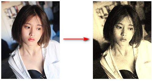
Seeing is believing, you can click here hard: CSS realizes the effect of old photos with noise demo
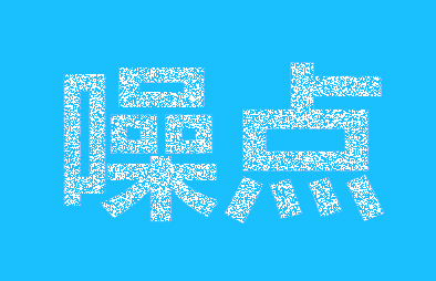
2. Noise Text Effect
The HTML content looks like this:
 <div class="title">

    <strong>CSS New World</strong>

</div>
The corresponding CSS declaration statement is:
 .title {

    background-color: deepskyblue;

}

.title strong {

    font-size: 100px;

    color: #0000;

    background:

        repeating-radial-gradient(#000 0 0.0001%, #fff 0 0.0002%) 50% 0/2500px 2500px,

        repeating-conic-gradient(#000 0 0.0001%, #fff 0 0.0002%) 50% 50%/2500px 2500px;

    background-blend-mode: difference;

    mix-blend-mode: lighten;

    -webkit-background-clip: text;

          background-clip: text;

}
The final CSS rendering effect is as follows, you can see a lot of random noise on the text:

Seeing is believing, you can click here hard: CSS implements noise text effect demo
4. Conclusion
According to my test, this effect is only suitable for Chrome and Firefox browsers, and Safari does not show the noise effect.
After all, the kernel is different, and the rendering algorithm is also different.
Considering that there are still many projects that do not need to be compatible with Safari, it cannot be said that this technology cannot have vitality.
Moreover, sometimes, effects like old photos or text noise are icing on the cake and do not affect the use.
Hmm… This article will not be nonsense. There is nothing to say about things like car maintenance today, children signing up for basketball lessons, and going to have their teeth straightened on Wednesday.
Okay, the above is the whole content of this article. If you think it is good, please like and forward it.
In addition, the behavior is hasty, mistakes are inevitable, welcome to correct.

Reference article: Making Static Noise From a Weird CSS Gradient Bug
This article is an original article, welcome to share, do not reprint the full text, if you really like it, you can bookmark it, it will never expire, and will update knowledge points and correct errors in time, and the reading experience will be better.
Address of this article: https://www.zhangxinxu.com/wordpress/?p=10872
(End of this article)
This article is transferred from: https://www.zhangxinxu.com/wordpress/2023/06/css-noise/
This site is only for collection, and the copyright belongs to the original author.