Original link: http://vis.pku.edu.cn/blog/dumbledr/
Dimensionality reduction is a commonly used method for high-dimensional data visualization, which projects high-dimensional data into a low-dimensional space, preserving specific characteristics of the original data in the resulting projection. Since different dimensionality reduction methods aim to preserve different characteristics of the data, they can produce very different results. To help users choose suitable results, researchers have proposed a variety of dimensionality reduction results evaluation methods. These methods can be roughly divided into two categories: quantitative measurement and qualitative judgment. The former can be further divided into accuracy measures that assess the degree of information retention and interpretability measures that assess the saliency of visual patterns. Qualitative judgments are driven by human preferences. For example, researchers have found that the more expertise users have, the more consistent their judgments will be [1]. While there are many evaluation methods available, some challenges remain in evaluation. First, user preferences are not well described, and it remains unclear what they care about when choosing projections. Second, there is a gap between quantitative metrics and qualitative judgments, and we don’t know how well the metrics reflect user preferences. Finally, these methods lack further guidance on projection selection, and they cannot predict which projections users might like and explain why they like them.
Faced with these challenges, the authors propose DumbleDR [2]. They first conduct experiments to analyze users’ subjective preferences in dimensionality reduction, and then develop models that predict users’ preferences for projections by combining quality metrics. Based on the model, they propose DumbleDR, a web tool that supports ranking projections and shows which metrics drive rankings.
The authors use 11 image datasets to complete user experiments. The benefit of using an image dataset is that each point in the projection can be replaced with a corresponding image thumbnail, allowing the user to judge whether a true cluster appears, thereby ensuring that the extracted projection preferences are meaningful. They selected eight dimensionality reduction techniques, namely PCA, MDS, Isomap, t-SNE, UMAP, Local Linear Projection (LLE), Spectral Embedding (SE), and Gaussian Random Projection (GRP). Dimensionality reduction with tunable parameters produces multiple projections. Participants were presented with eight projections of the same dataset in each experiment and then asked to decide which projection they preferred (Figure 1). Specifically, participants were asked to assign 15 points (represented by red hearts on the interface) to these projections. The higher the score, the more the participant liked the projection. They can directly mark a projection as bad. In addition, participants were asked to rank projections by preference, which allowed them to focus on local comparisons of a projection and its immediate neighbors.
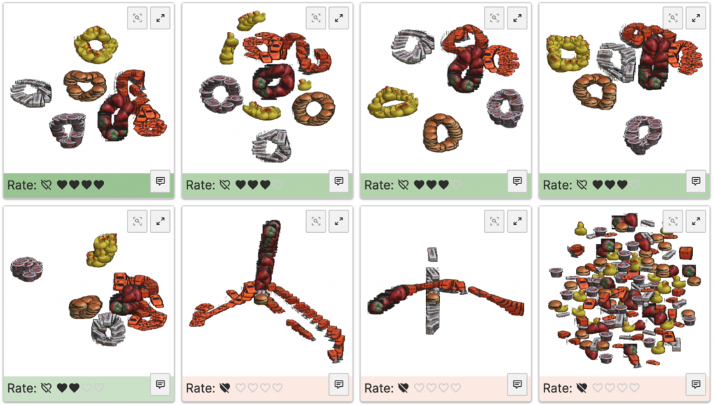 Figure 1: User experiment interface.
After completing the experiment, the authors first counted the degree of consensus among participants through pairwise comparisons between the two projections. Combining users’ difficulty ratings for each dataset, they found that more complex datasets produced a higher proportion of disagreements (Figure 2). In addition, they plotted a preference matrix for dimensionality reduction techniques, where each cell represents how often participants agreed that the dimensionality reduction technique in that row was better than the technique in that column (Figure 3). It can be seen that GRP and UMAP with bad parameters are generally disliked because GRP usually produces scattered results and considering only two neighbors is not sufficient in UMAP.
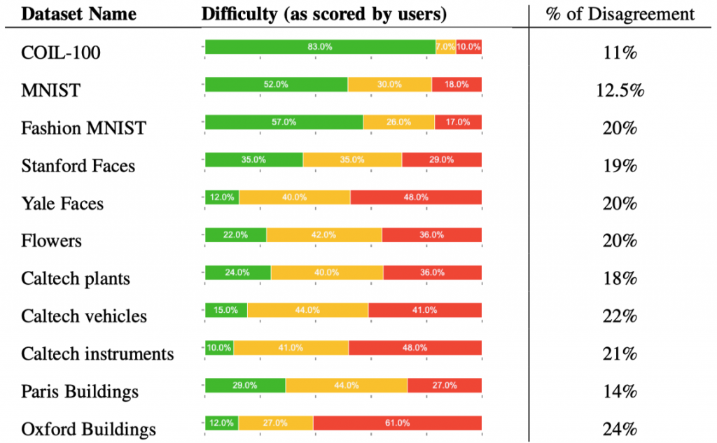 Figure 2: Difficulty of different experimental datasets and degree of consensus on user preferences.
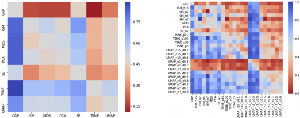 Figure 3: Preference matrix for dimensionality reduction techniques.
To predict user preferences, the authors collected metrics that measure different aspects of dimensionality reduction results (Figure 4, left). Some of them measure the quality of low-dimensional visualizations, others measure the correctness of the mapping from high to low dimensions. Based on the user experiment results, they drew a correlation matrix heatmap (right in Figure 4), and it can be seen that some cluster separation metrics are highly correlated. They then filter out some metrics by relevance and informativeness.
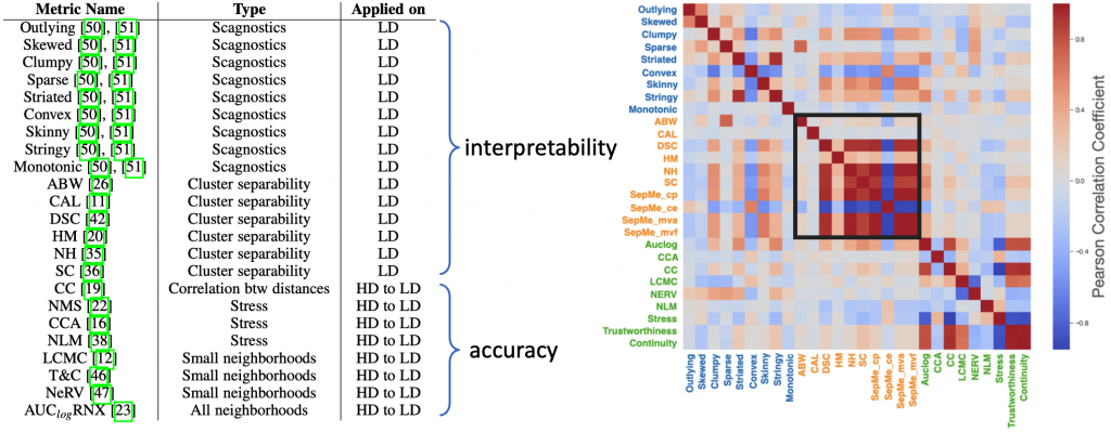 Figure 4: The left side shows a list of initial metrics, and the right side shows the correlation between these metrics.
They then developed three models with increasing levels of detail to predict user preferences. The purpose of the first model is to classify “good” and “bad” projections. “Good” projections get at least one heart, while “bad” projections are those that are crossed out. The second model learns linearly which projection is more popular, and it can answer “Will projection A be more popular than projection B”. The third model aims to provide a ranking of projections to answer “how much better is projection A than projection B”. Inspired by the cross-validation setting leave-one-group-out, they used the leave-one-dataset-out (LODO) setting, leaving one image dataset at a time as the test set, using the other dataset as the training set, and Repeat this process for all dataset combinations. The three models are random forest model, Bradley-Terry model and boosted tree model. The authors interpret the predictions of each model by SHAPley values to obtain their metric importance. Figure 5 shows the five most important metrics for each model. As can be seen, both accuracy metrics (green) and interpretability metrics (blue and orange) are important, indicating that users tend to choose accurate projections that contain readable patterns.
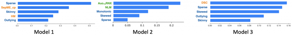 Figure 5: The 5 most important metrics in each model.
The authors developed DumbleDR based on the third model (Figure 6). The left side of the interface shows a projection map of sampled projections, where similar projections are located close together and dissimilar projections are far apart. The blue areas in the map represent good projections. The right side of the interface displays the sampled projections in the form of a list, and displays their dimensionality reduction techniques and parameters, rankings, and quality indicator values.
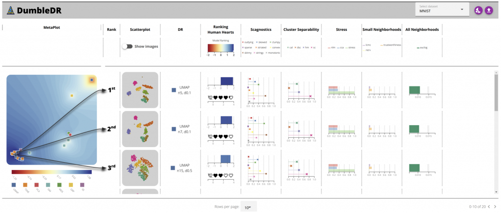 Figure 6: DumbleDR.
references
1. Joshua M. Lewis, Laurens van der Maaten, and Virginia R. de Sa. A Behavioral Investigation of Dimensionality Reduction. In Proceedings of the 34th Annual Meeting of the Cognitive Science Society, 2012.
2. Cristina Morariu, Adrien Bibal, Rene Cutura, Benoît Frénay, and Michael Sedlmair. DumbleDR: Predicting User Preferences of Dimensionality Reduction Projection Quality. IEEE VIS 2022.
This article is reprinted from: http://vis.pku.edu.cn/blog/dumbledr/
This site is for inclusion only, and the copyright belongs to the original author.