Original link: https://www.zhangxinxu.com/wordpress/2022/07/clip-path-css-number/
by zhangxinxu from https://www.zhangxinxu.com/wordpress/?p=10490 Xin Space-Xin Life
This article welcomes sharing and aggregation. There is no need to reprint the full text. The copyright is respected. The circle is so large. If you need it urgently, you can contact for authorization.

1. Serve directly
I thought about it before, and then I happened to have a need to use it recently, so I took a few hours to draw a set of numbers with pure CSS, and the effect is shown in the following figure:
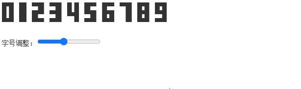
Not only the font size follows the font-size environment font, but the color can also be controlled by color, and even the font-family can be changed to change the aspect ratio of the numbers.
If you want to understand the implementation, or copy the code, you can click here hard: Drawing a set of Arabic numerals in pure CSS demo
Feel free to use it for free, just keep one line of the original author’s note.
Technical realization
All numbers are implemented using the same graphics function of the same CSS property, the clip-path property ( described earlier in this article ) and the polygon() function ( described earlier).
Cold knowledge: The polygon() function did not support percentage values at the beginning, and it was only supported later, so that we can easily draw proportional graphics without fear of size changes.
Take the number 0 as an example, the corresponding clip-path trimming code is as follows:
.num0 { clip-path: polygon(0 0, 100% 0, 100% 100%, 60% 100%, 60% 20%, 40% 20%, 40% 80%, calc(60% - .01px) 80%, calc (60% - .01px) 100%, 0% 100%); }
Find the point coordinates of the corresponding corner, express it as a percentage, and write it down.
The technical difficulty is very low, as long as you are careful.
have a trick
However, the figure of the character 0 is closed, not open, and the clip-path can only be cut once. How to cut the hollow in the middle?
According to my practice, it is only necessary to add a very small offset to the seemingly overlapping points, such as 0.01px. Although the browser renders it as stitched, the browser will actually consider it as two points. .
Therefore, calc(60% - .01px) only appears in the CSS code above.
If you still don’t understand it, we can change this .01px to 1px, and then enlarge the font size, and everyone will know what’s going on. See the picture below:

You can see that there is a 1px wide gap below the graph corresponding to 0, which is actually non-closed!
Everything can be clip-path
Since we can clip a seemingly closed figure with minimal deviation, as long as it is a non-arc figure, it can be detected using clip-path:polygon() .
Not to mention numbers, 26 English characters and even a whole set of Chinese characters can be cut out.
2. When to eat
When do you need to use CSS to draw numbers?
1. Precise control of glyph position
In general English fonts, as well as Chinese fonts, the width occupied by the digital characters is different from the width of the glyphs, and a little gap buffer is reserved on the left and right sides.
If we want the graphics of several numbers to be rendered exactly 1px from each other, we must use a font that is accurately drawn. The number rendered by the default font is difficult to precisely locate.
For example, the following 123 rendering effect:
2. Protect the numbers
Websites all have some sensitive numbers that you don’t want to be crawled by crawlers, you can use CSS to draw numbers.
In this case, the following two HTML renderings are the same:
<span class="num num0">0</span> <span class="num num0">9</span>
That is, the numbers inside are used for machine identification, and are deliberately misleading.
If the other party finds it misleading, the class name will be randomly and dynamically generated, making it irregular.
If the other party wants to identify by grabbing the code of the pseudo element.
Then the position of the coordinate points in the clip-path is random. Anyway, all the points in the polygon(), which one is the first and which one is the last, are not regular. For example, if there are 10 drawing points of 0, then there are 10 drawing methods. .
If the other party finds the law again.
Then turn all coordinate points such as 60% into random calc() calculation functions. For example, calc(18% + 42%) has the same effect, but the identification of the other party is more difficult.
If the other party is really a goddamn god, then directly delegate the getComputedStyle method, so that it cannot obtain the clip-path value in the pseudo element.
In one word, do it!
3. About CSS Graphics Drawing
If you are interested in CSS graphics rendering, you can read my previous article: ” Common CSS graphics rendering collection “, which shows the rendering of 43 common CSS graphics, all of which are carefully selected and commonly used .
Everyone’s evaluation is also good, you can pay attention.

Well, that’s all, I just show off my little works.
If you have a better implementation, feedback is welcome.
Or if you find that other people have drawn numbers using CSS, please let me know, and I will watch and learn.
Thanks for reading, welcome to share, see you in the next article!
By the way, there is one more thing, please pay attention to my B station account . At the end of the month, there will be rewards for adding 1000 fans, and it is still a little bit closer!

This article is an original article, welcome to share, do not reprint in full text, if you really like it, you can collect it, it will never expire, and will update knowledge points and correct errors in time, and the reading experience will be better.
The address of this article: https://www.zhangxinxu.com/wordpress/?p=10490
(End of this article)
This article is reprinted from: https://www.zhangxinxu.com/wordpress/2022/07/clip-path-css-number/
This site is for inclusion only, and the copyright belongs to the original author.