the difference:
Adaptive: Multiple sets of interfaces need to be developed;
Responsive: Just develop a set of interfaces.
1. Adaptive:
By detecting the resolution of the viewport, it is judged that the currently accessed device is: PC, tablet, mobile phone, so as to request the service layer and return different pages; responsive design detects the resolution of the viewport. Code processing to display different layouts and content.
2. Responsive:
The screen adaptation for the page is within a certain range: for example, one set of adaptation for PC (>1024), one set for tablet (768-1024), one set for mobile phone (<768); one set for responsiveness All pages fit. (As you can imagine: the content to be considered in responsive design is much more complicated than that in adaptive design)
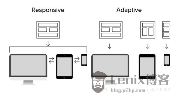
Responsive Design (RWD): Build a web page and change the size of the web page to adapt to screens of different resolutions through CSS Media Query, Content-Based Breakpoint and other technologies.
Adaptive Design (AWD): Create different web pages for different types of devices, and call the corresponding web pages after detecting the device resolution.
…
The post Difference Between Adaptive and Responsive first appeared on Lenix Blog .
This article is reprinted from https://blog.p2hp.com/archives/9575
This site is for inclusion only, and the copyright belongs to the original author.